


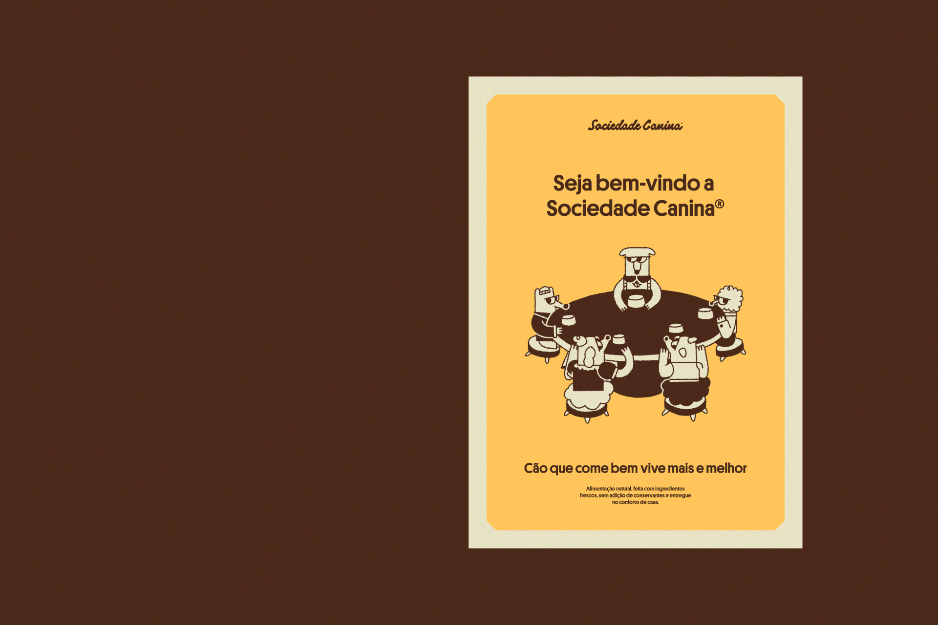
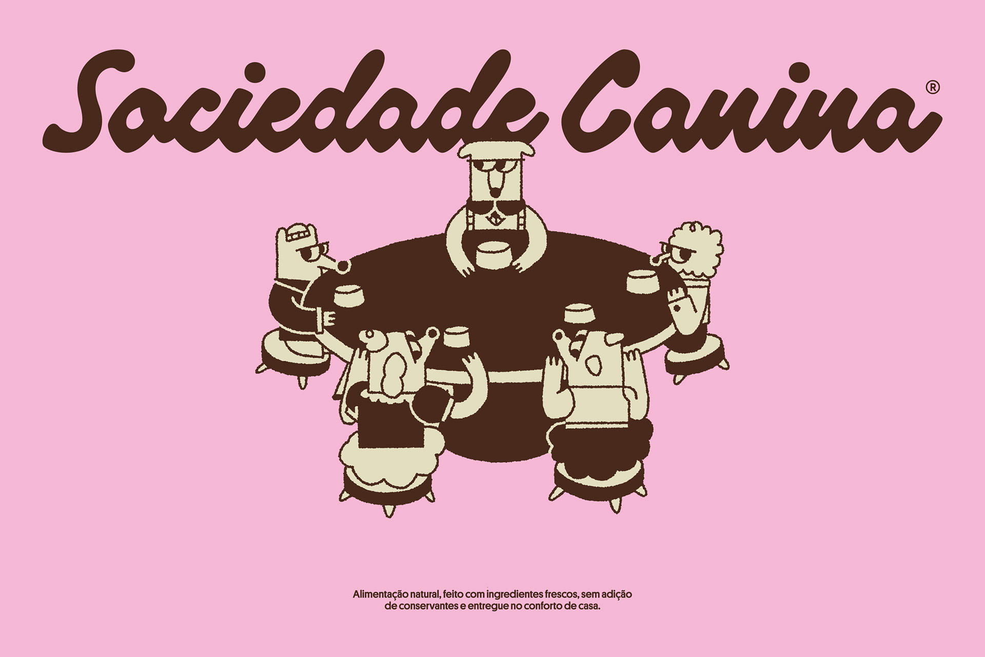
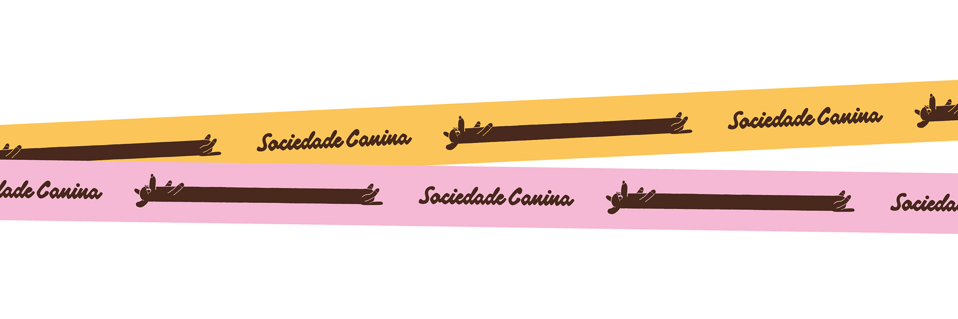
Sociedade Canina
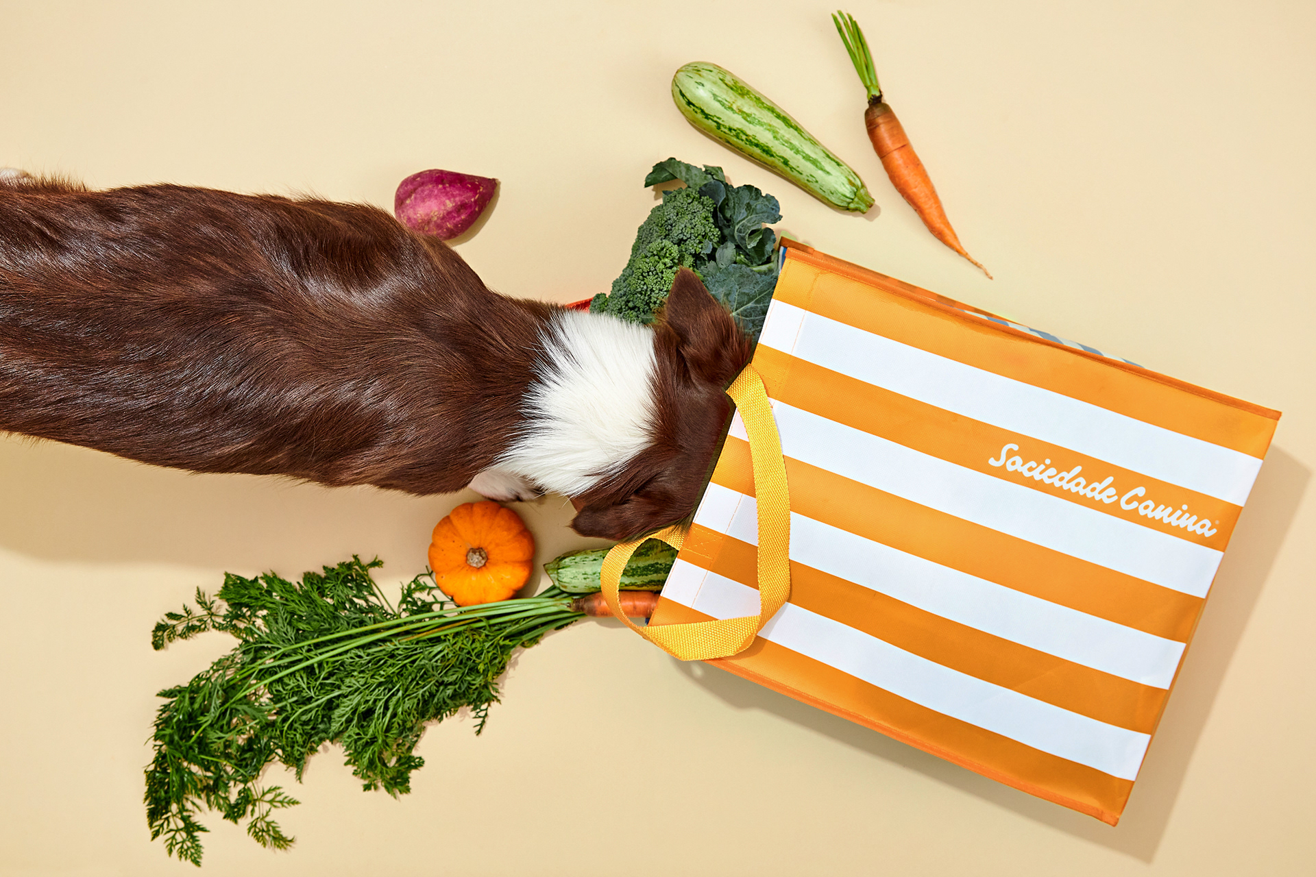
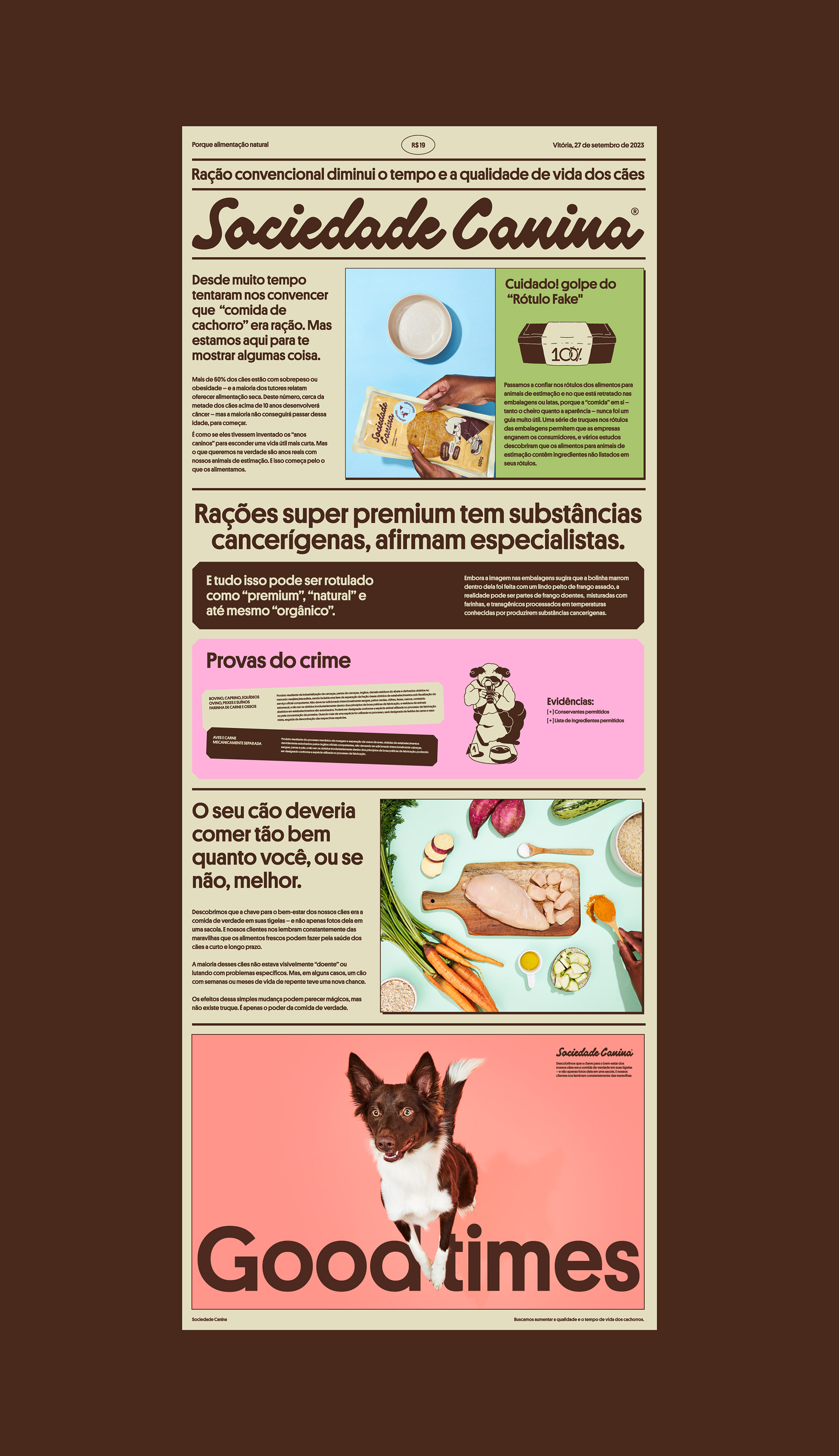
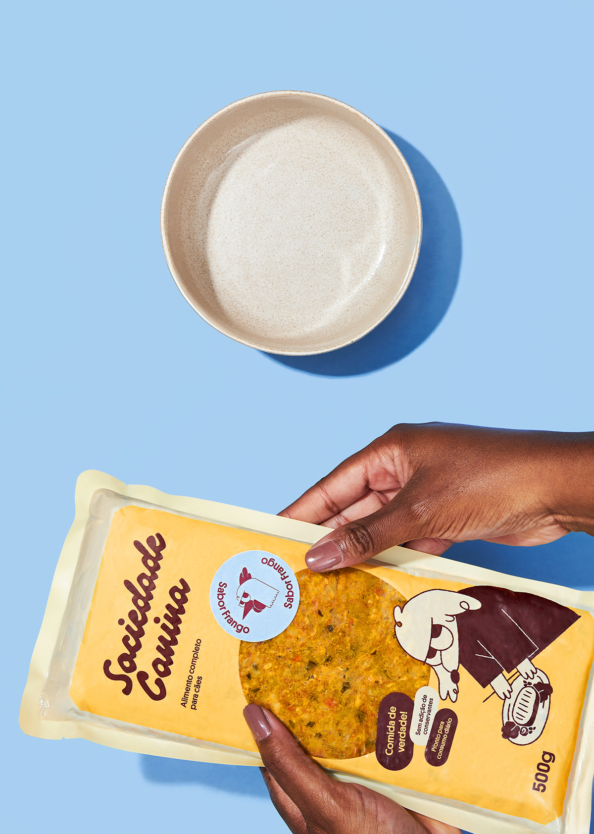
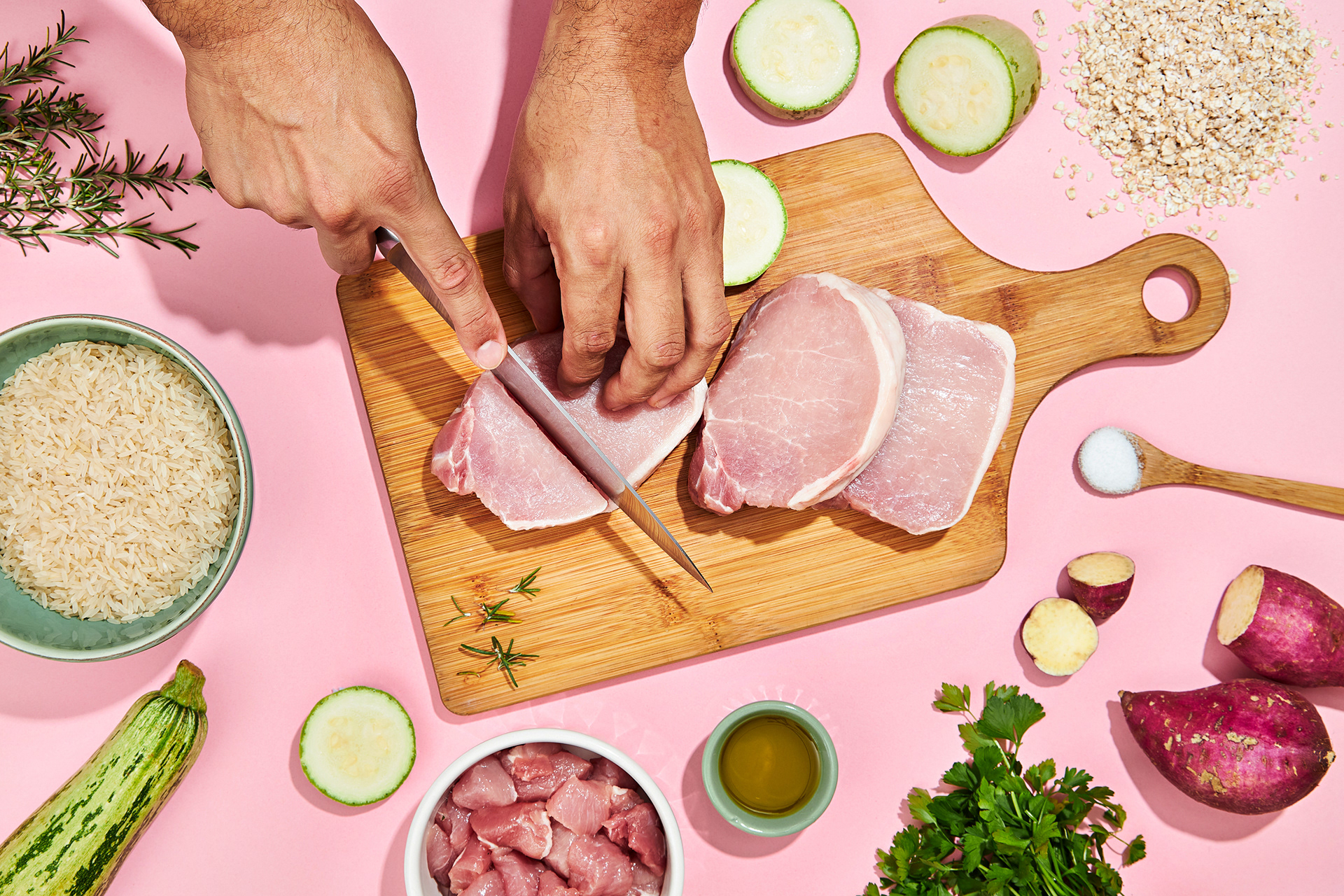
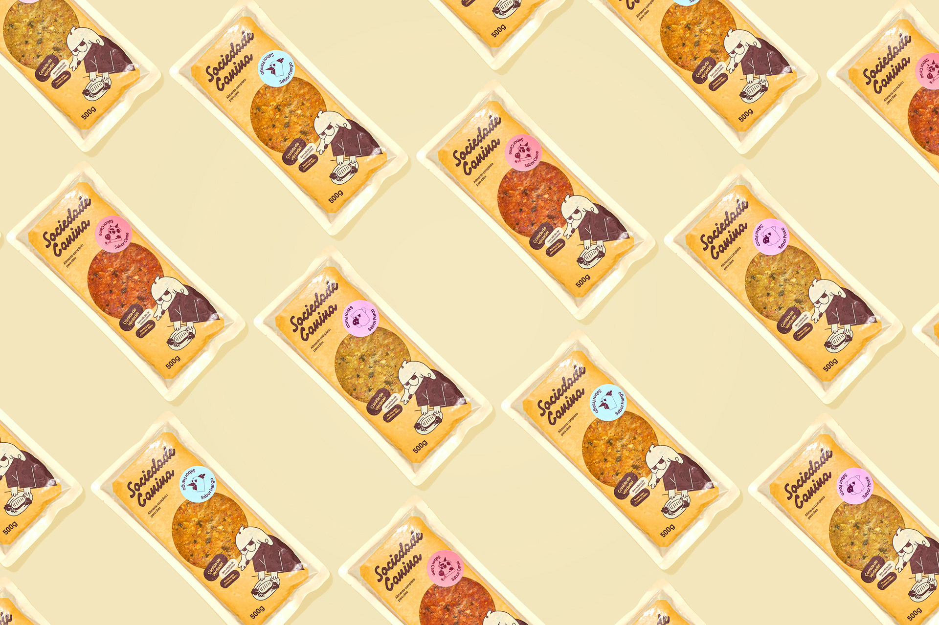
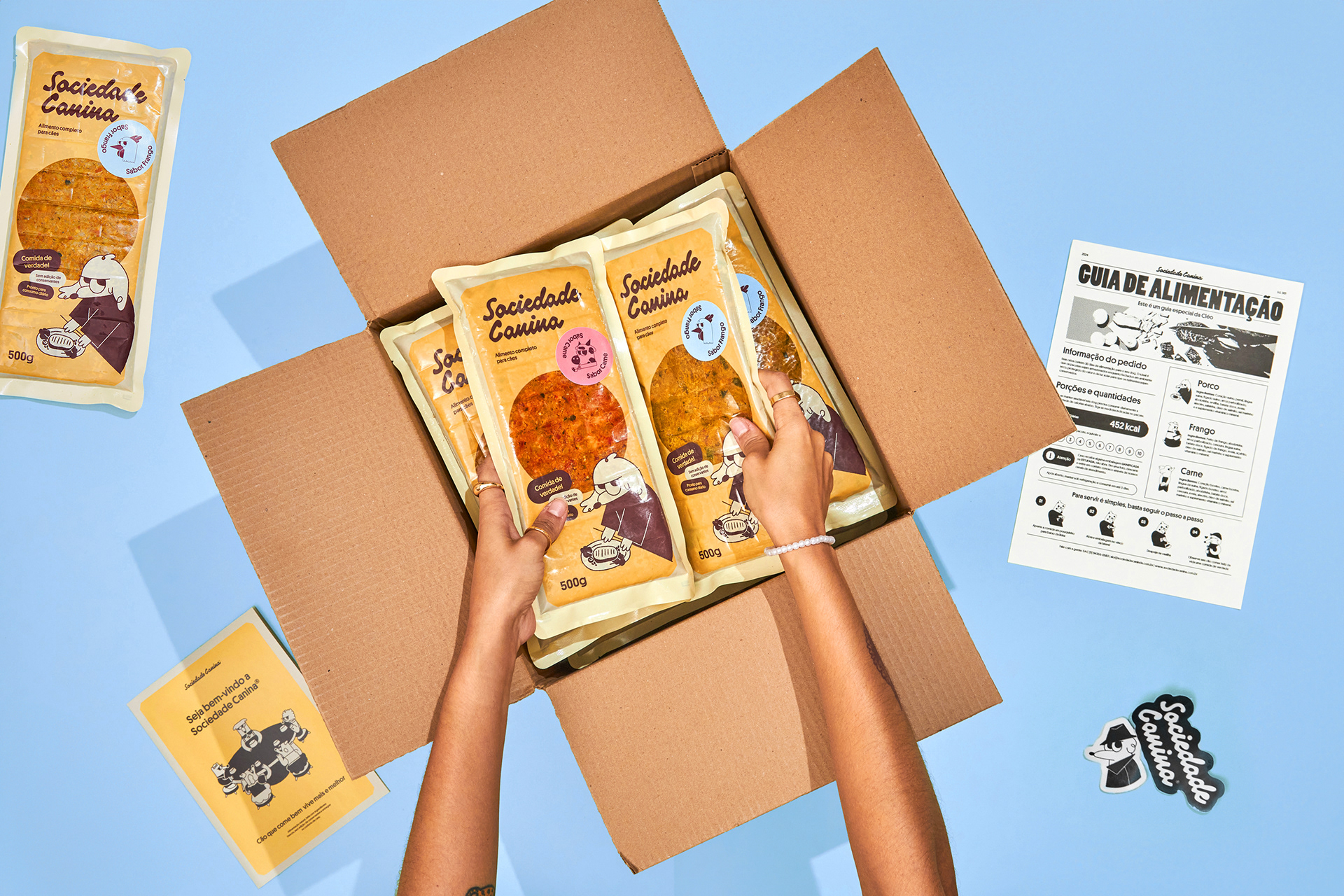
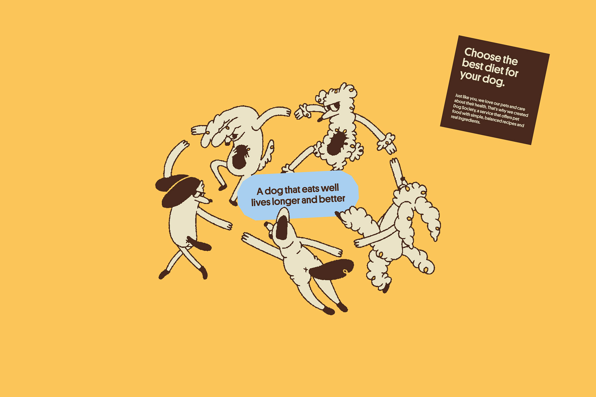
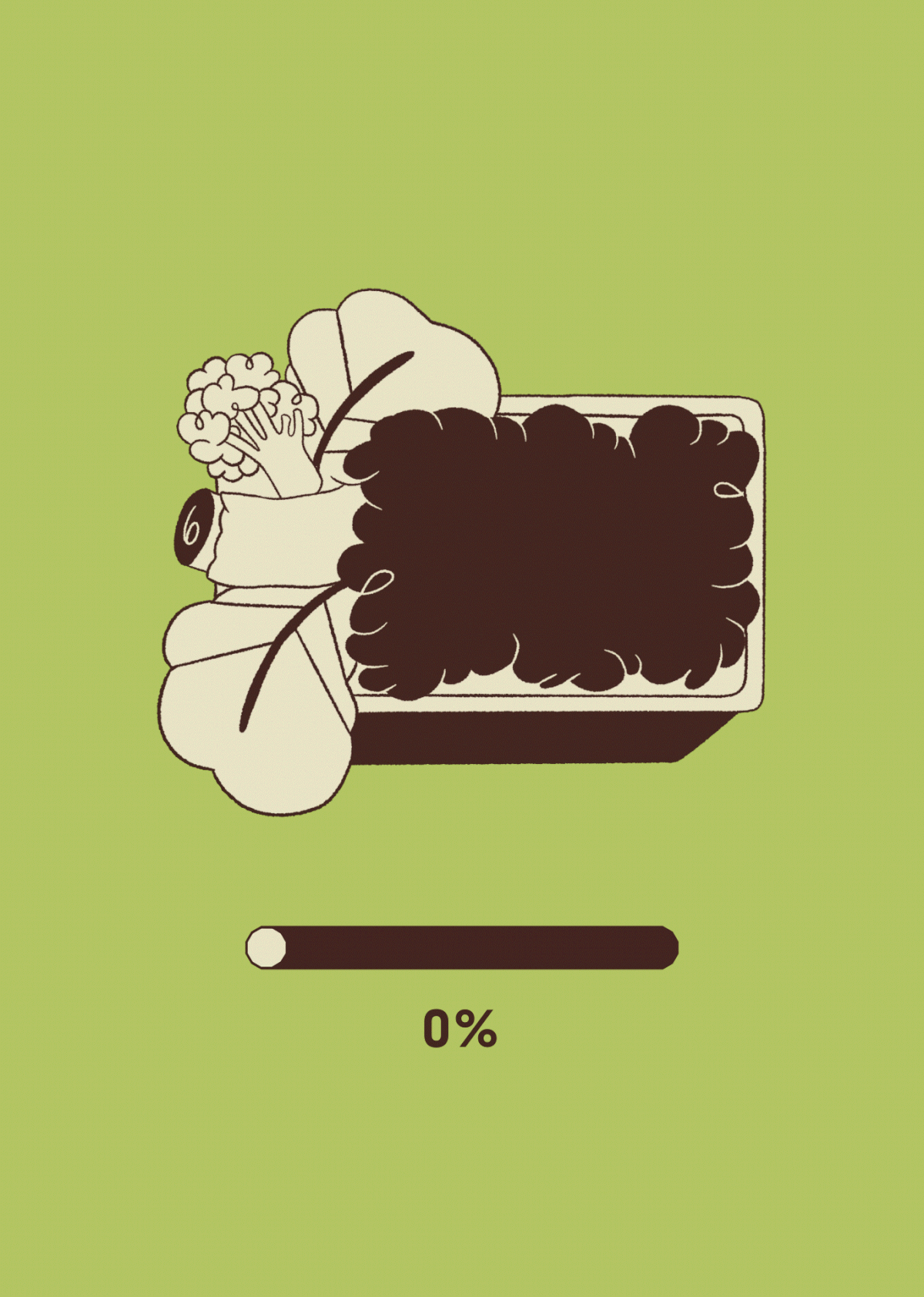
Your dog should eat only real food.
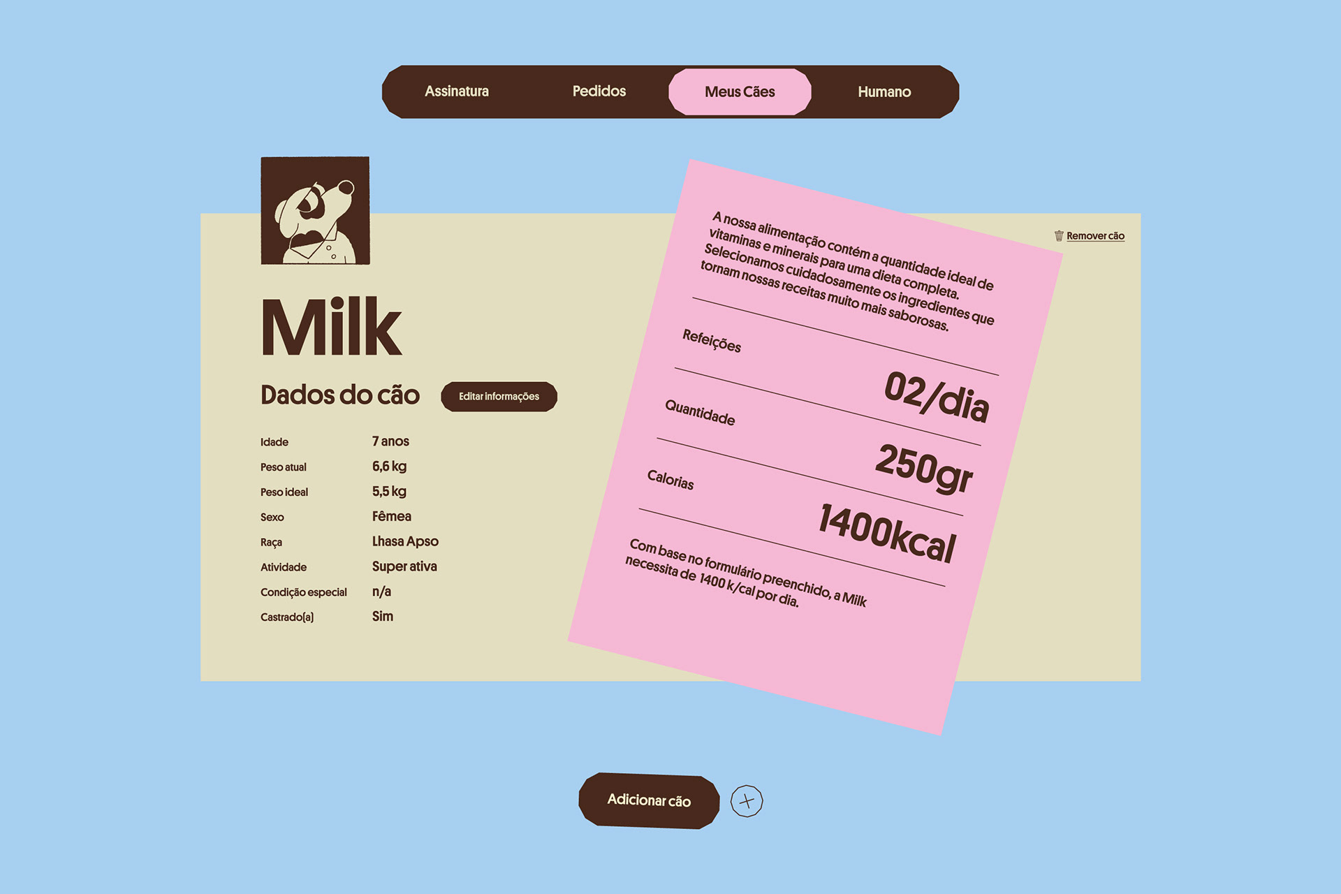
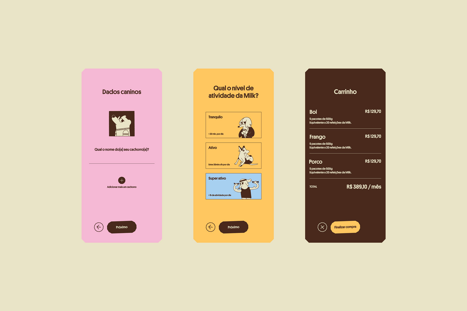
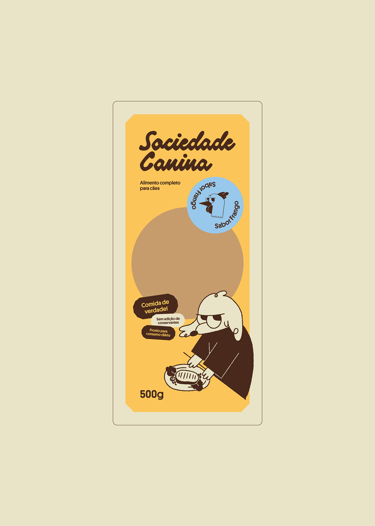
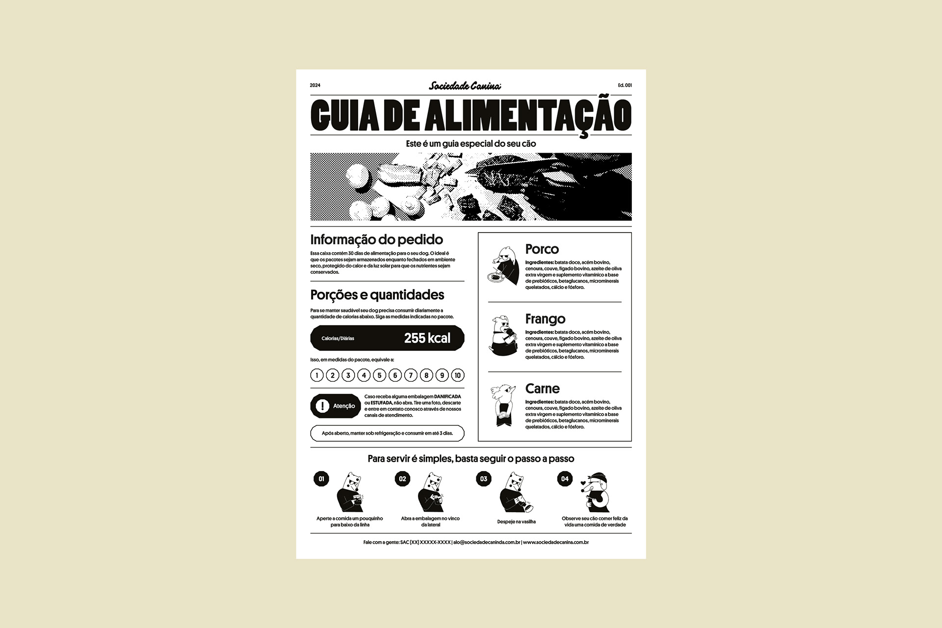
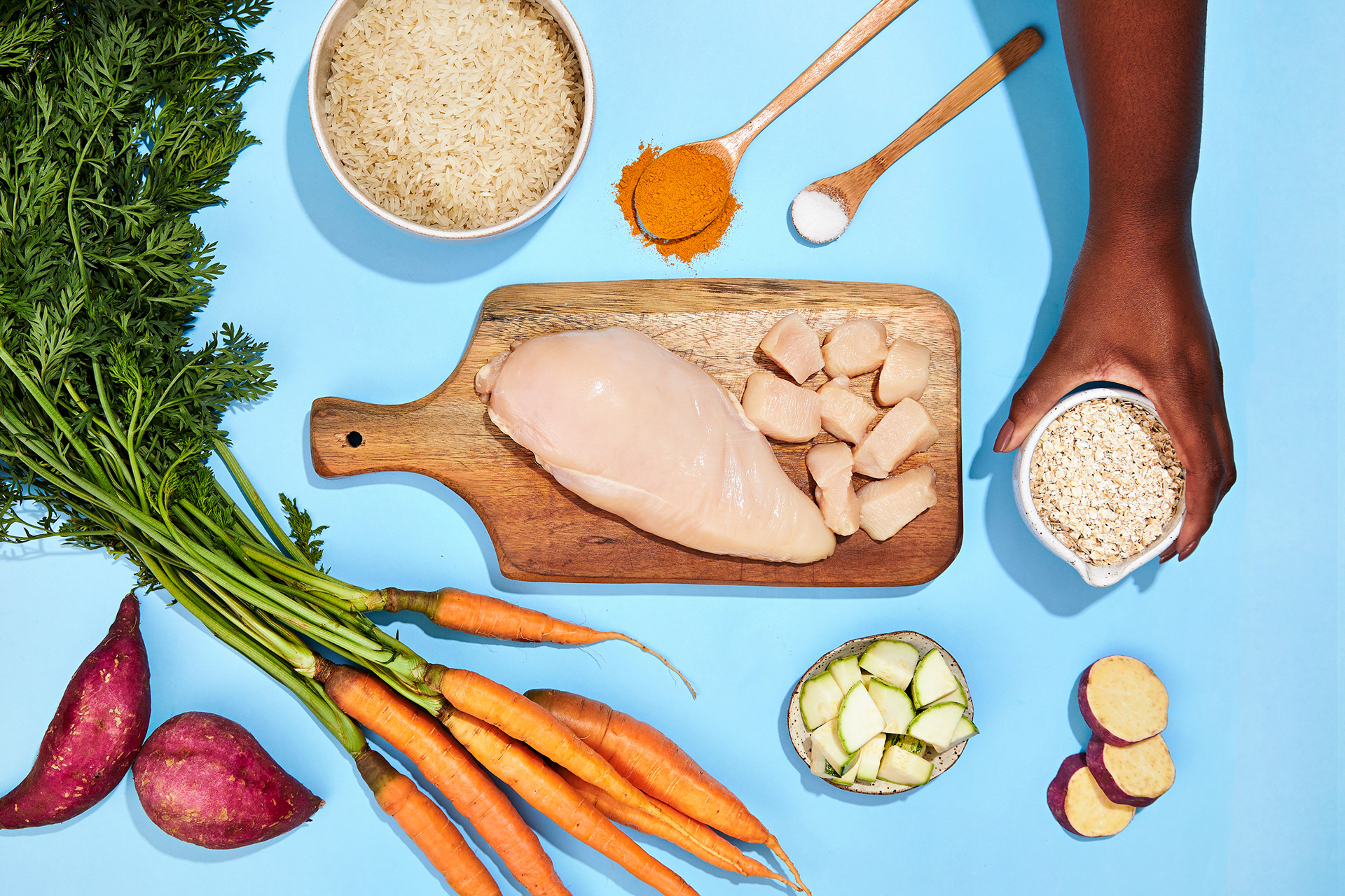
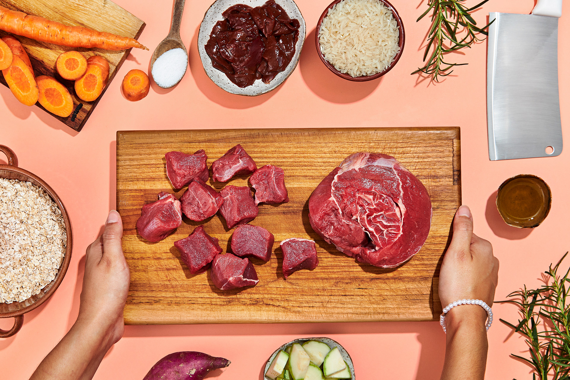
We have nothing to hide; the meal is complete and balanced, with no added preservatives and made with natural ingredients and seasonings. Sociedade Canina accepts nothing less!
This is one of those projects where we put a lot of ourselves into it. When Jeovana and Diego approached us, we saw a brand with an unquestionable purpose and a dream of having branding as one of its pillars.
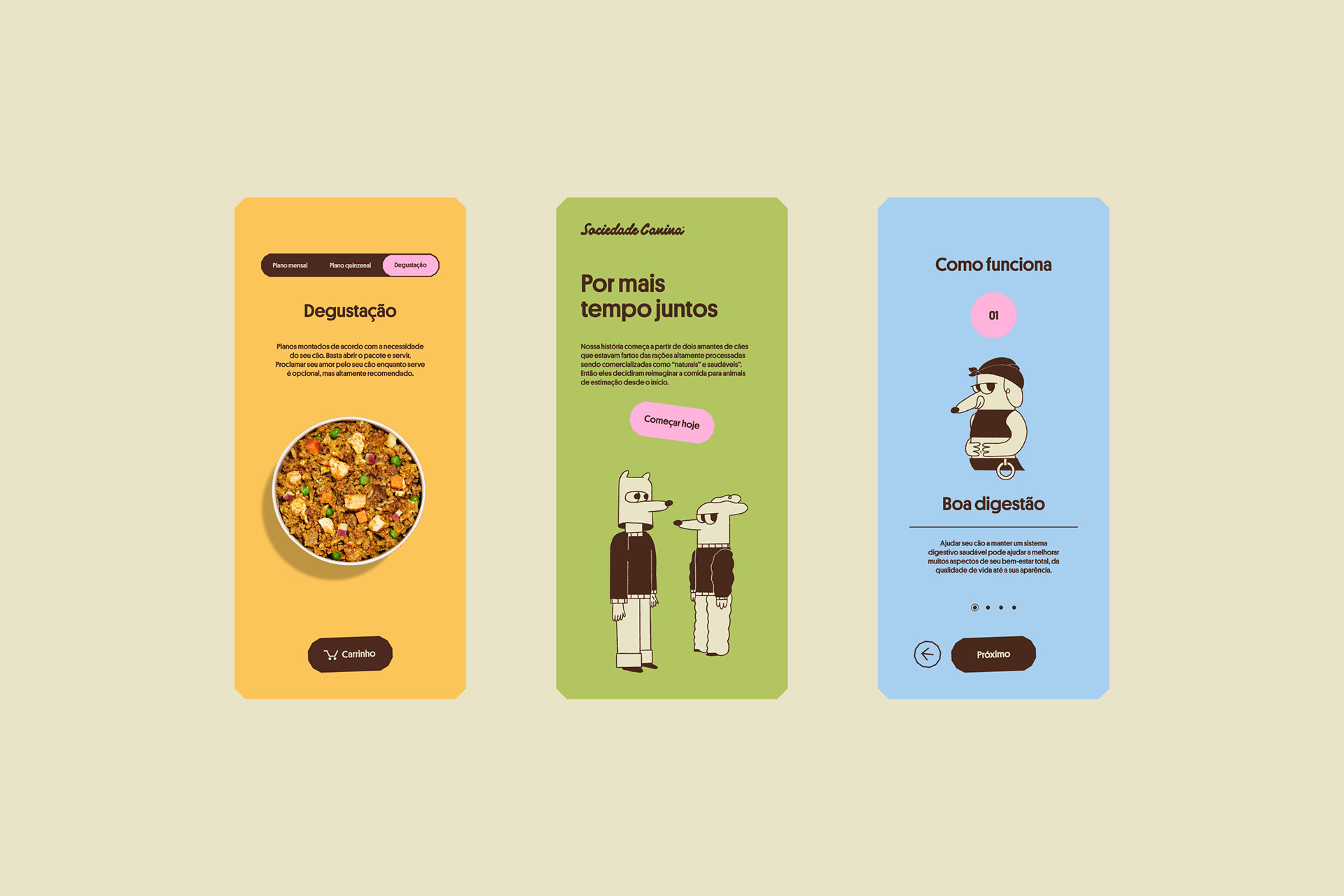
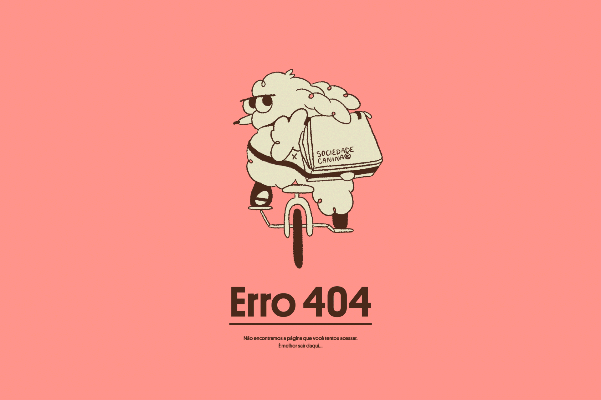
In this project, we put all our skills into practice: Brand positioning, naming, visual identity, UI & UX, illustration, photography direction, animation, packaging, and products.
That said, welcome to Sociedade Canina.
- GABRIEL MACOHIN Creative Direction, Strategy, Naming, Design, UI&UX and Photographic Direction
- FERNANDA LIMA Strategy, Naming, Design, Illustration and Animation
- RAFAEL ALVES Strategy, Naming, Design and UI&UX
- PAULO DOI Strategy, Naming, Design and Animation
- NICOLE KHOURI Food Styling
- GUILHERME LIMA Food Styling
-
Behance – The Best Of Behance
-
LAD 25 - The best Digital Design Project
-
LAD 25 – Gold (E-commerce)
-
LAD 25 – Silver (Illustration)
-
LAD 25 – Bronze (Graphic Design)
We hate looking at a brand and thinking: I don't need this…
Yes, you need this! Or rather, your dog needs this! We are not selling a concept but delivering the best product possible. From this point, what we sought throughout our journey was to create a light brand that generates belonging and pride.
Because we know once your dog becomes part of this Society, they will never leave!
The client gave us great challenges for the naming, as they asked for a name that was unusual, sounded familiar, and could be translated without losing its meaning. And for us, creating a name is always the most complex part of the project, as it is the first word of the story. It doesn't have the function of saying what the product is, but the duty of conveying the right feeling for the business.
The name Sociedade Canina (Dog Society) was aligned with the brand's strategy and had a tone of voice that sparks curiosity. It allowed us, in various brand unfoldings, to use this as a spark of creativity for greater things.
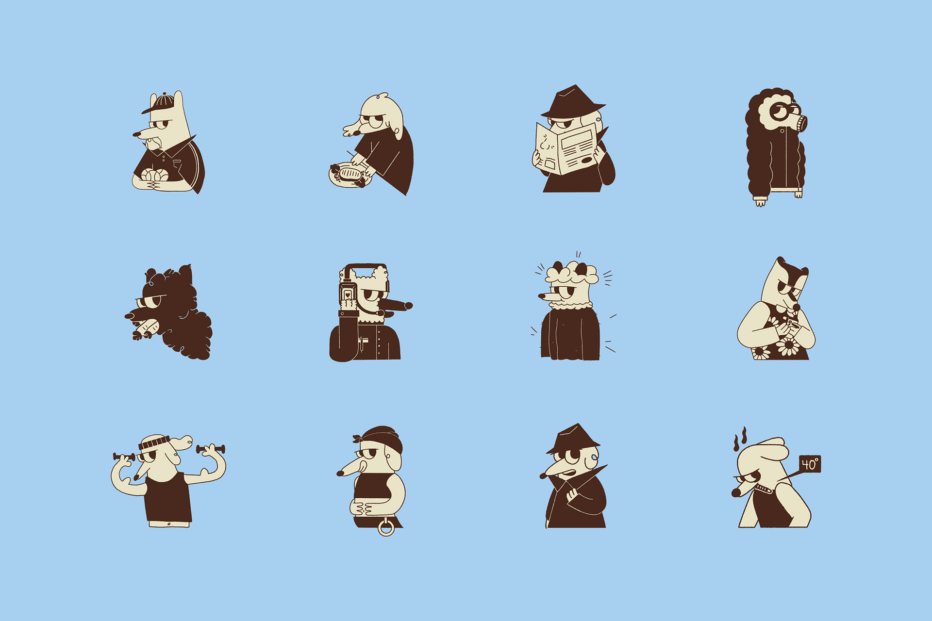
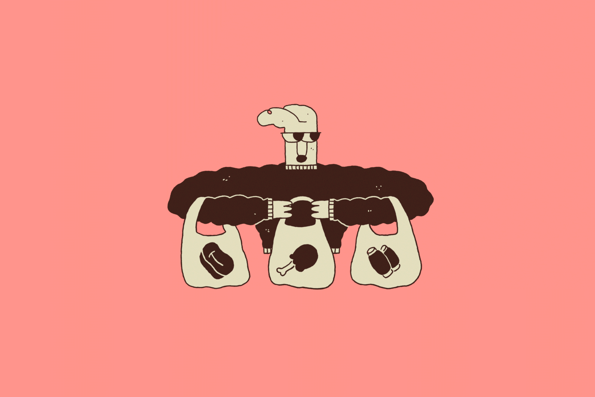
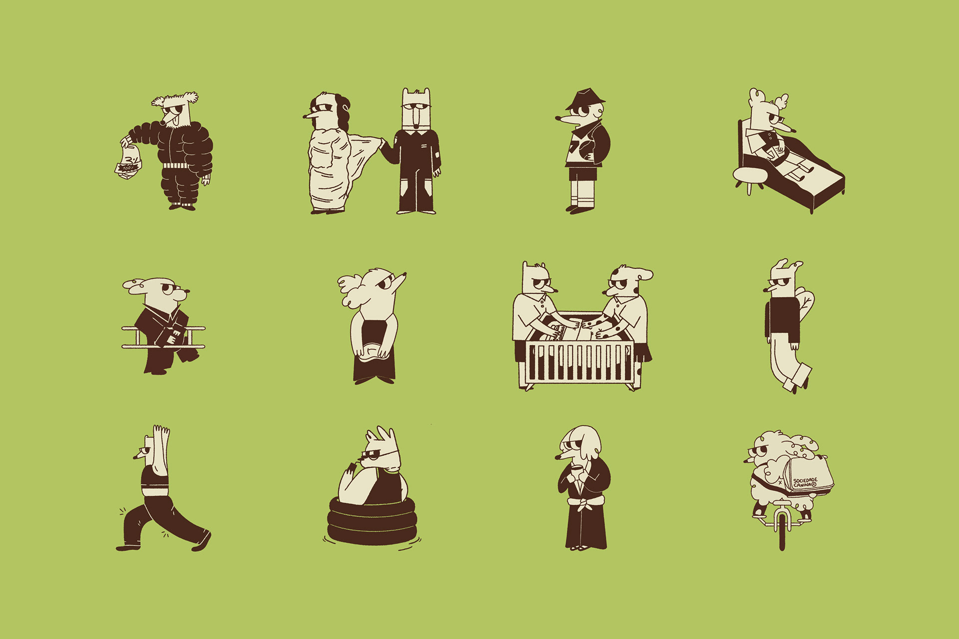
We try to put a touch of strangeness into everything we do, and here it was no different.
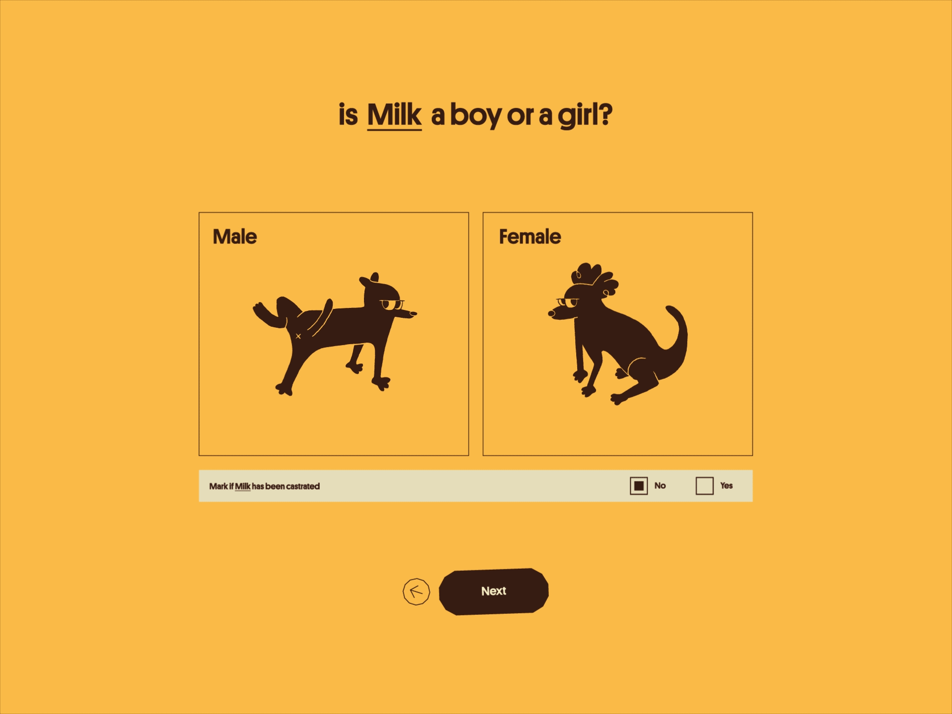
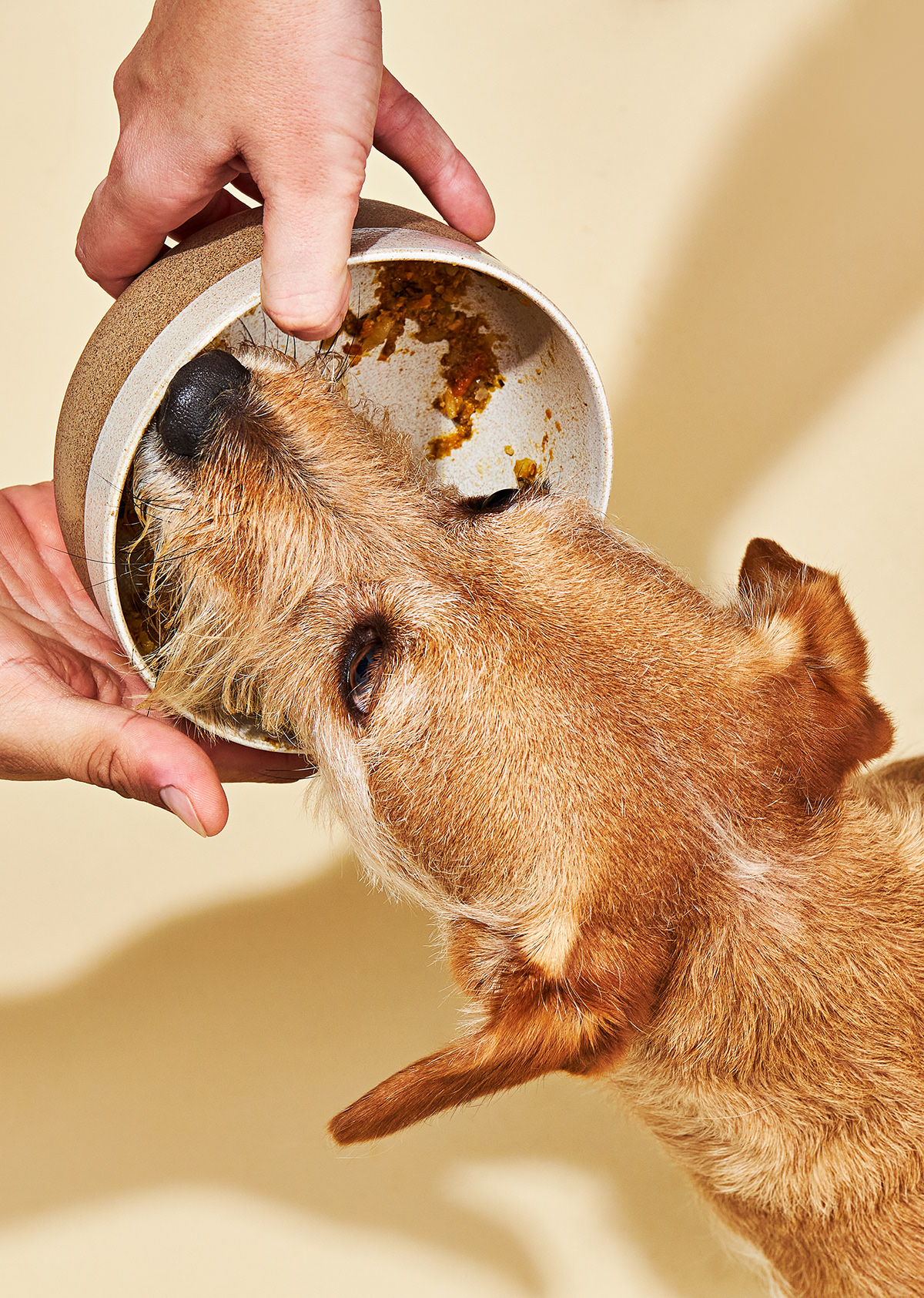
When we look at the elements that make up the identity separately, each thing has a style and works in isolation, but come together to create something unique. For example, the typography is sober, neutral, and with a retro touch, while the illustrations add an enigmatic, fun, and even quirky feeling, and the photographic direction contrasts this relaxed feeling by showing what your dog is actually eating.
We see brands almost like people; they are full of stories, have vast repertoires, and never wake up the same way. Brands go beyond manuals; they express feelings and evolve daily.
We are eager to see the paths that Sociedade Canina will take.