


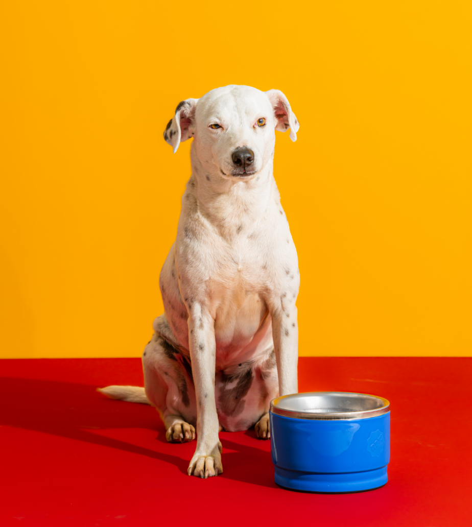
Ruska Bowl
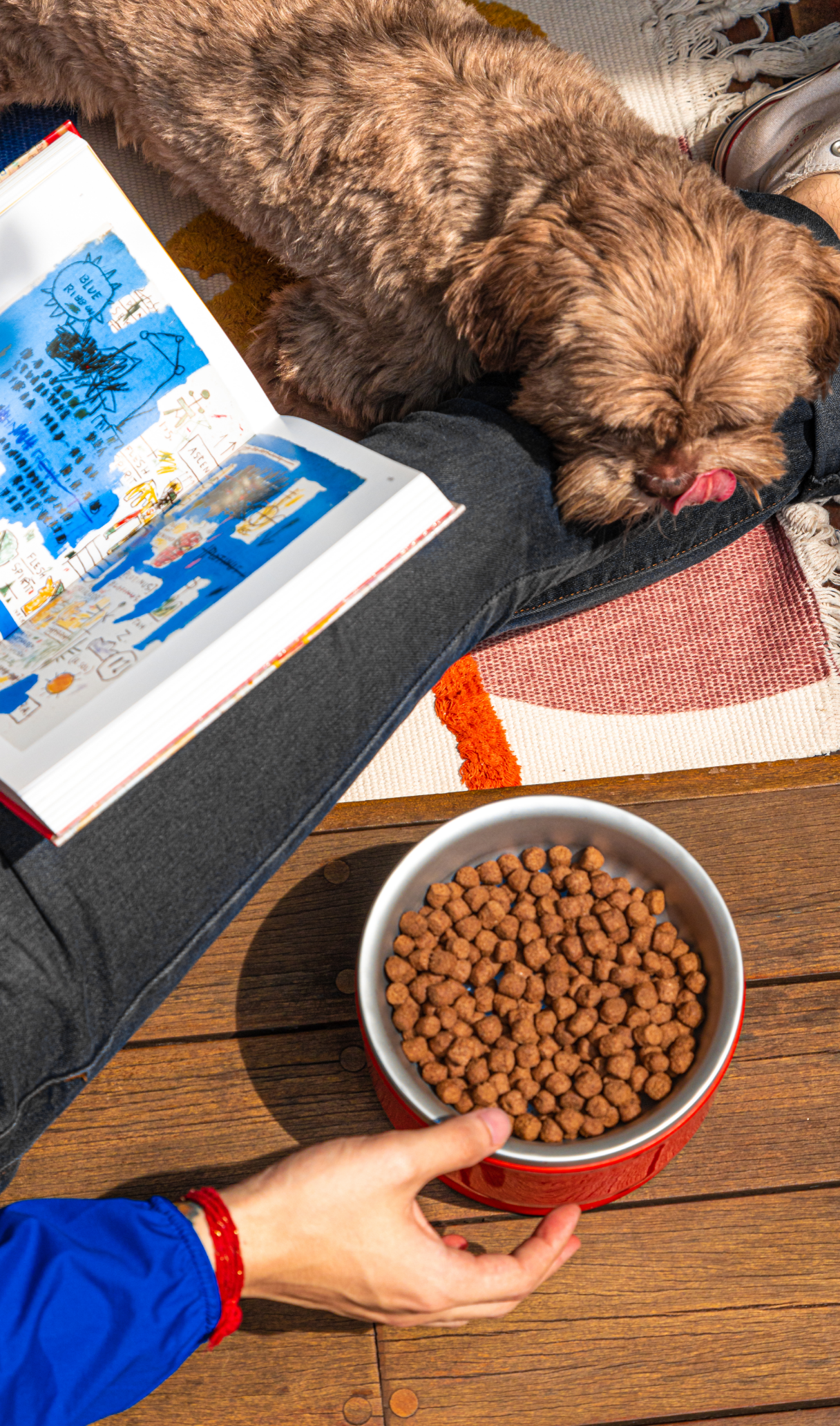
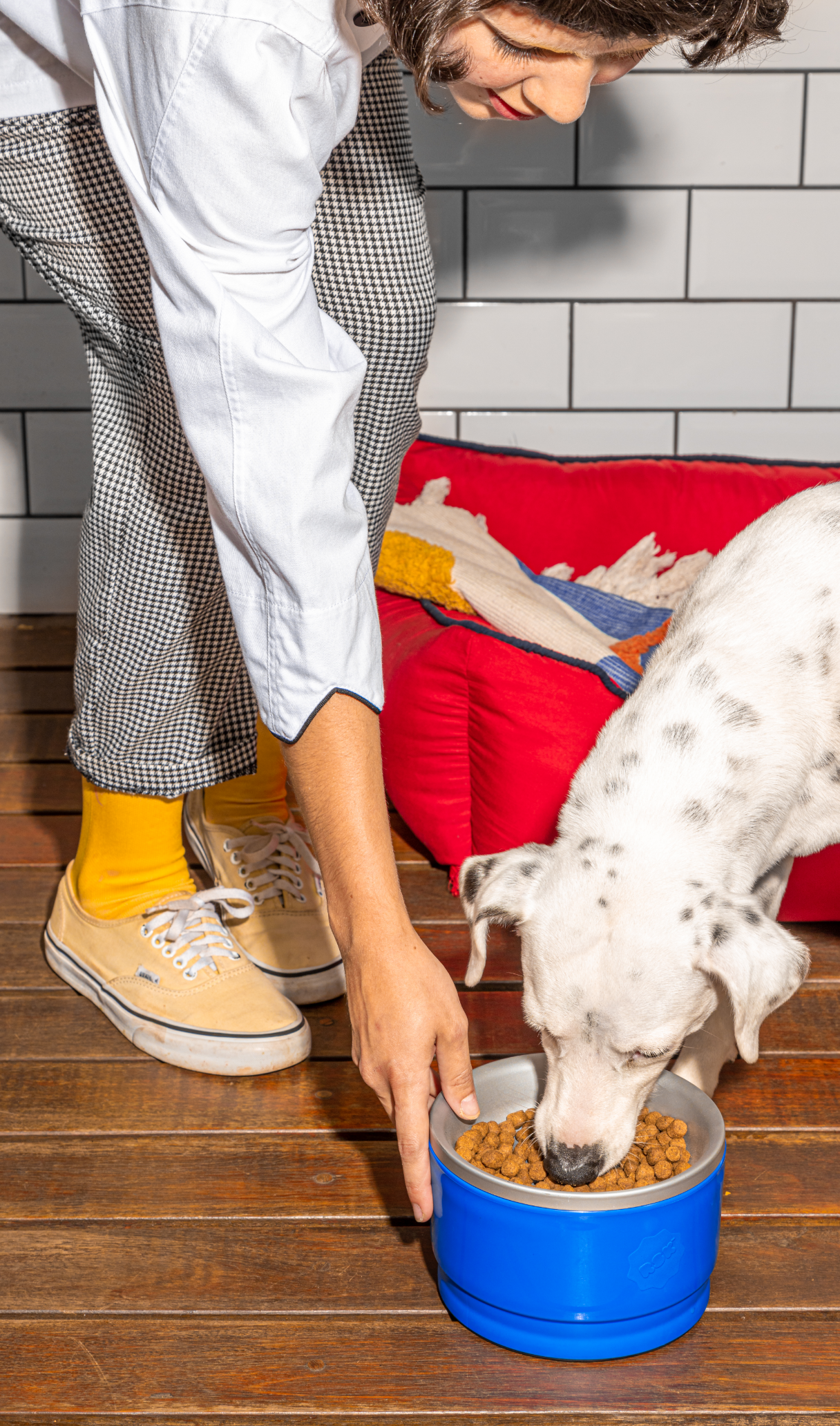
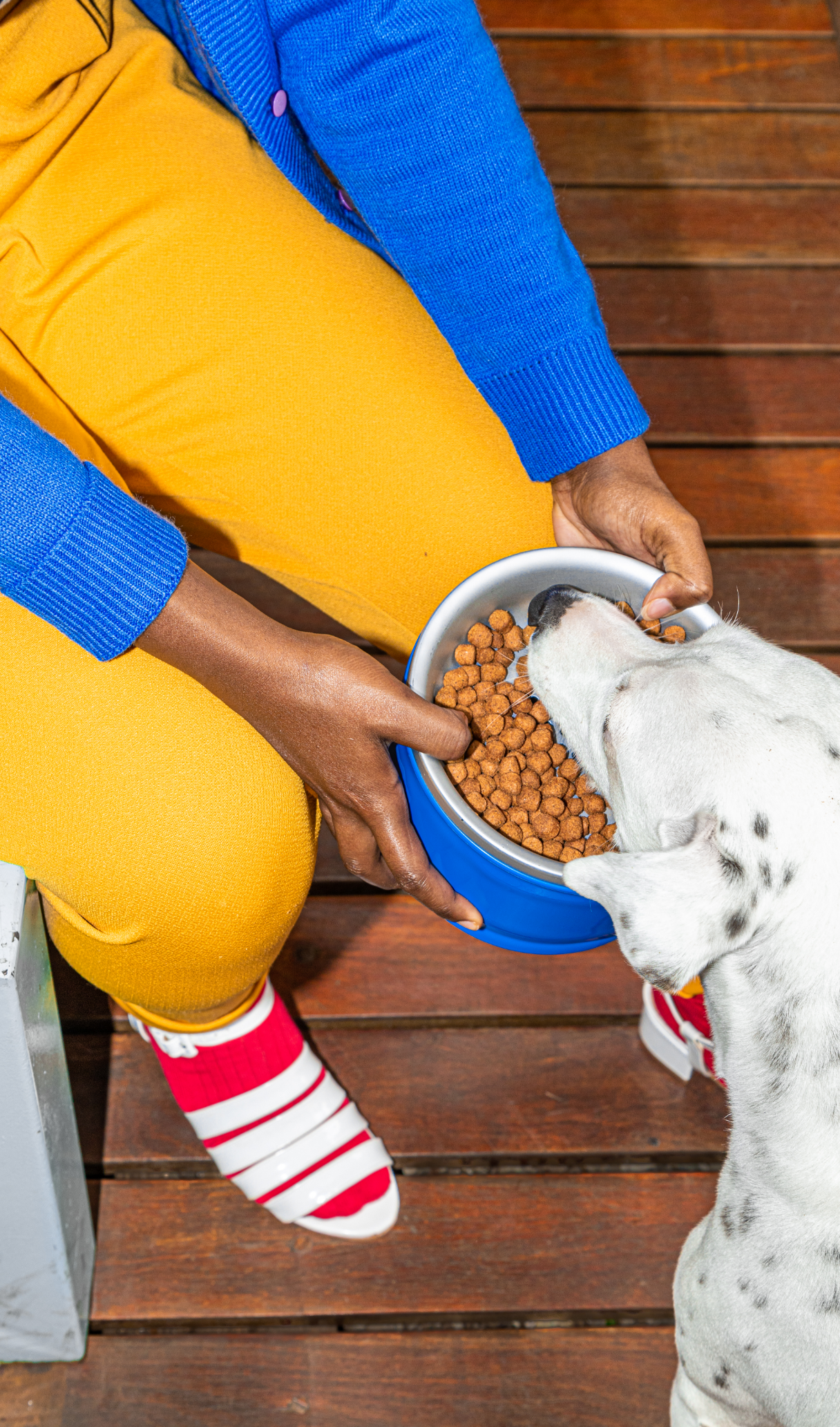
Ruska is a bowl that provides a simple yet ingenious solution to a common pet problem: lack of interest in pet food. Recently launched, the brand was born with the mission of revolutionizing the relationship that dogs have with food.
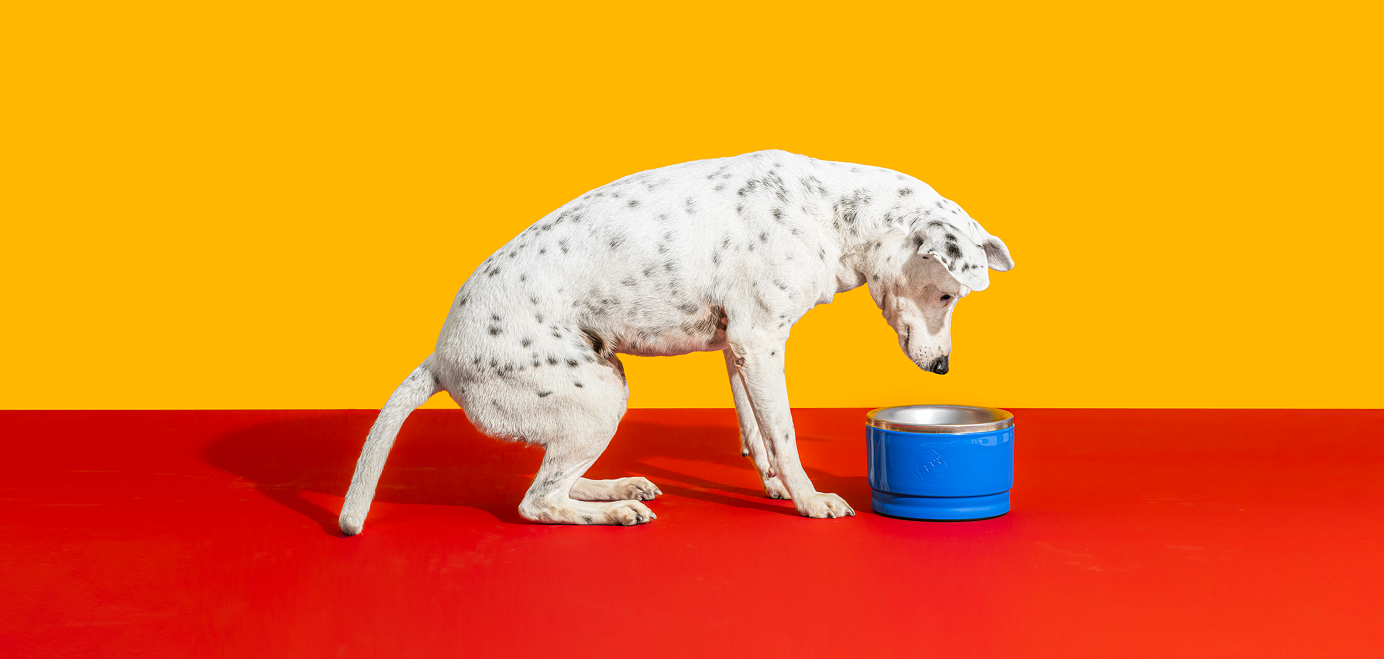
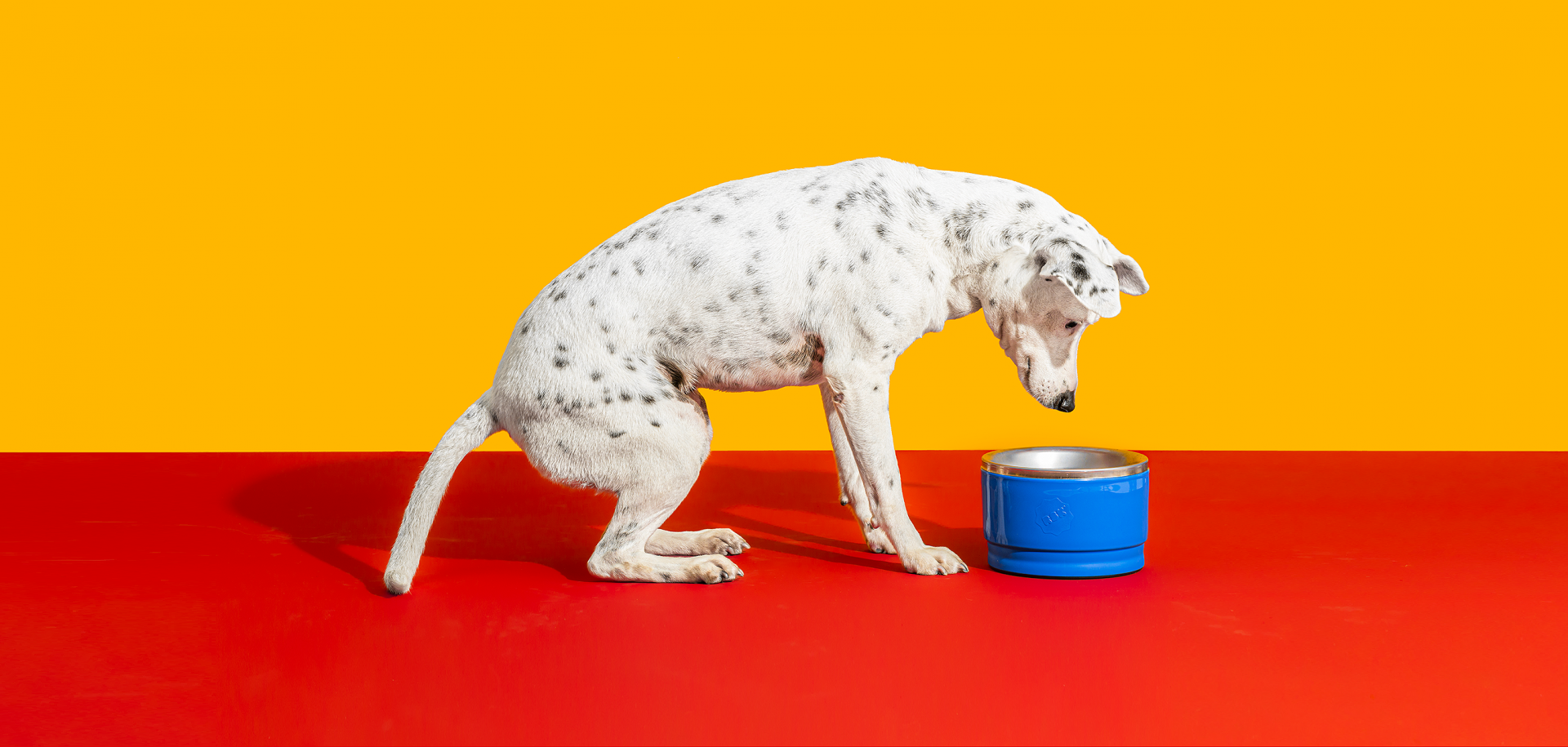
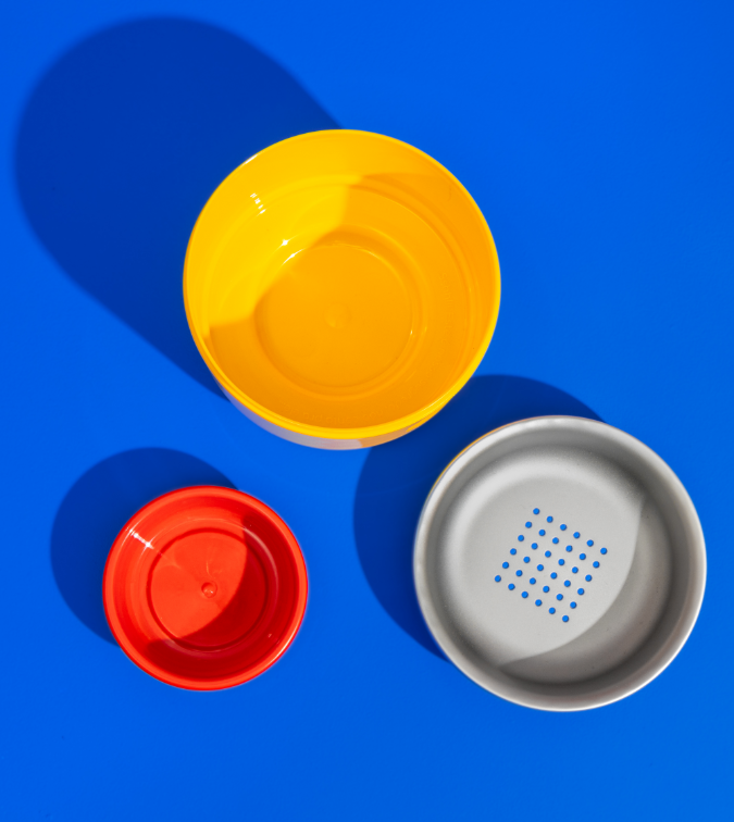
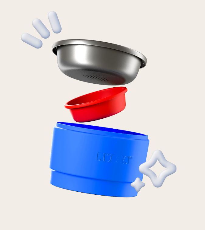
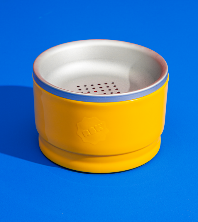
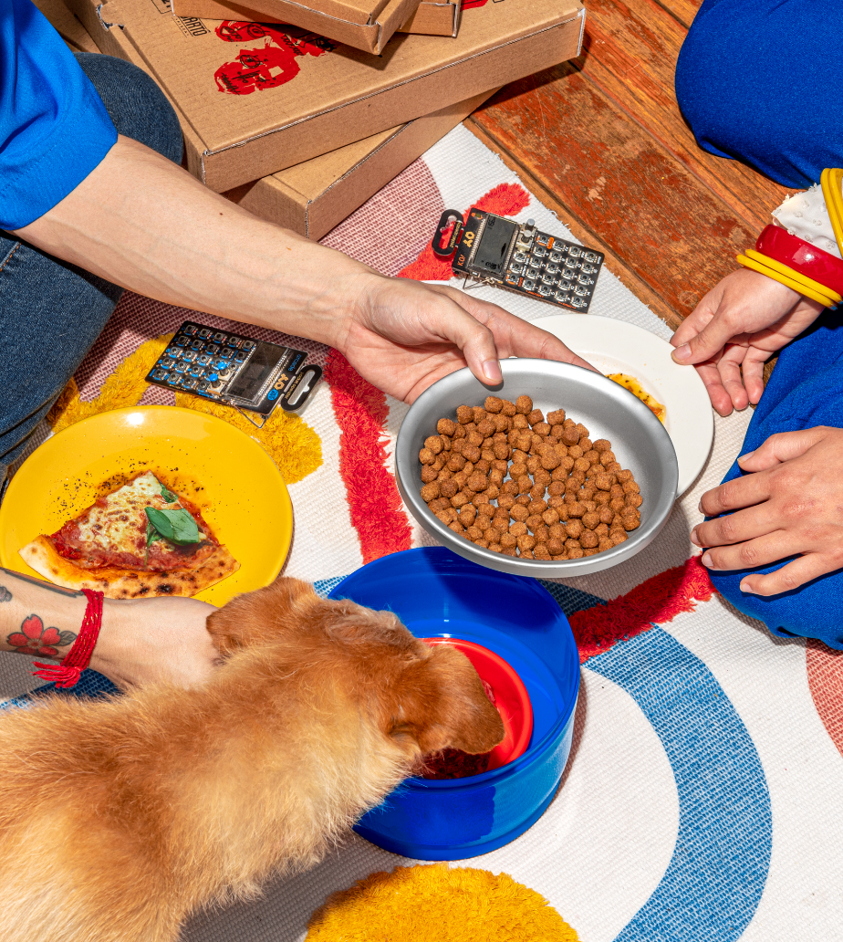
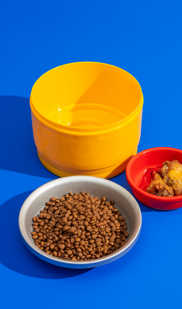
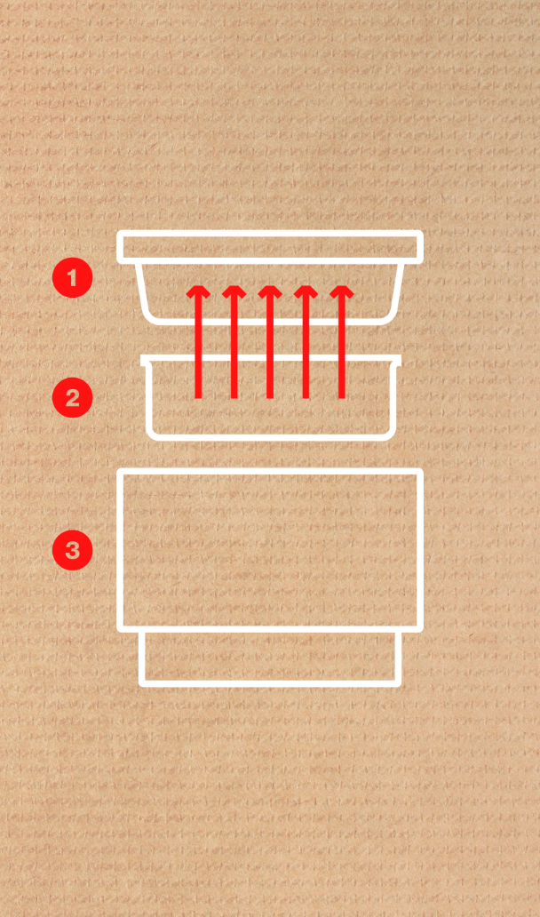
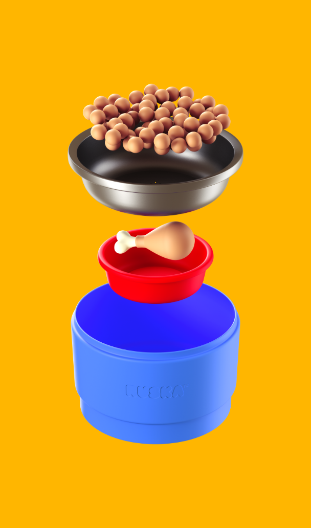
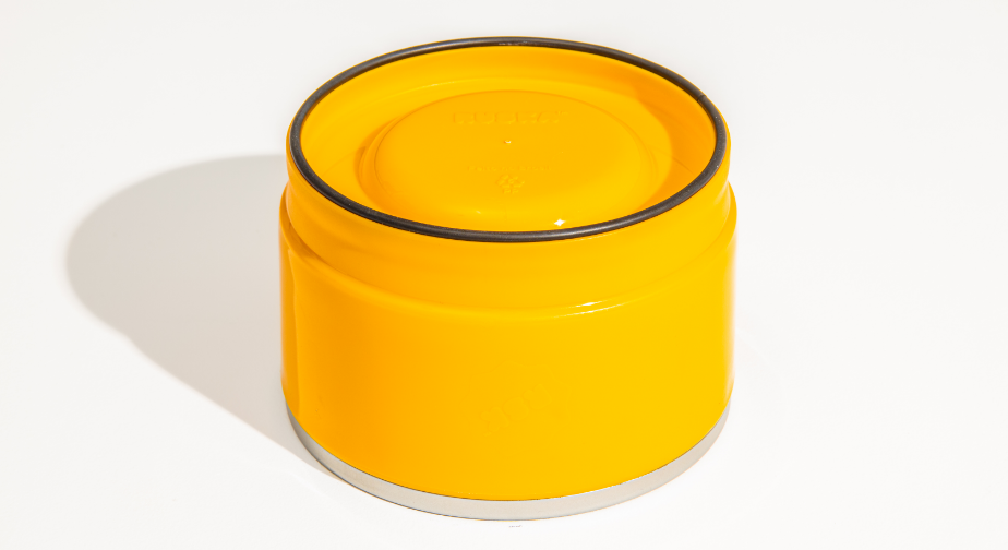
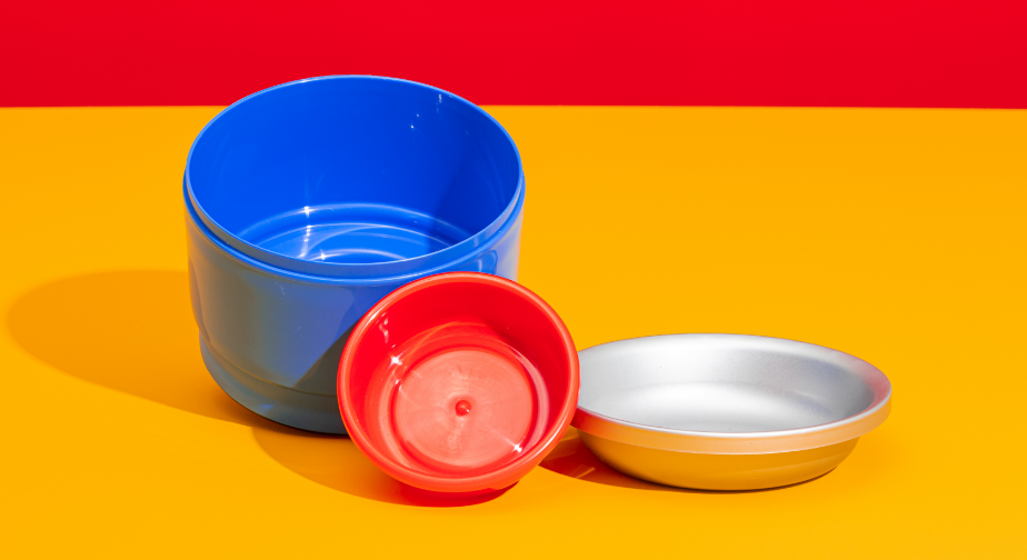
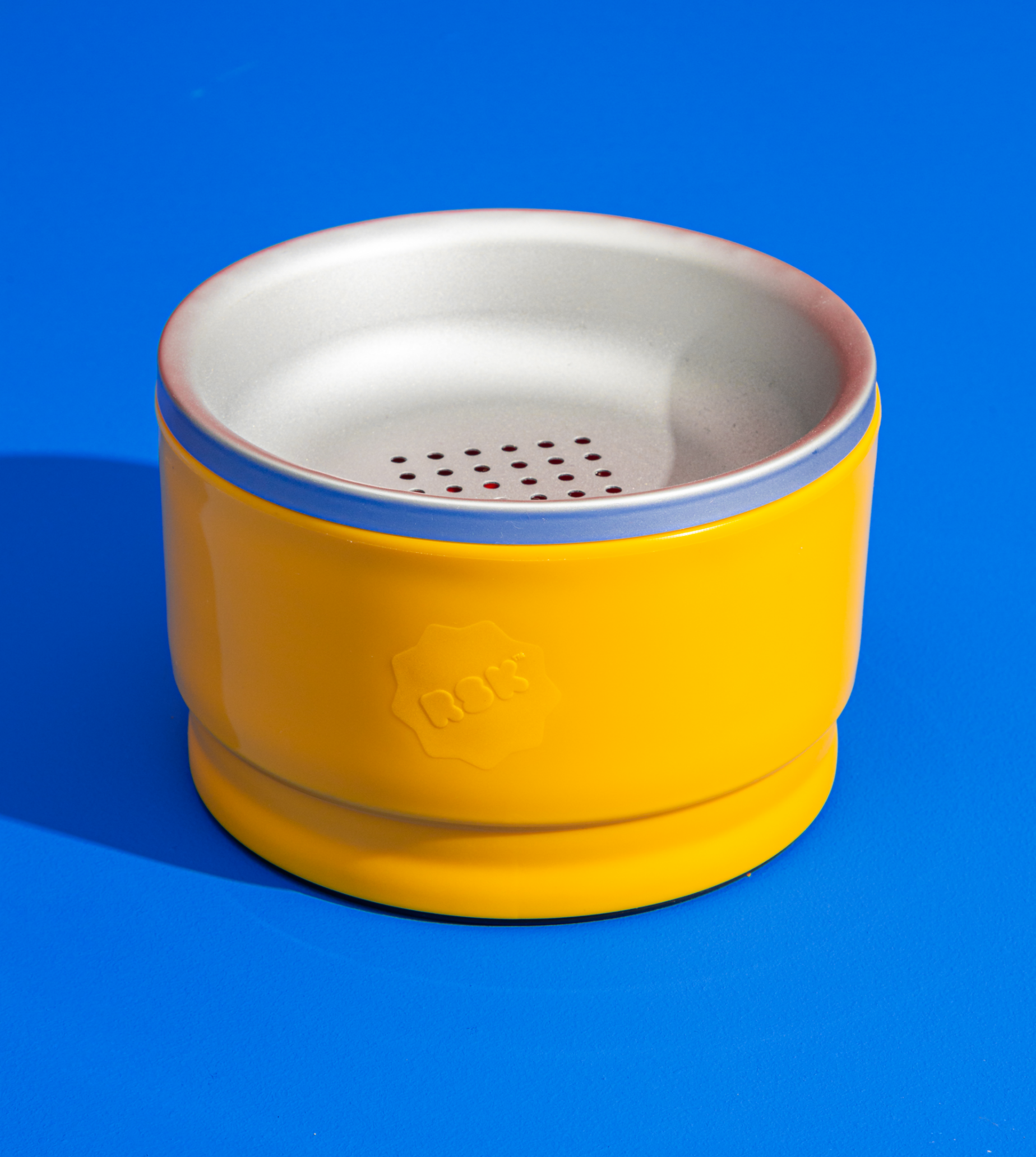
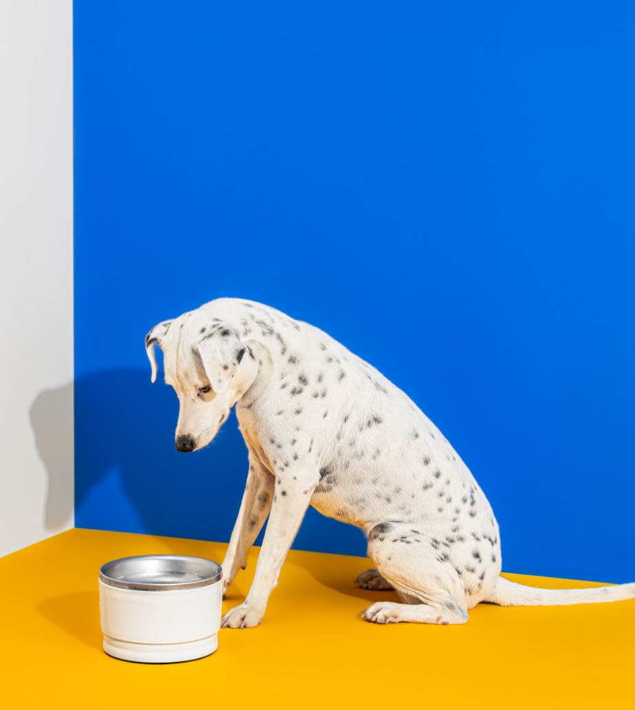
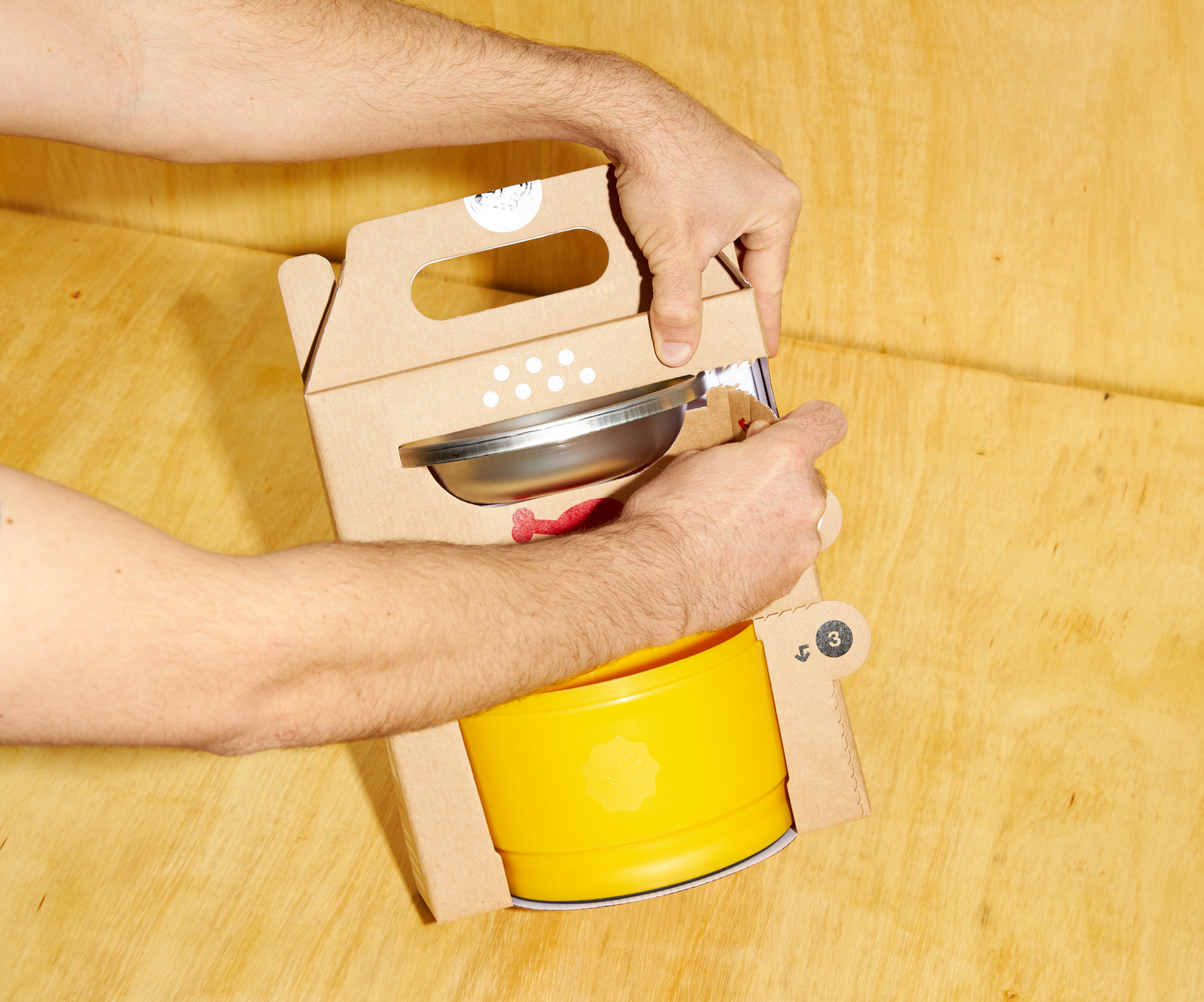
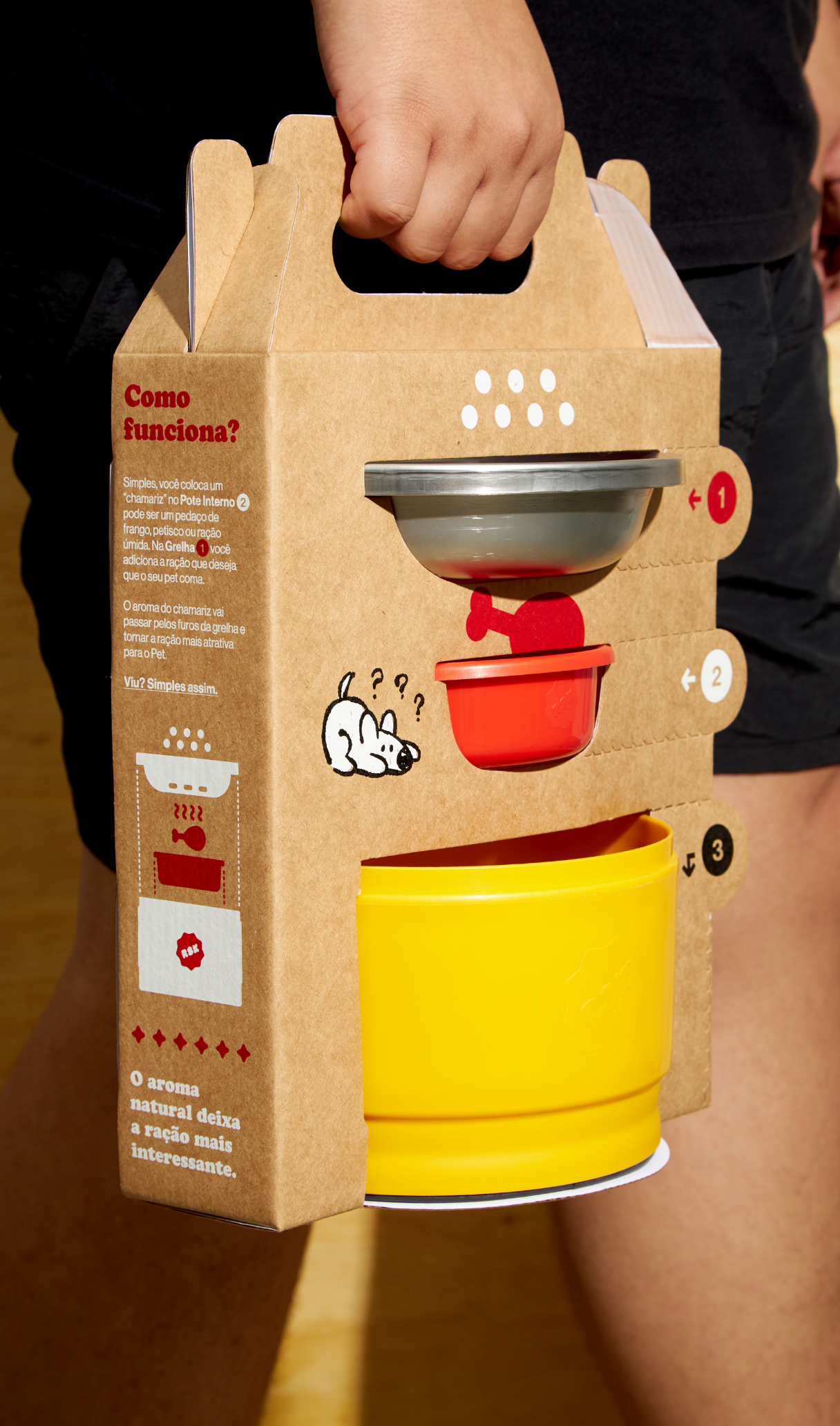
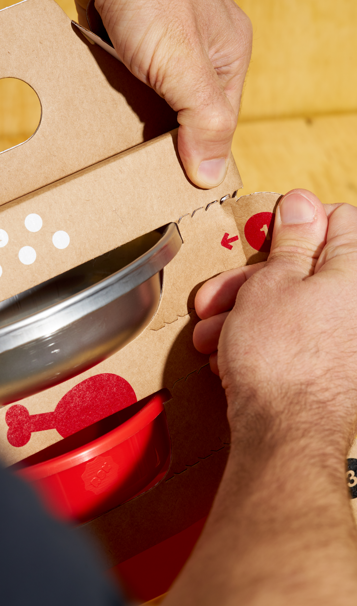
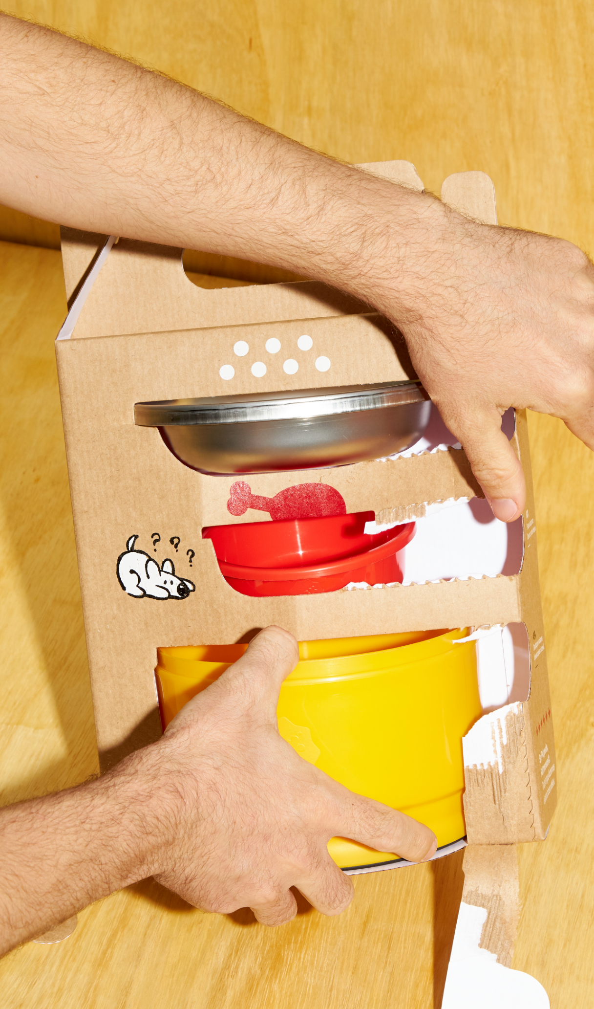
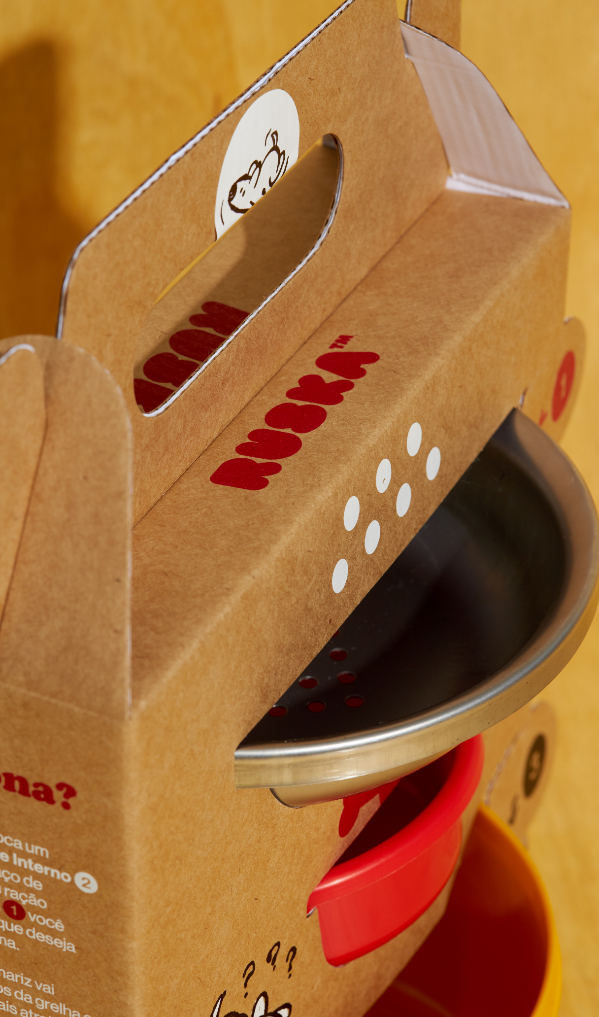
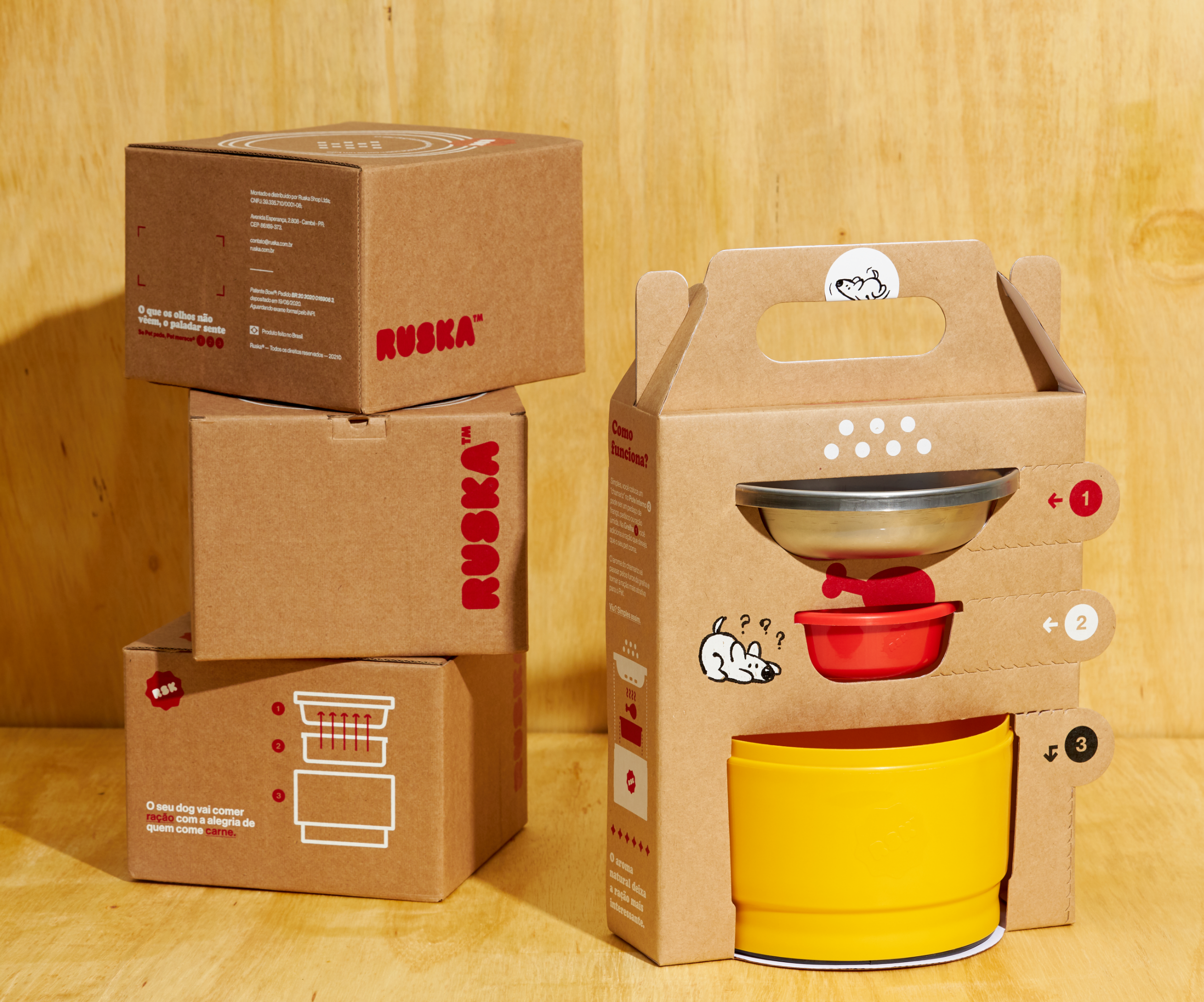
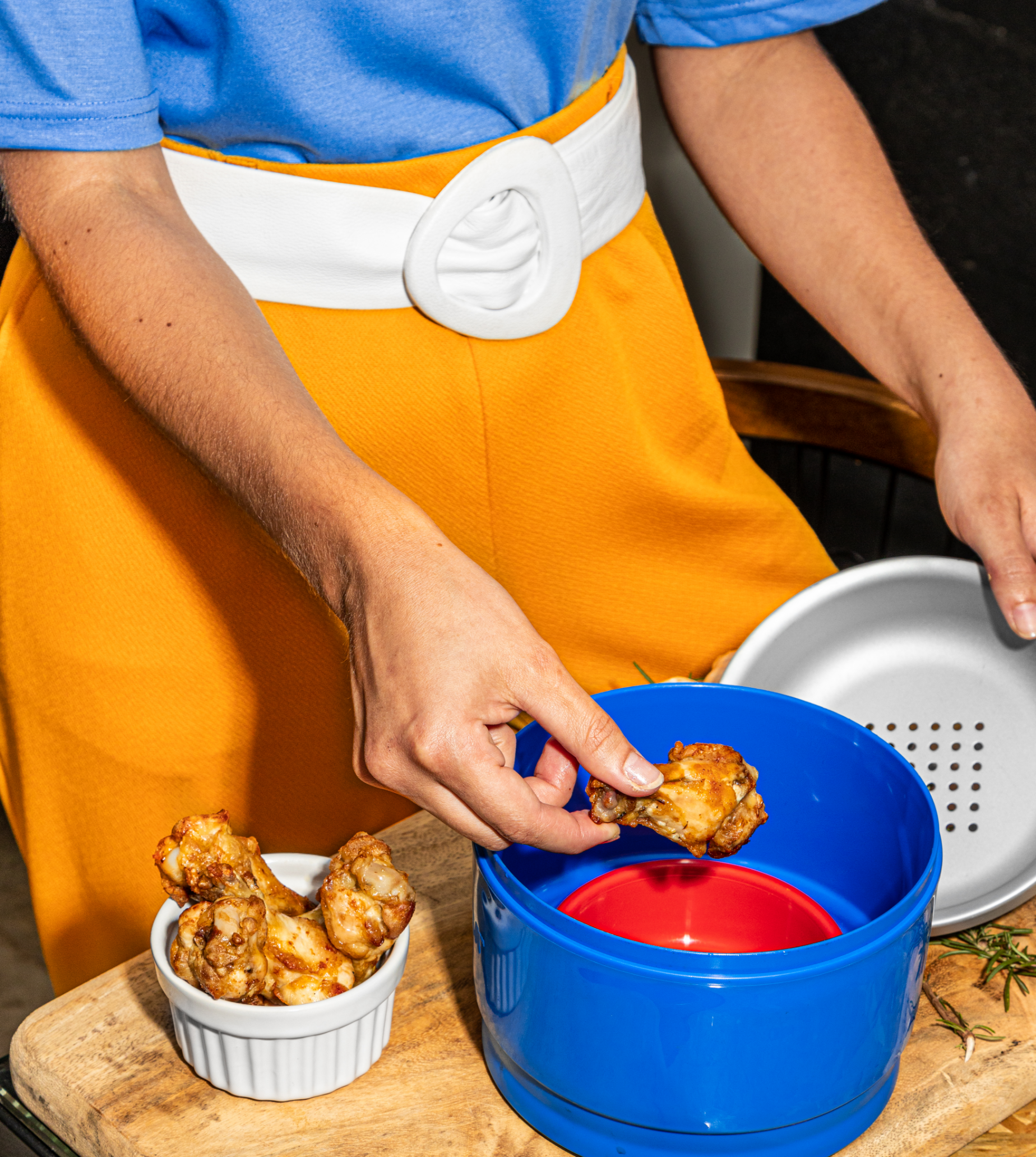
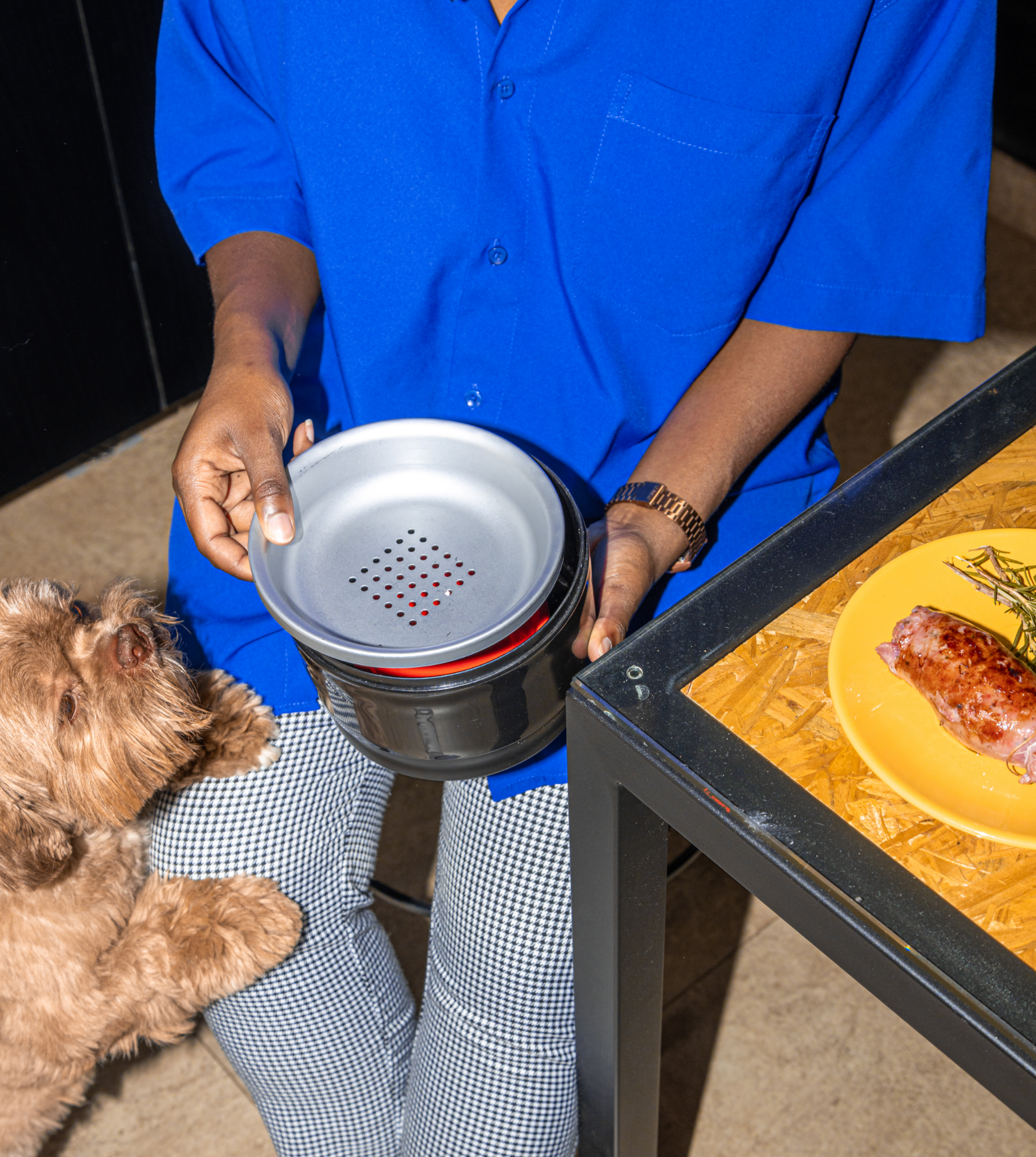
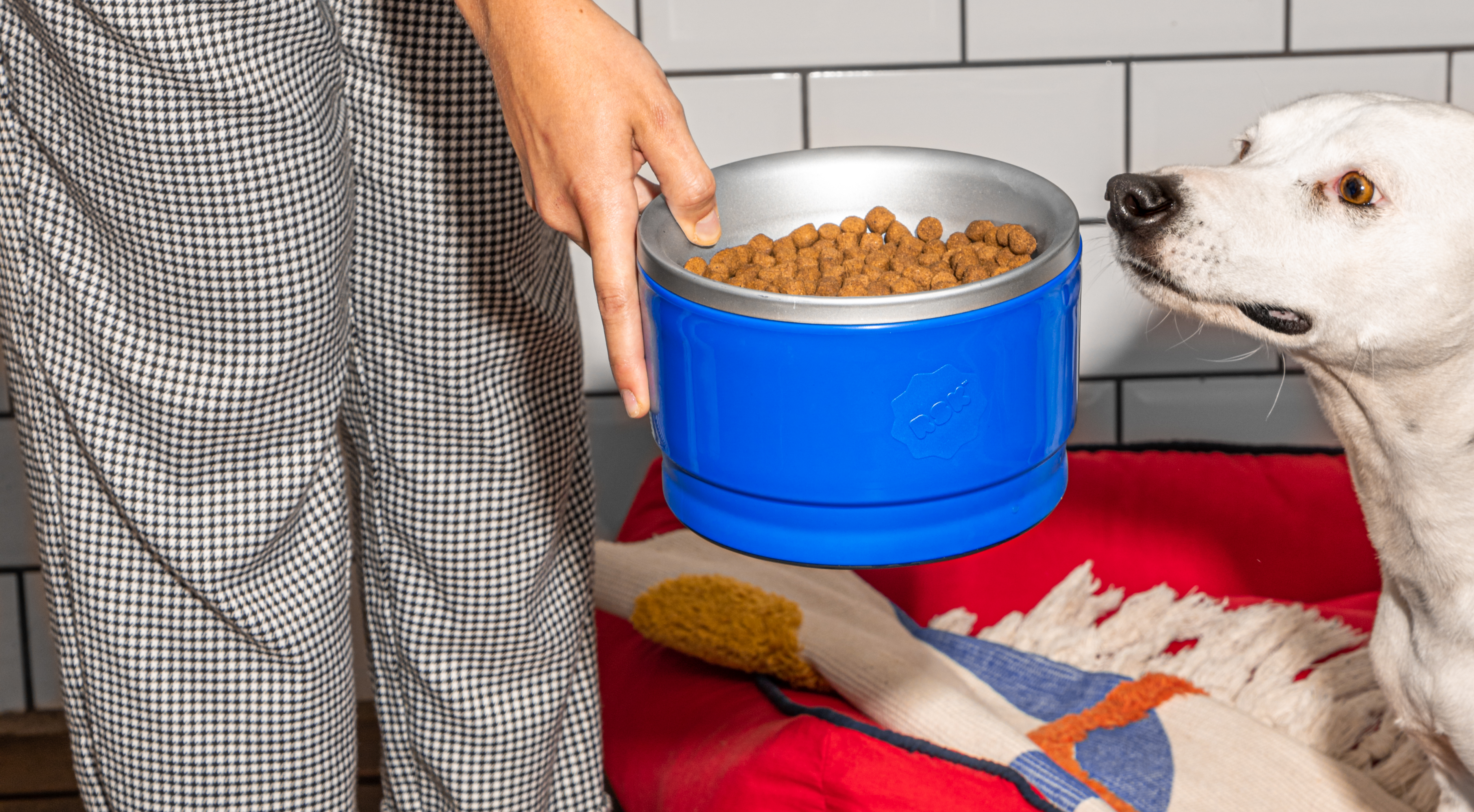
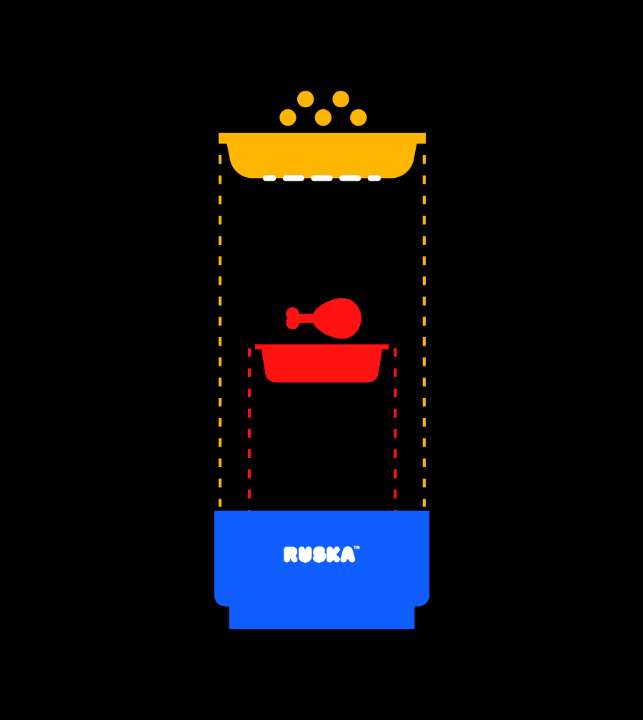
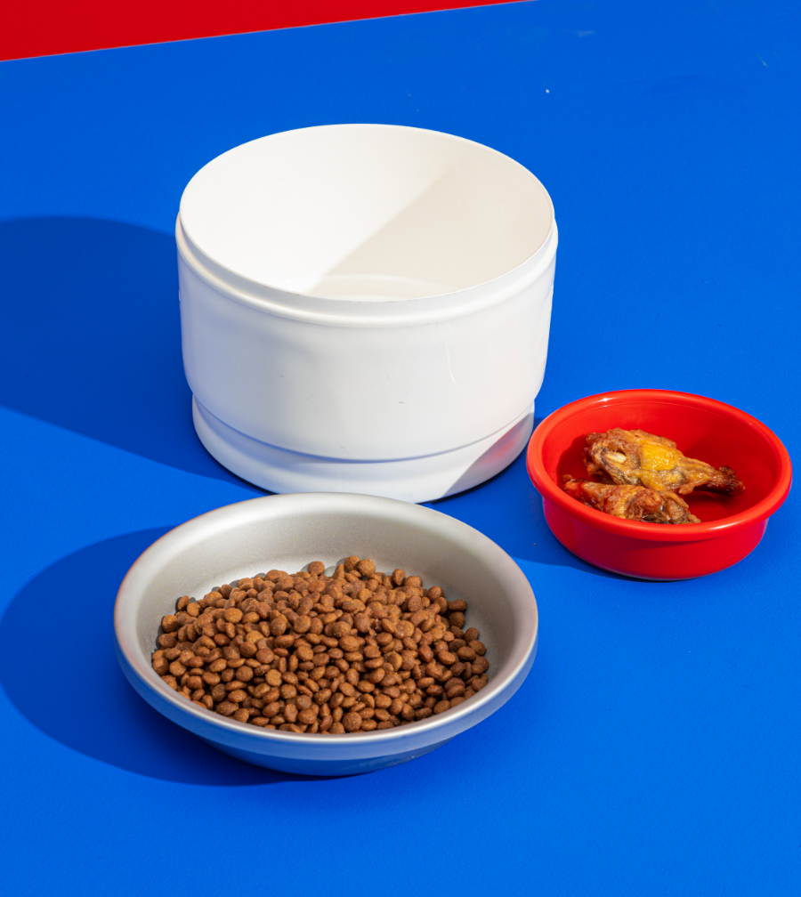
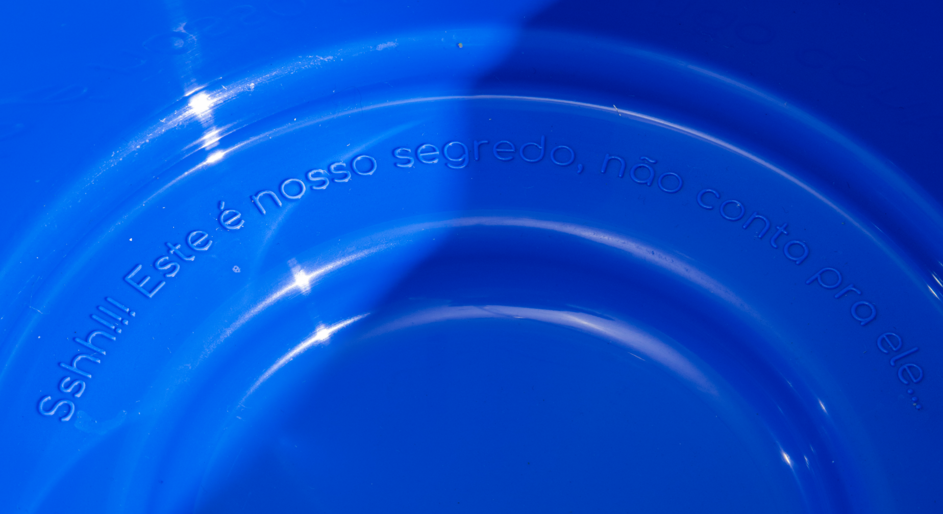
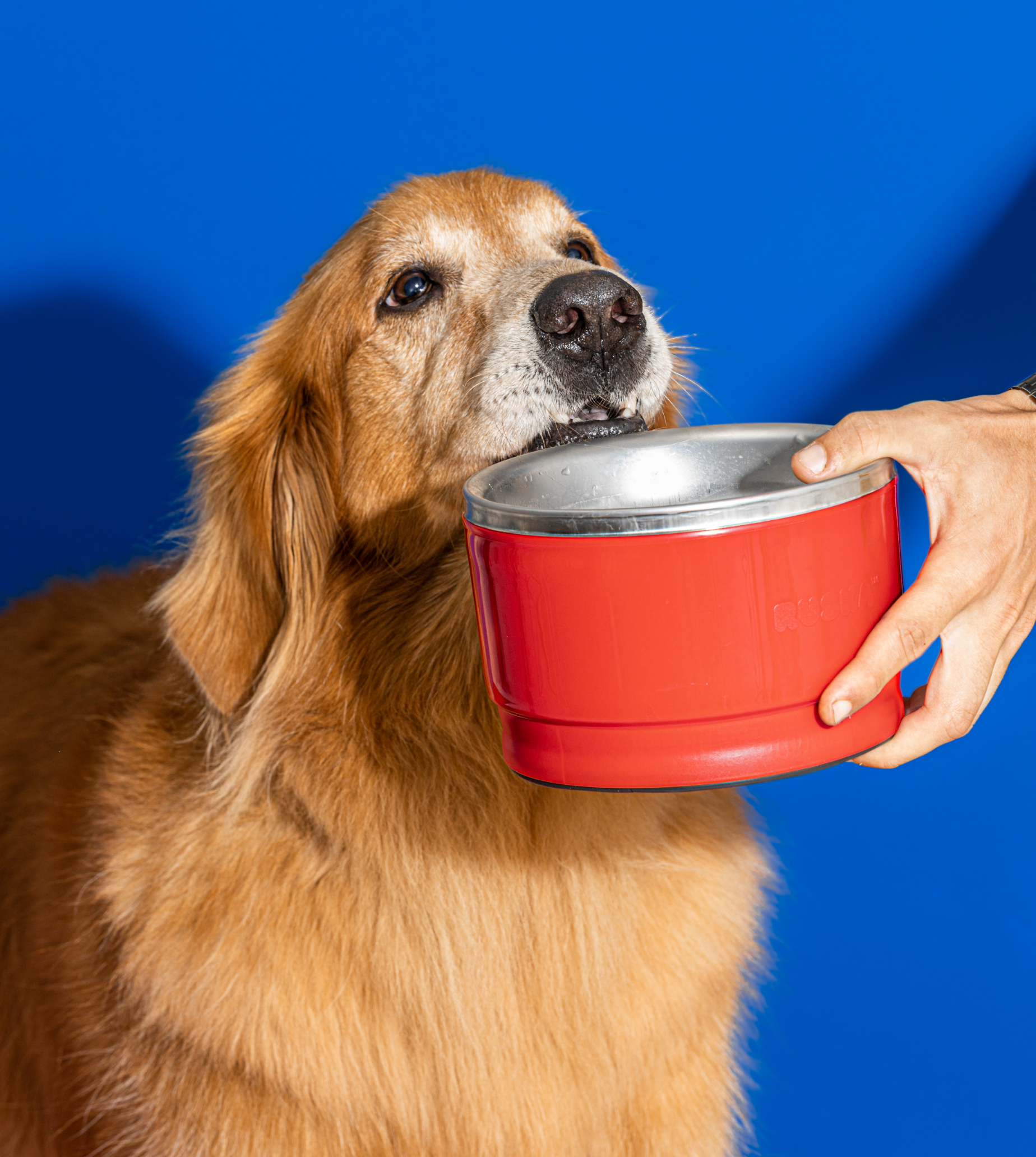
We all know how difficult it is to eat the same thing every day, and for pets, this is no different. Many get tired of the same food and don't want to eat it anymore, others get sick and need specific foods that are less palatable. The Ruska bowl creates an experience for the dog and, through the sense of smell, makes the food more attractive. The Ruska bowl consists of three parts: (1) a base; (2) an inner container where the treat is placed; and (3) a plate for the food. The plate has perforations that allow the dispersion of the aroma of the snack. And yes, dogs love that!
- GABRIEL MACOHIN Creative Director, Design, Illustration e Voice
- PAULO DOI Design, Illustration, Motion Design, Sound Design, 3D, Video Direction e Voice
- RAFAEL ALVES Design e Packaging Design
- BRUNO NANTES 3D Modeling e Animation
- BER SARDI Photography
- CAFETERIA FILMES CO. Video Production
- Programatório Web Programming

Ruska was born with the purpose of improving the lives of dogs through food and the branding project aimed to transform this pain of pet owners into something lighter, fun and with an end-to-end design.

Despite the exponential growth around the pet market, we have seen how rare are the brands that place design as a pillar of innovation and aesthetics. Most brands simply see the segment as an opportunity to make a profit, missing the opportunity to contribute to the transformation of the market. Ruska, on the other hand, comes to break that and puts design at the center of the entire research and development process. The essence of the brand is the promotion of health and well-being for pets, without forgetting that each product that is placed in a home affects the environment, and that this interference must be a source of pride and pleasure to those who live there.
-
-
Here’s a good example of how we work together as a team.
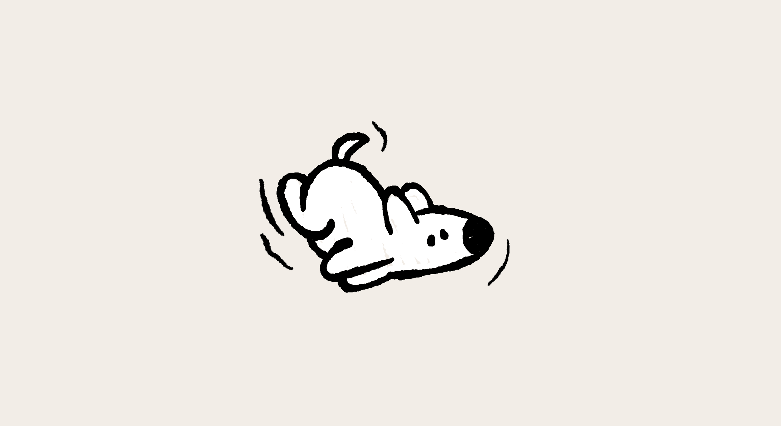
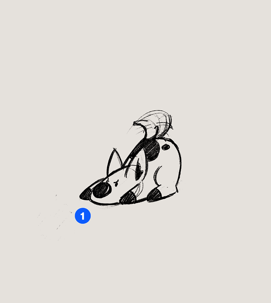
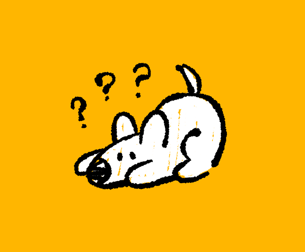
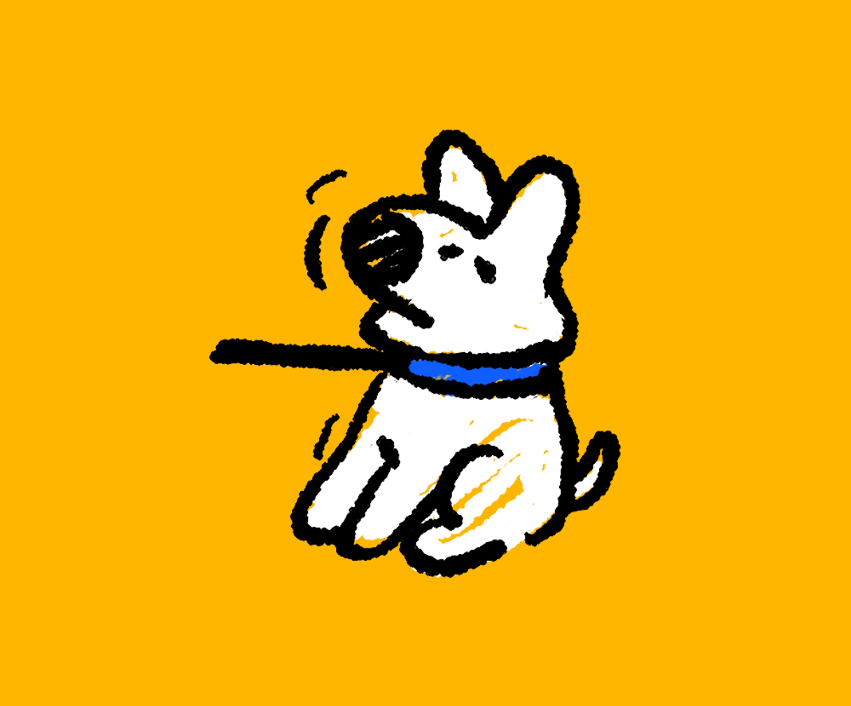
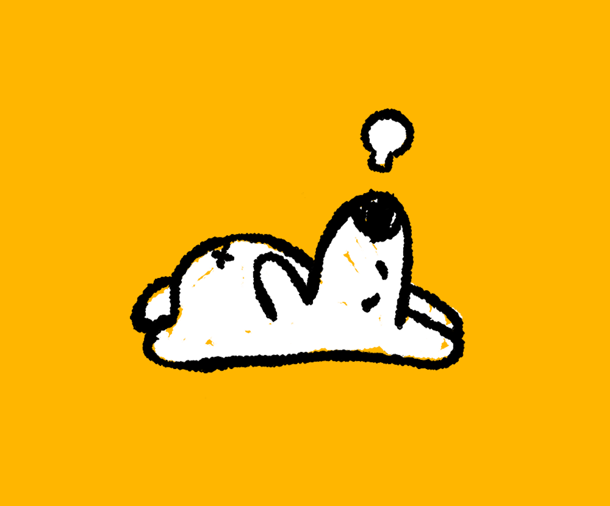
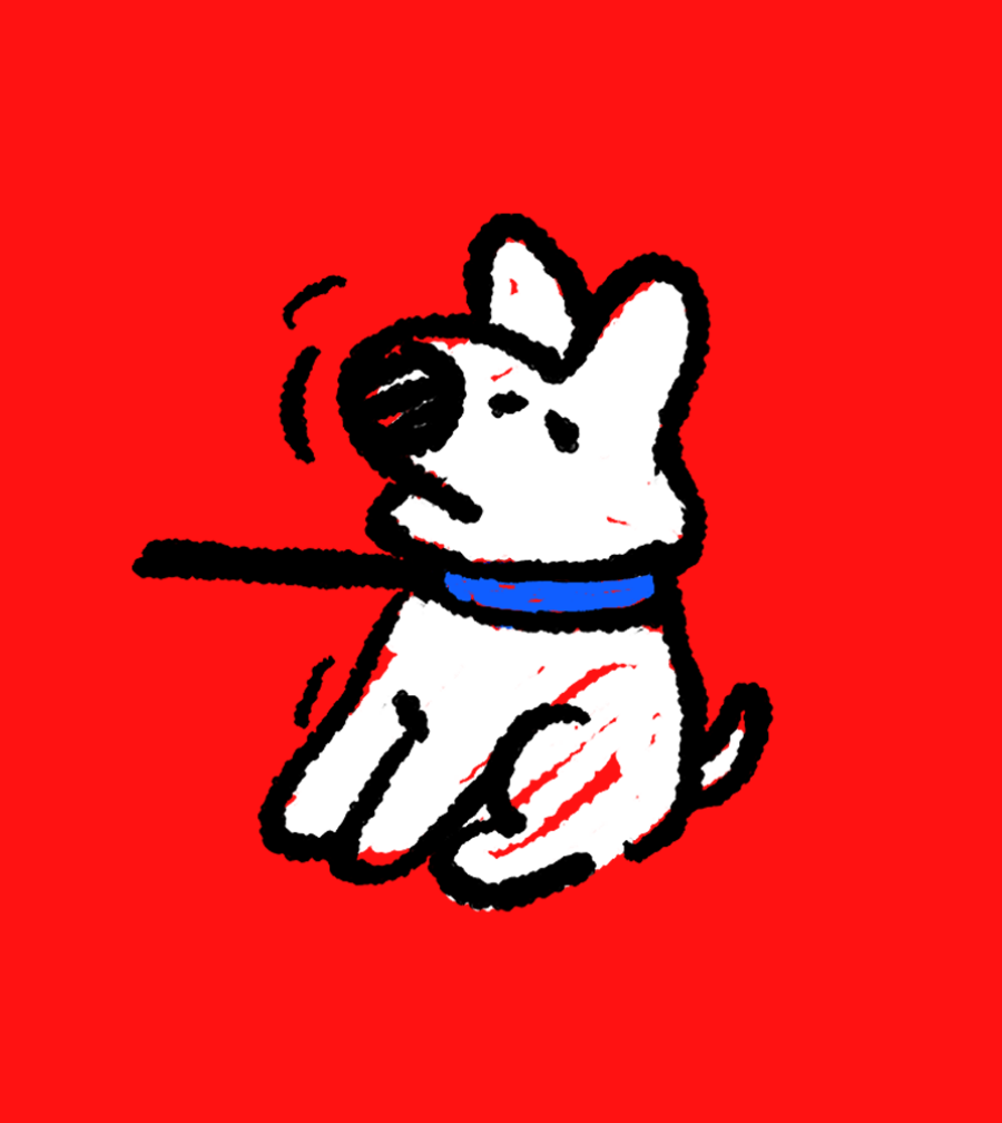
The first pass on the mascot design was fine. It was cool. But we felt it missed a little something, a little zhoozh.
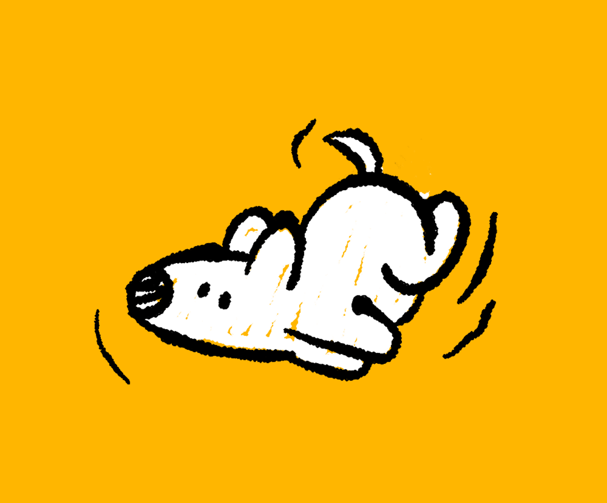
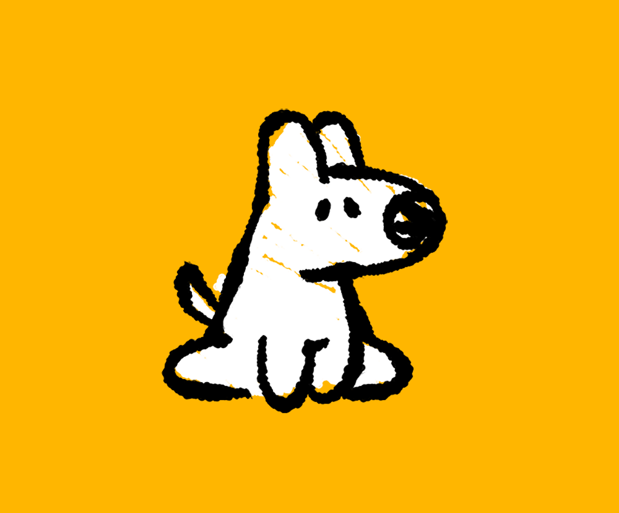
It’s when the project goes around the studio, going through everybody’s hands that it really gets interesting. With our added skills and perspectives is how our projects get to be look like us.
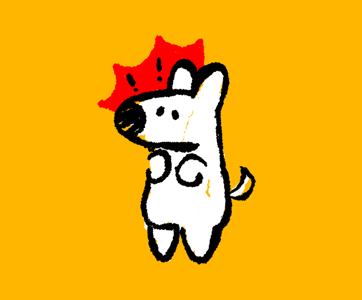
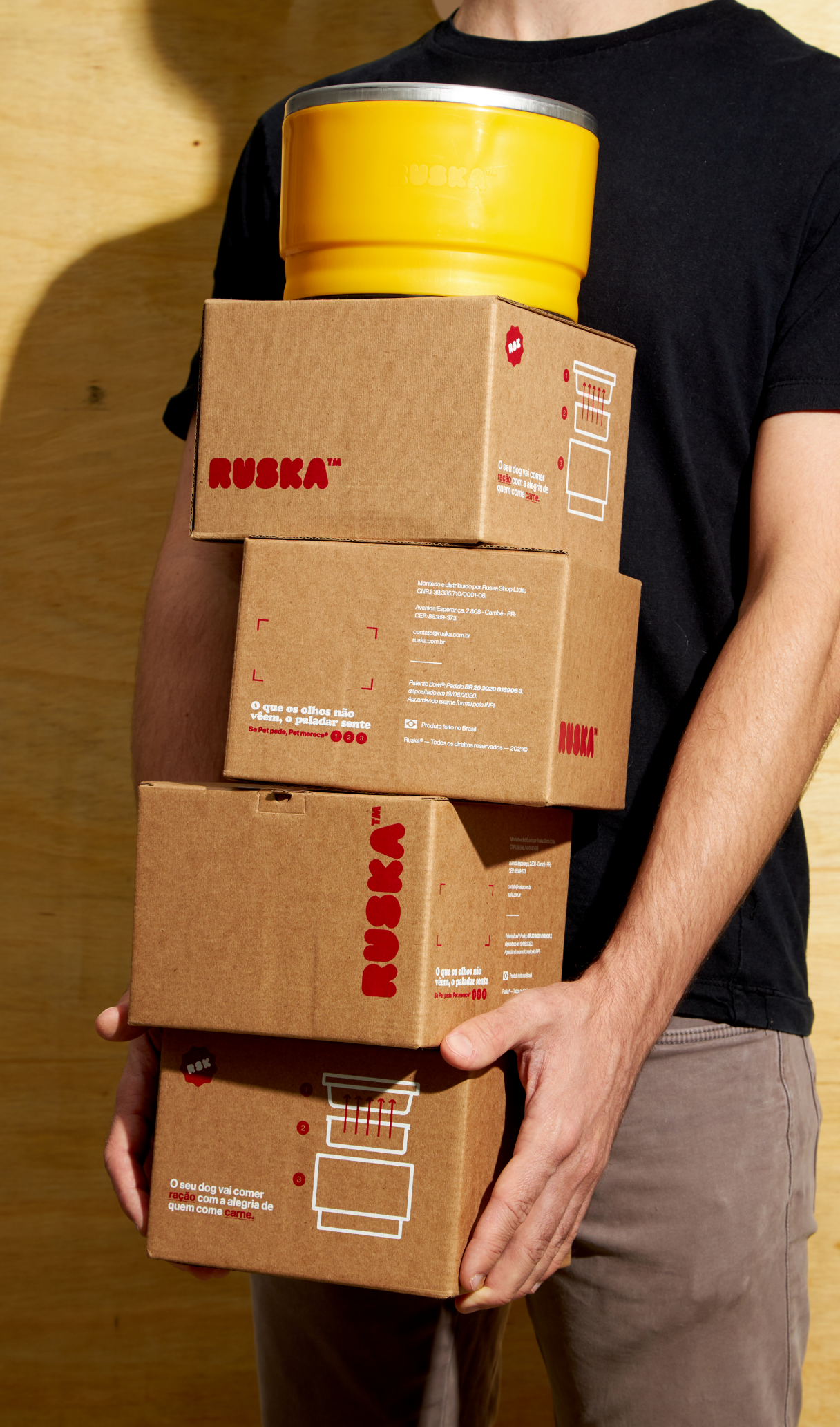
We thought of each of the touchpoints in a unique way. They carry a consistent visual unity, but they were built with different graphic elements. For this, we created several photographic, typographic, chromatic profiles, as well as different styles of 3D, vector and freehand illustrations. This graphic miscegenation gave the identity a dash of weirdness and a ton of creativity.
As it is an innovative product, we knew that the public might not immediately understand its function. To resolve any doubts, we transformed the brand's main touchpoints (packaging and website) into infographics, leaving everything self-explanatory and, therefore, facilitating the understanding of the use of the Ruska bowl.
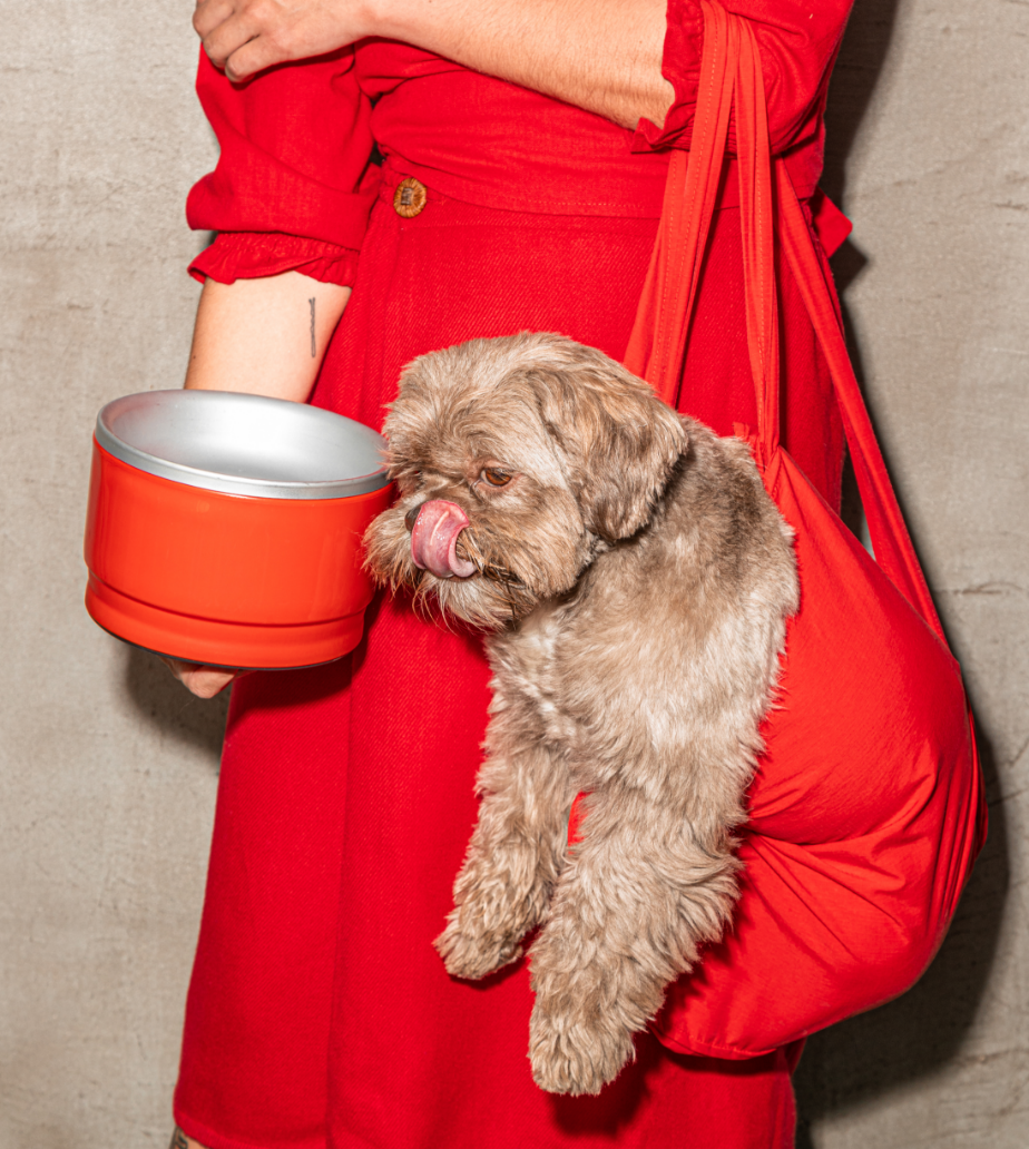
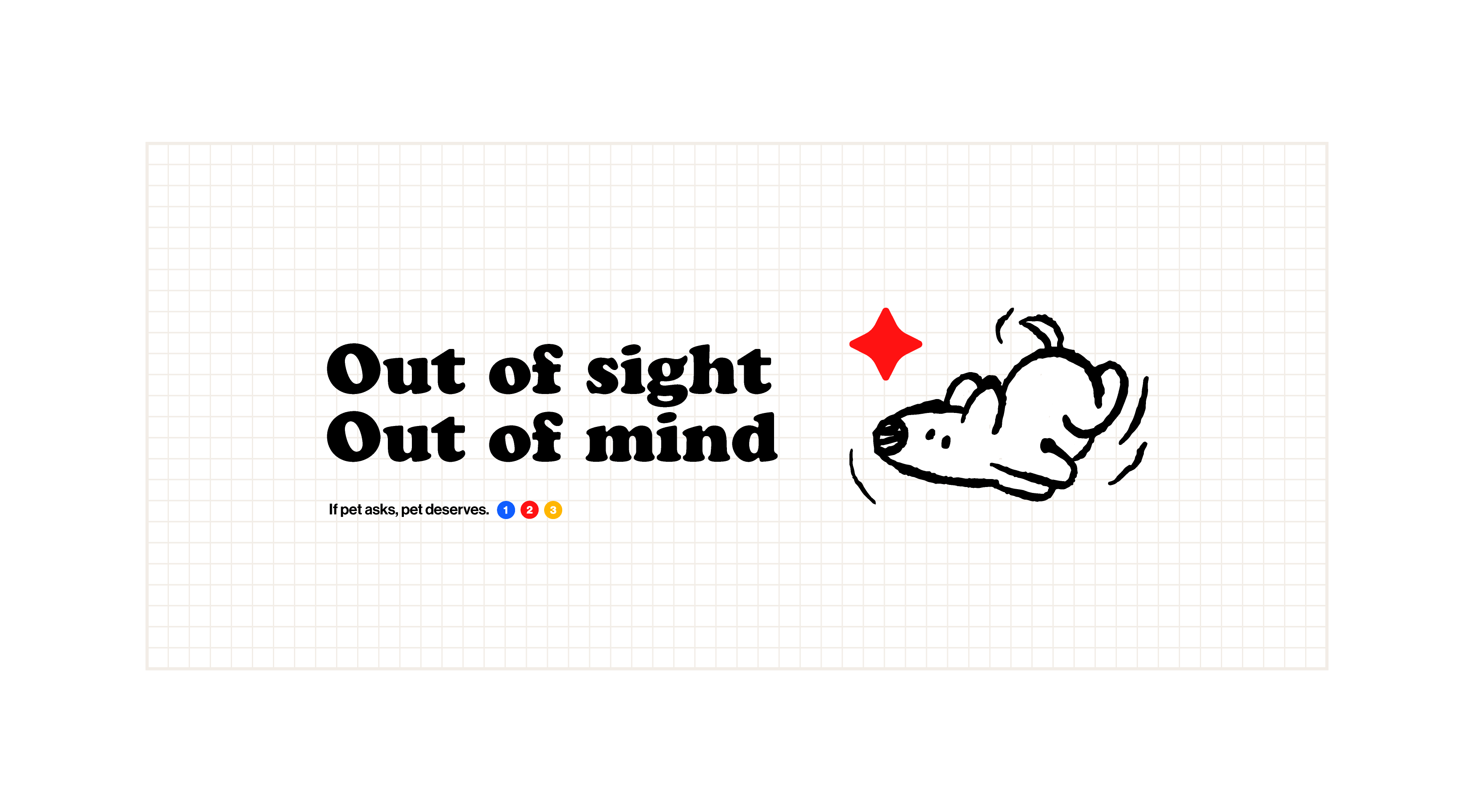
The branding followed Ruska's mantra down to a T: If Pet asks, Pet deserves it! And we provide dog parents with an incredible experience in the journey of buying and using this innovative solution that promotes health and well-being to their companion.
-
-
Rest In Peace, Shadow.
2014 - 2022