Coffee Lab
Coffee Lab is one of the main coffee labs in the world, with several awards and countless fans of the brand. They started in 2009 as a school dedicated to the teaching of coffee and, over time, became a laboratory for roasting, tasting and preparing quality coffees, focused on micro-lots with unique characteristics, ecosocial responsibility and traceability from the foot to the package. . The pandemic has brought numerous restrictions on trade, and this has drastically affected coffee shops. The Coffee Lab, led by Isabela Raposeiras, saw in this scenario the moment to reposition itself, reducing the focus on the cafeteria, strengthening the teaching arm through courses, mentoring and consulting, and becoming a niche publisher. The affirmation of this new moment resulted in a rebranding.
- GABRIEL MACOHIN Creative Director, Design, Illustration e Voice.
- PAULO DOI Design, Illustration, Video, Voice and Strategy
- JOTA OSHIRO Photography
- ISABELA RAPOSEIRAS Voice and Strategy
- CHARLES PIRIOU Strategy
We found a company that knows its role in the world, and a big part of this project was to help Coffee Lab reconnect with its origin and propel it into the future. We saw the need to visually align the company for the right positioning, reaffirm the Coffee Lab as a school, value people, bring art and strengthen the brand's tone of voice.
-
Initially, Raposeiras pointed out a path to identity, with aesthetic references from laboratories of the 60s. However, Coffee Lab is not obvious, following this path would only echo its name. As we delved into the company, we saw that its purpose is the struggle to rewrite the exploratory history of coffee in Brazil, through better remuneration for the producer, dissemination of information and, above all, exerting this influence on thousands of coffee shops. They fight for social causes, in a respectful way, but without forgetting their "nudge" tone. They are passionate about art, architecture, design and, above all, stories. So, behind the technical rigor, we discovered that for them, it was always more about people than the coffee itself.
-
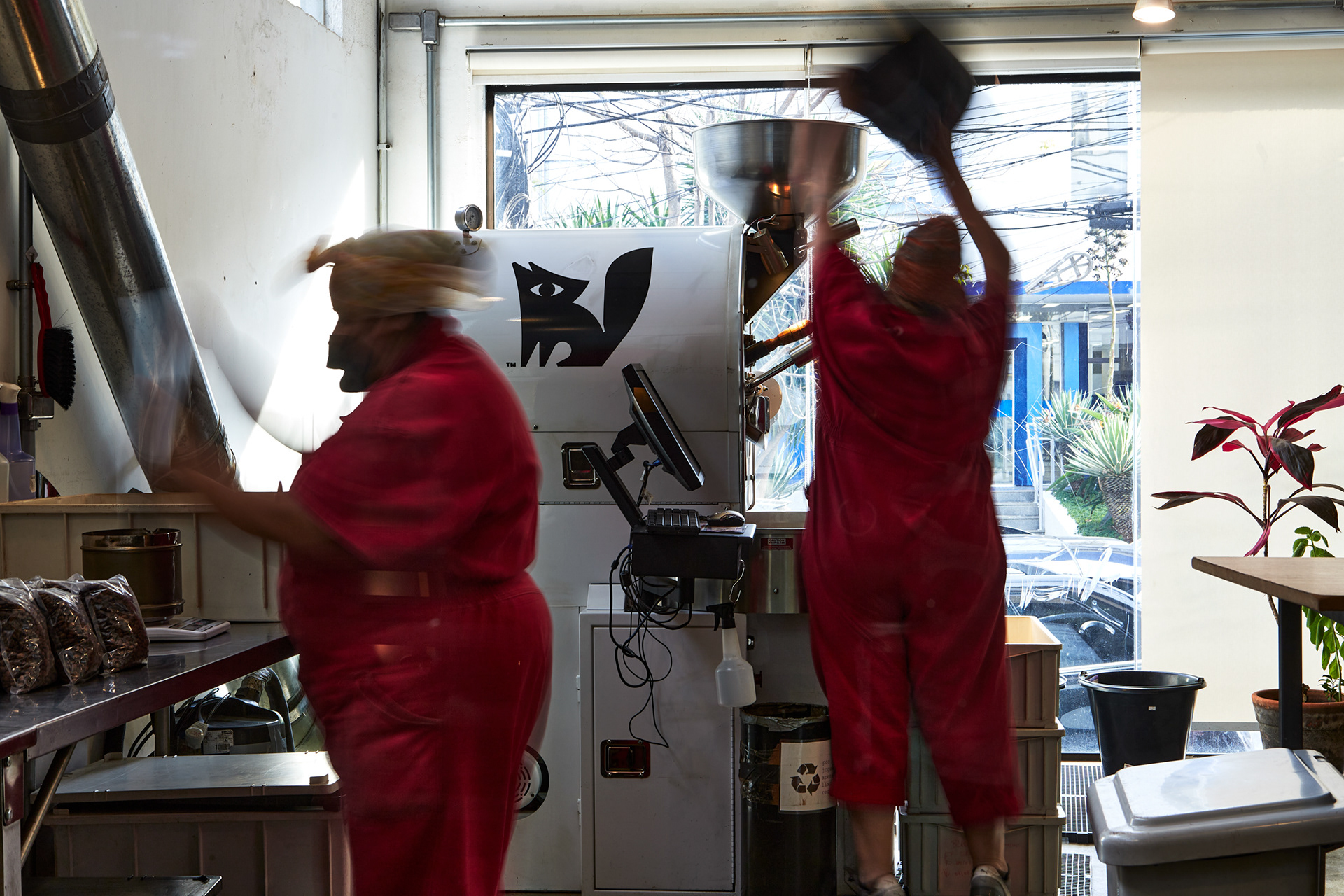
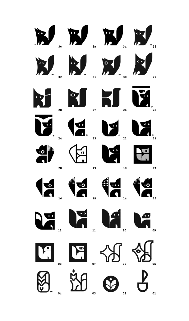
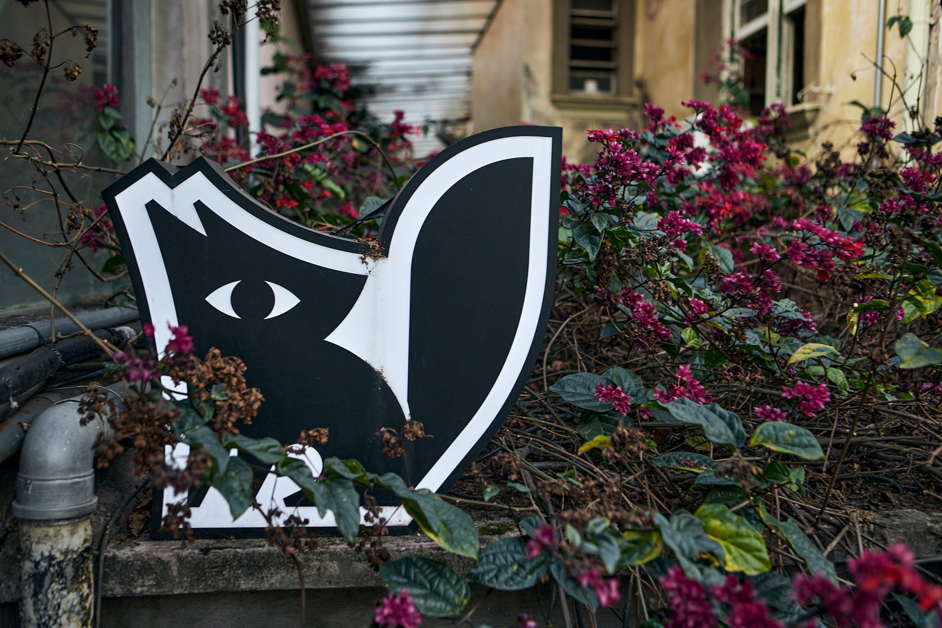
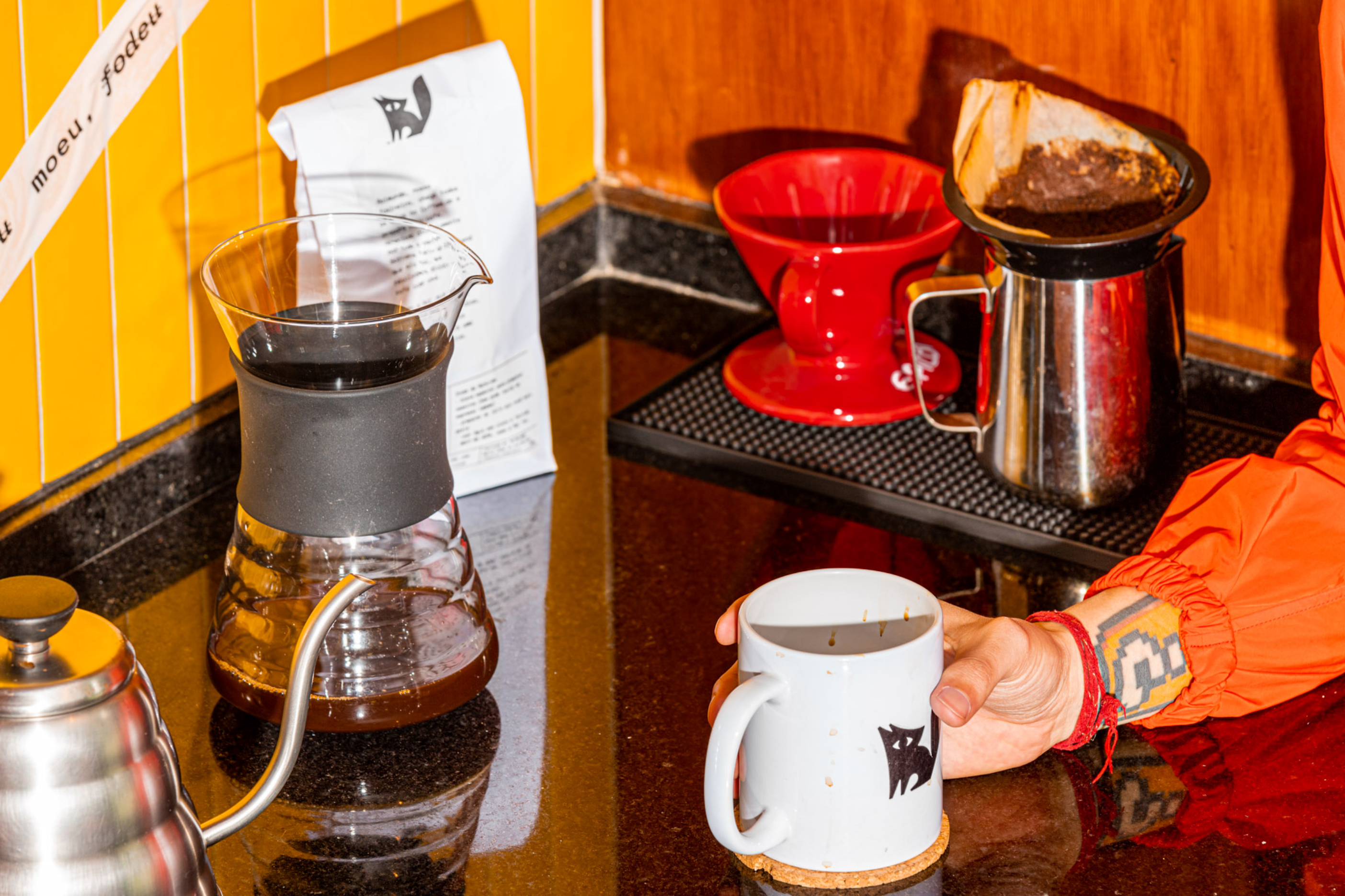
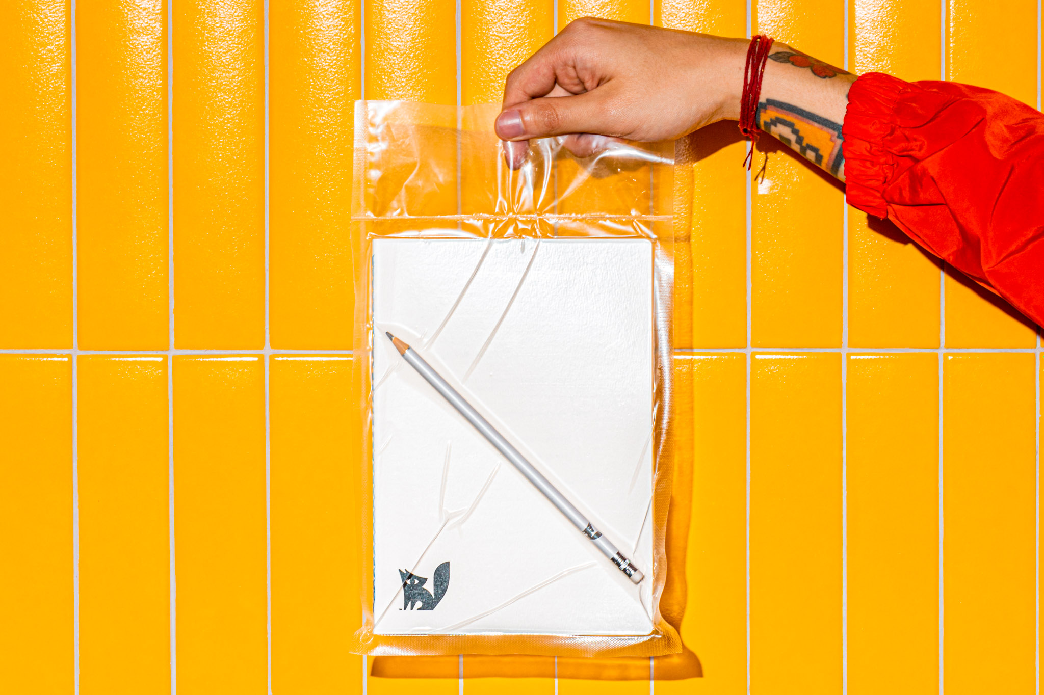
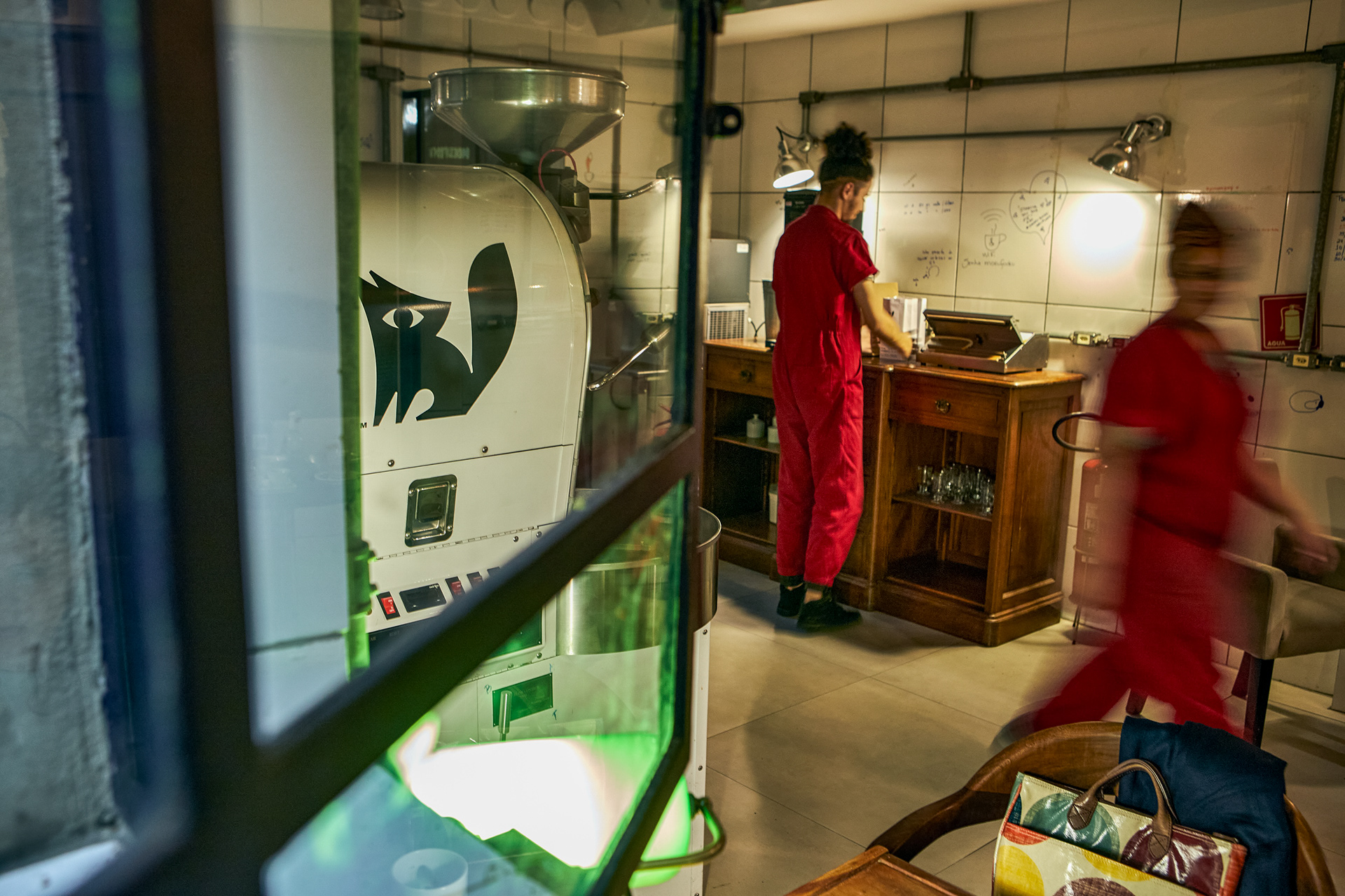
The Raposa symbol comes from the visceral relationship between company and entrepreneur, in a play on the surname Raposeiras. We embrace the awkwardness, add a dash of acidity, and remain friendly, but in a snarky way. The icon has precise lines, as well as the technical rigor with coffee, while the typography brought experimentation, expression and freedom with the mix of fonts.
-

-
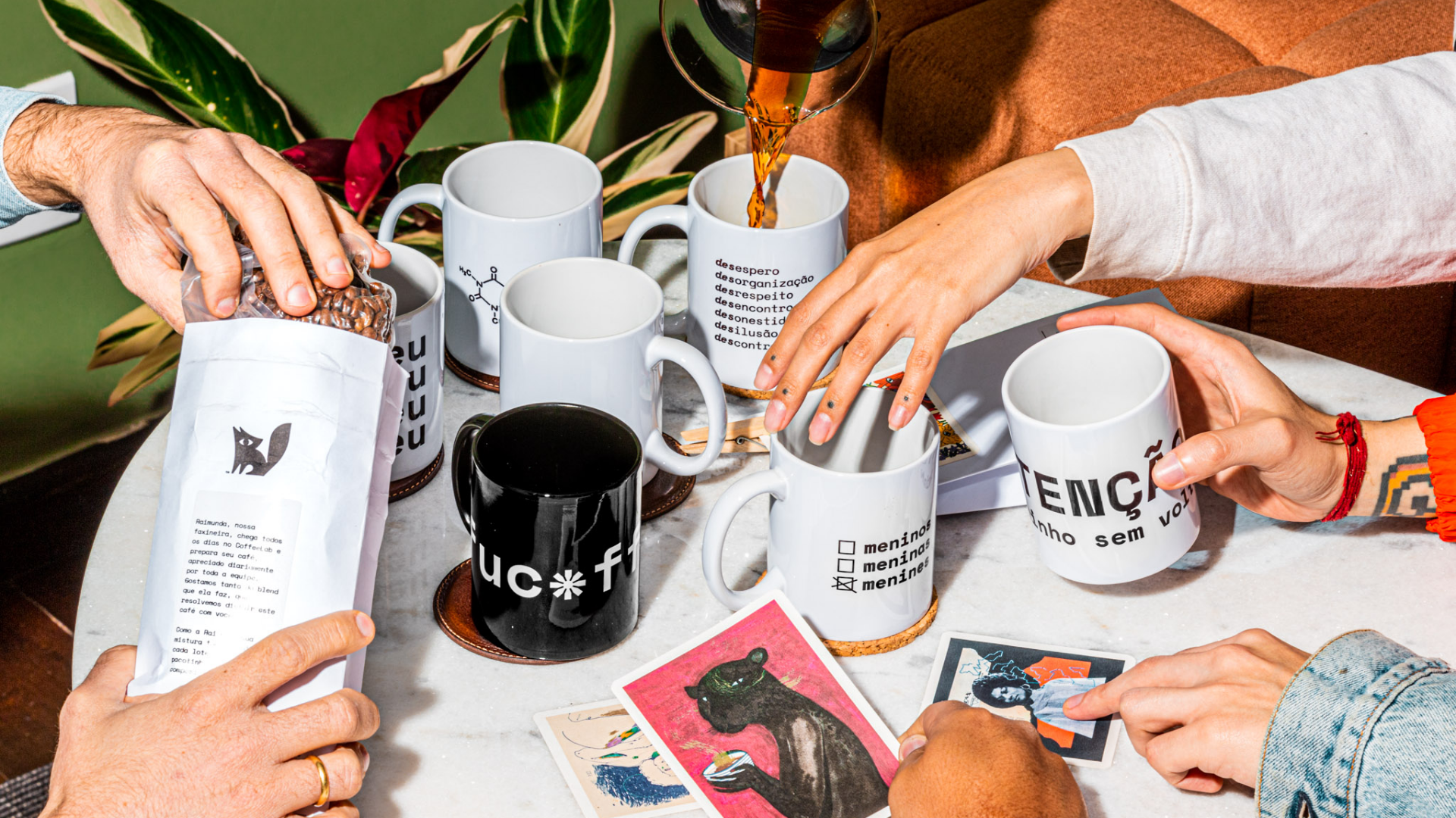
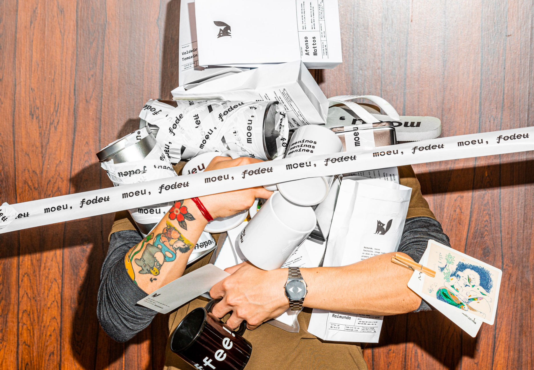
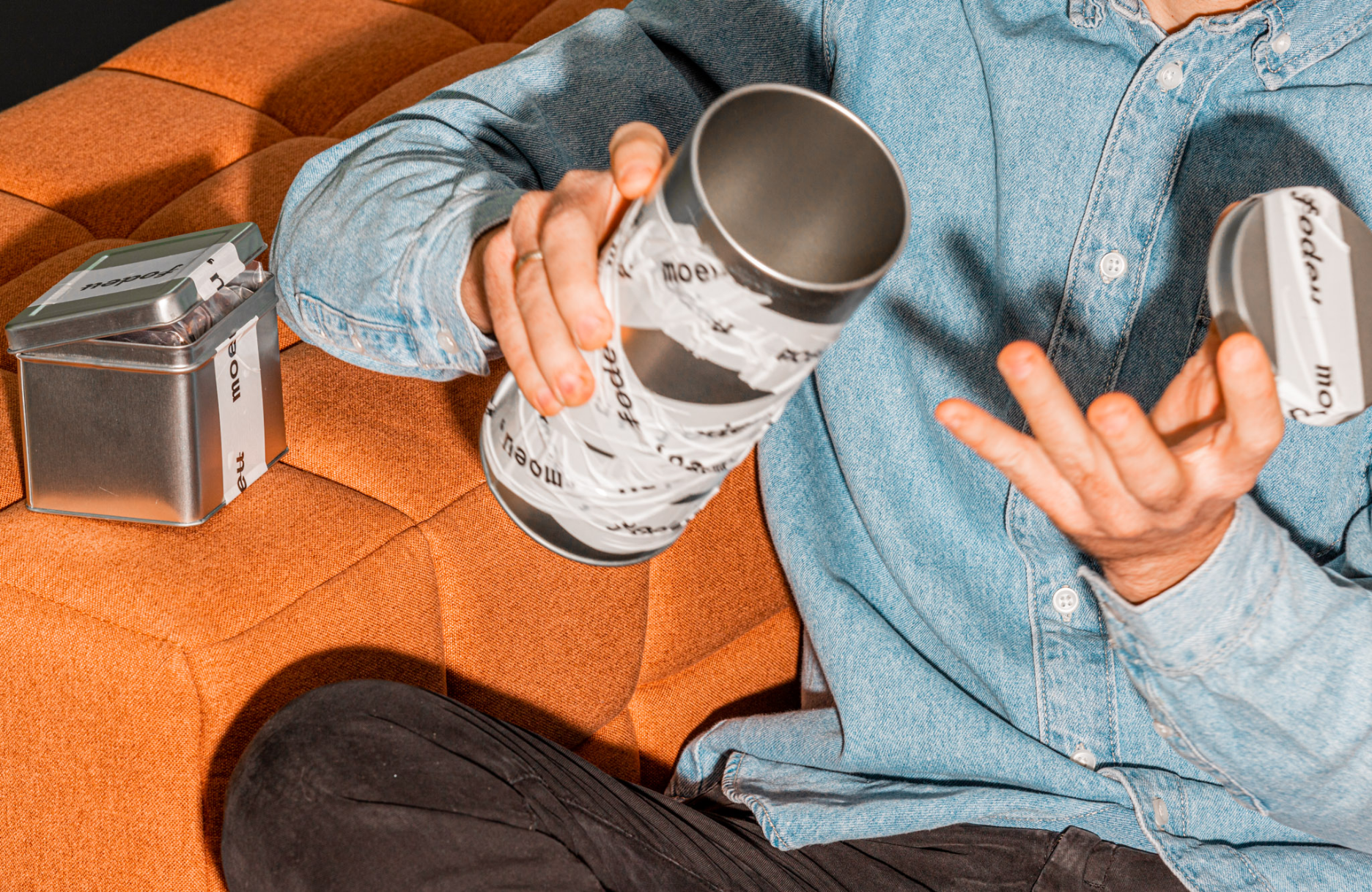
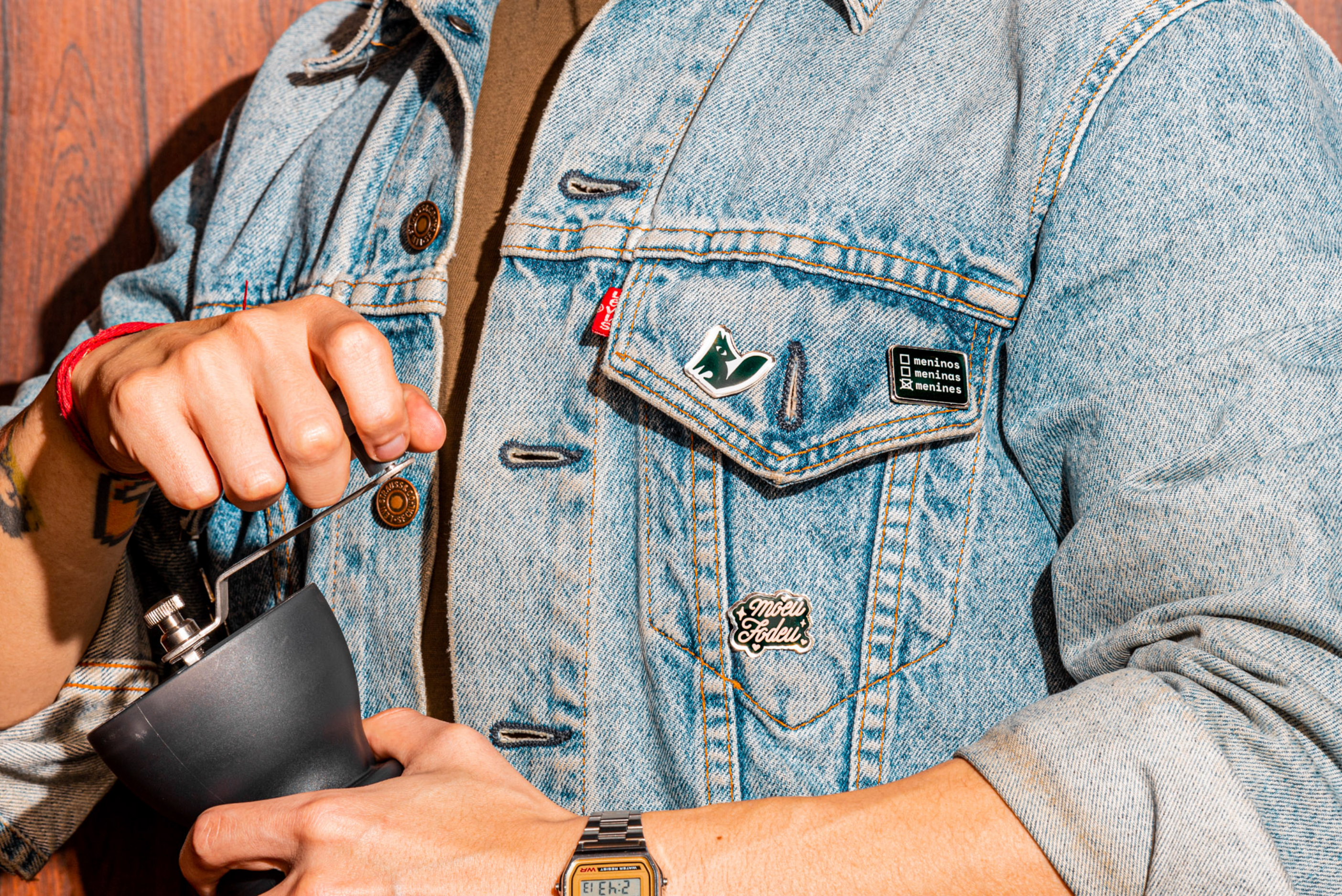
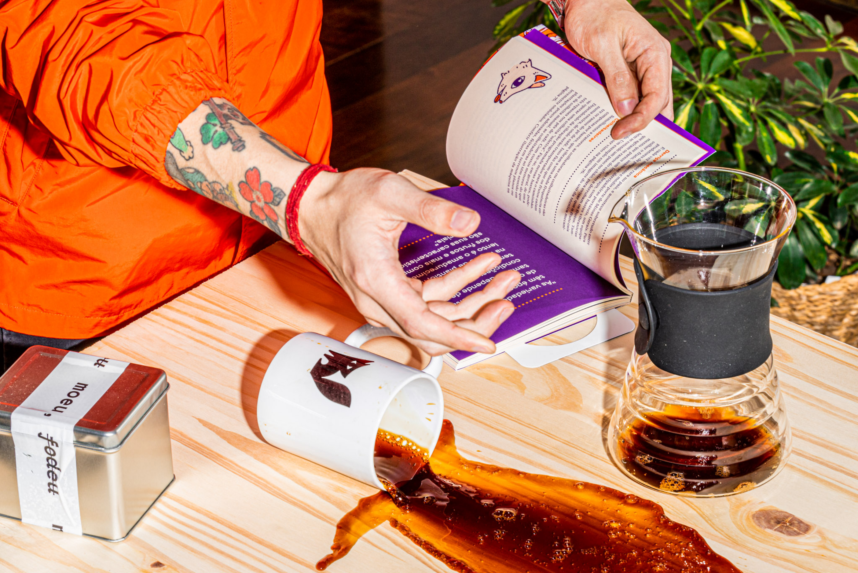
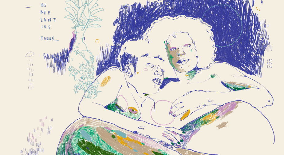
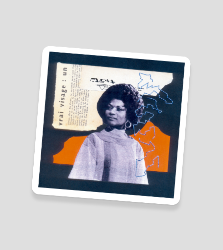
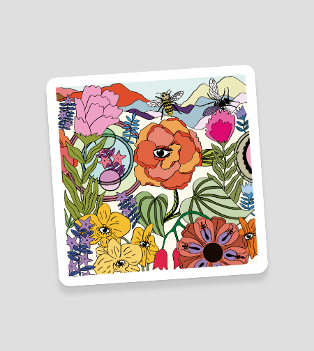
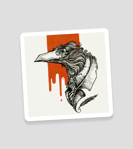
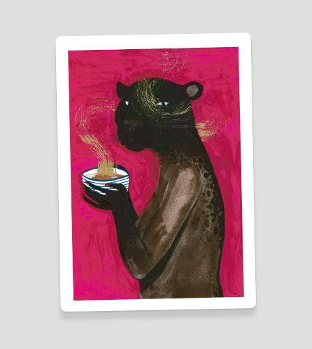
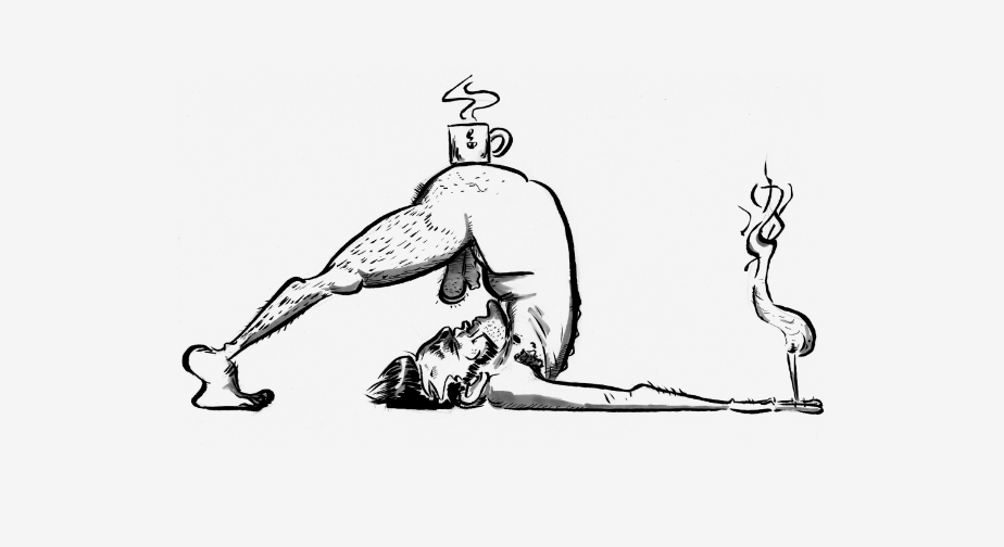
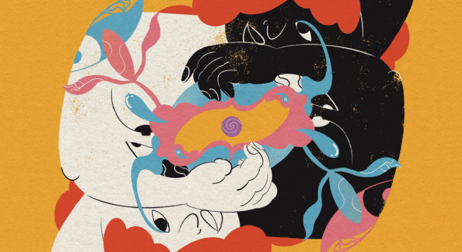
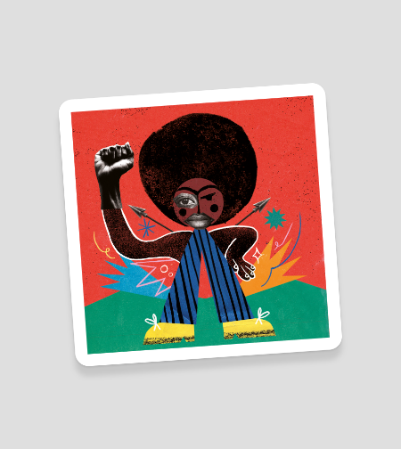
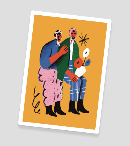
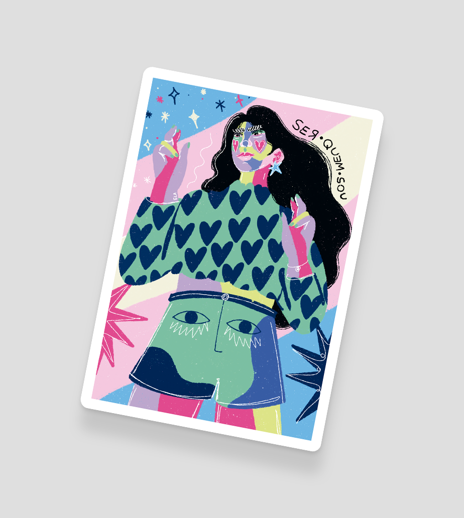
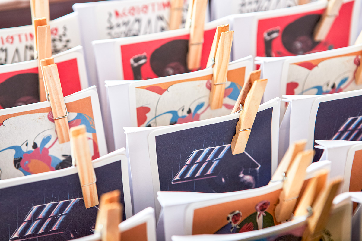
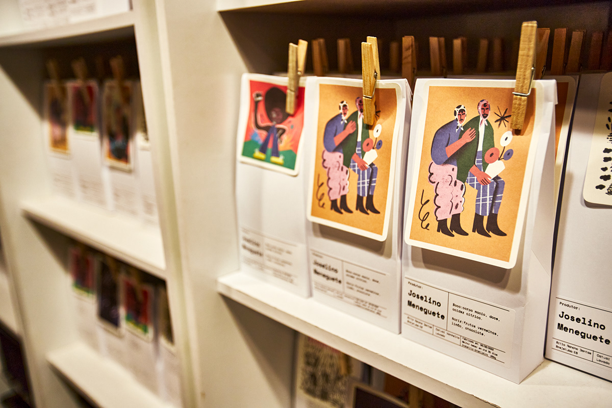
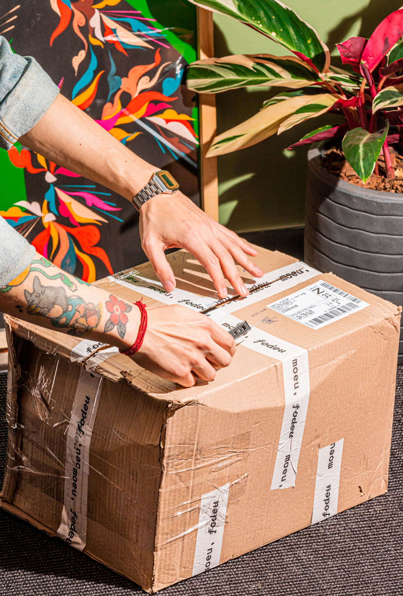
As they work with microlots, we created an easily applicable identity that gives the company autonomy to produce new packaging. We sustain the identity in the icon, add the mocking verbal side through phrases and, with them, we dress the products with the Coffee Lab style. We collaborated with artists who helped to affirm the concept and build the brand's atmosphere.
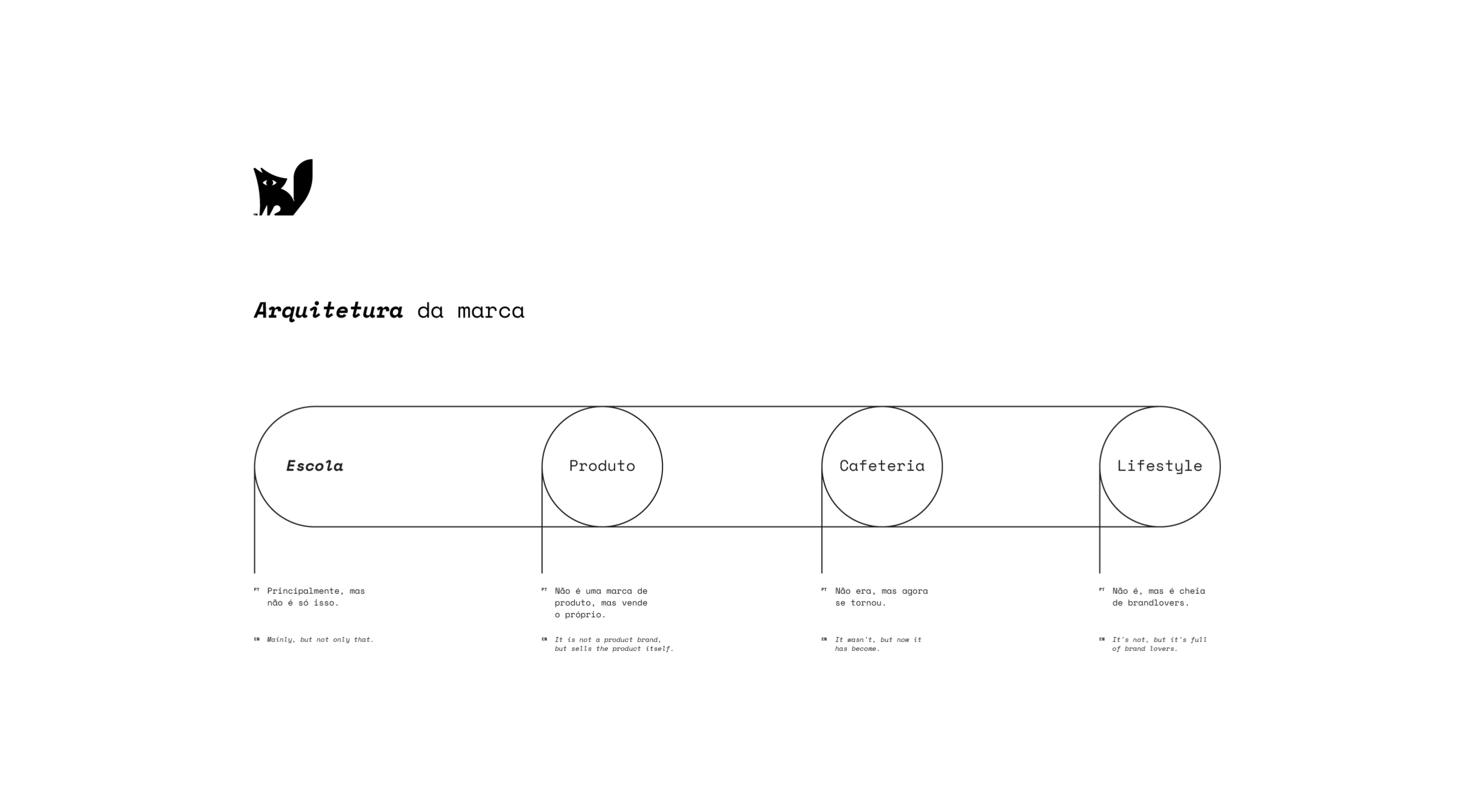
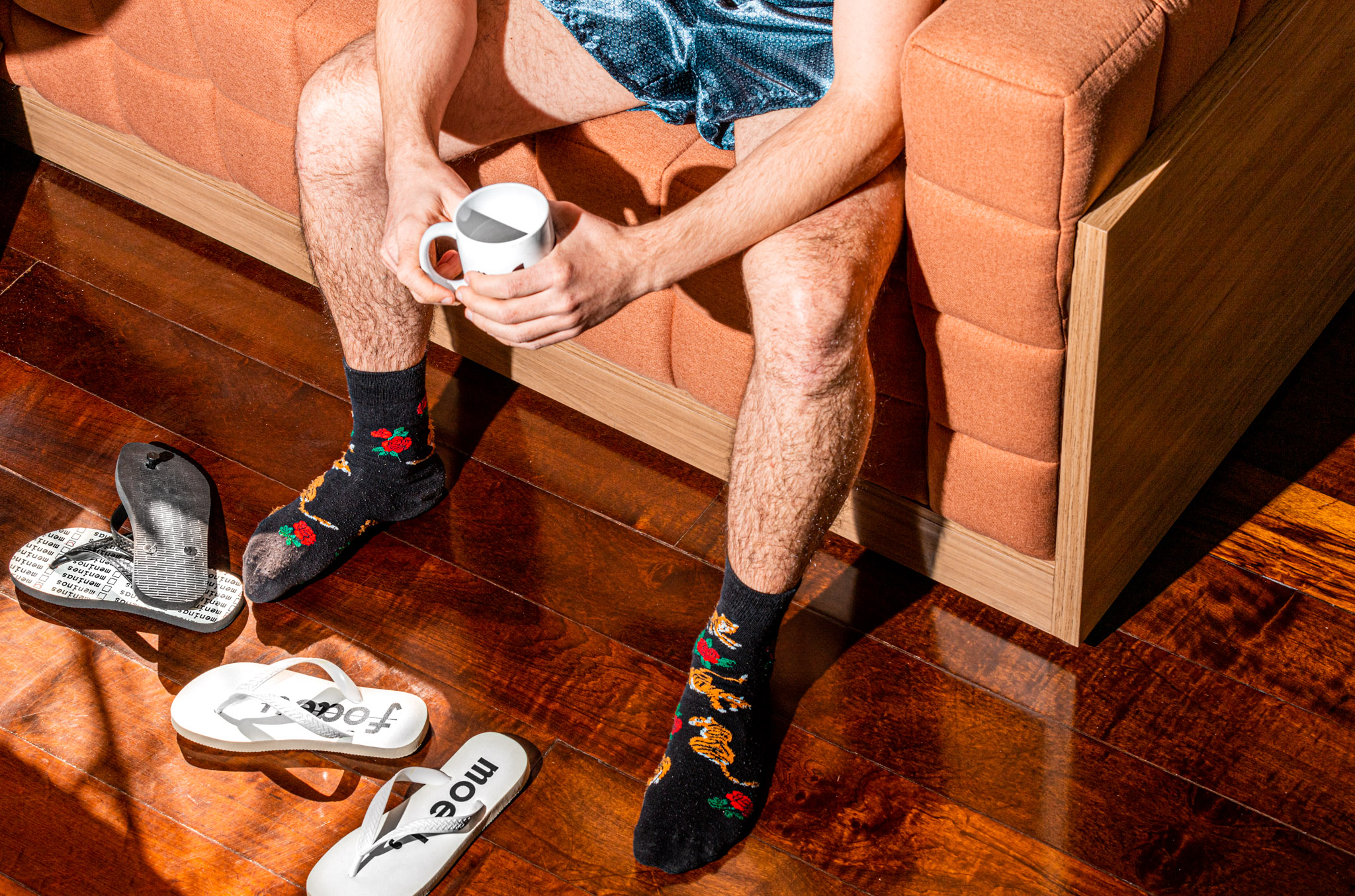
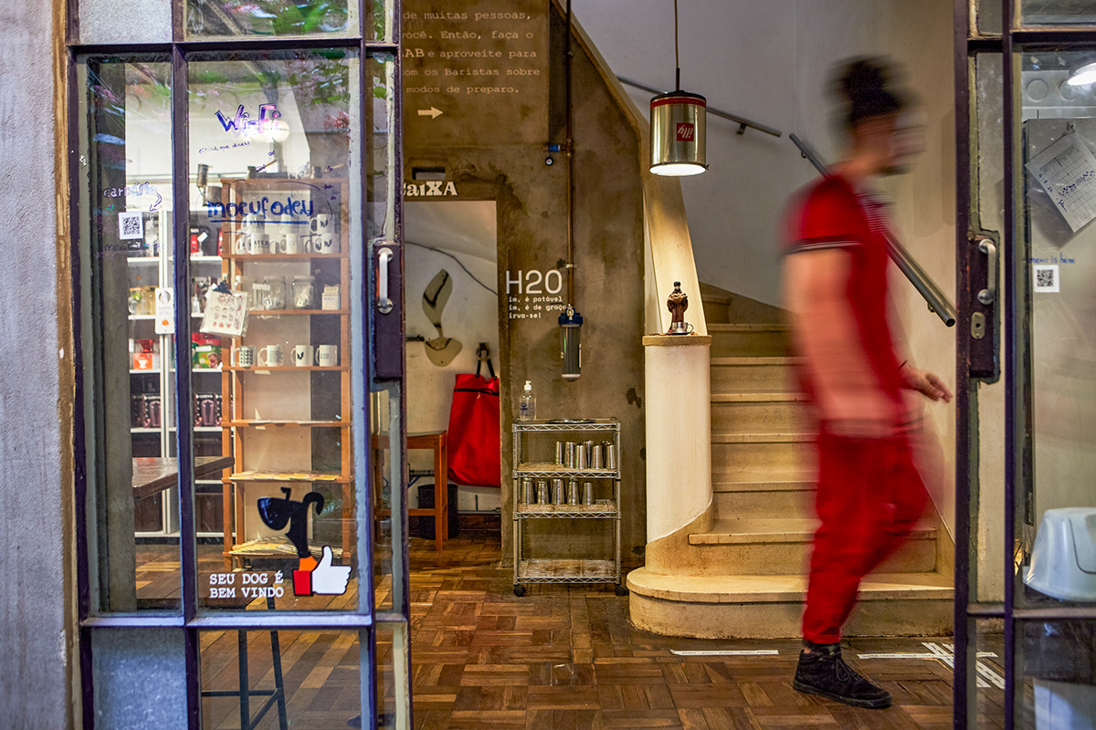
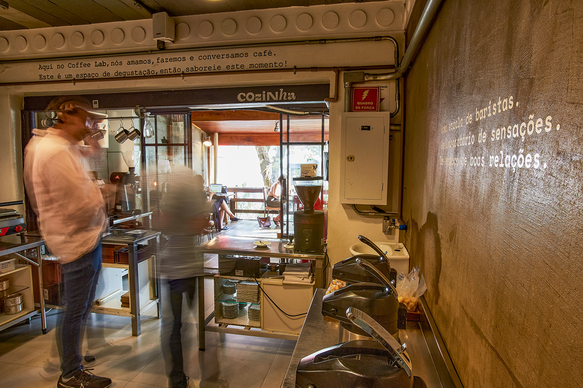
The Coffee Lab has a complex operation, as it acts as a school, roaster, cafeteria and shop. During the implementation, we aimed to reaffirm them as a School for baristas, entrepreneurs and the curious, without ever putting aside the other aspects. We seek to create a non-corporate atmosphere, inspired by artistic references, with a human feel and close to its audience. For this, we redesigned the brand, maintaining the connection between company and entrepreneur. In addition to the logo, at several points of contact, we opened up the acidic and “probing” tone of voice, which is so important in defending the Coffee Lab’s purposes.
Thanks to the illustrators who collaborated with this initiative
Heitor Kimura, Júlia Bertú, Talita Hoffmann, Theo Canto, Veridiana Scarpelli, Adriano Vespa, Kelly Boeni, Cássia Roriz, Hellen Vieira, R. Trompaz e Thuyla Azambuja.

