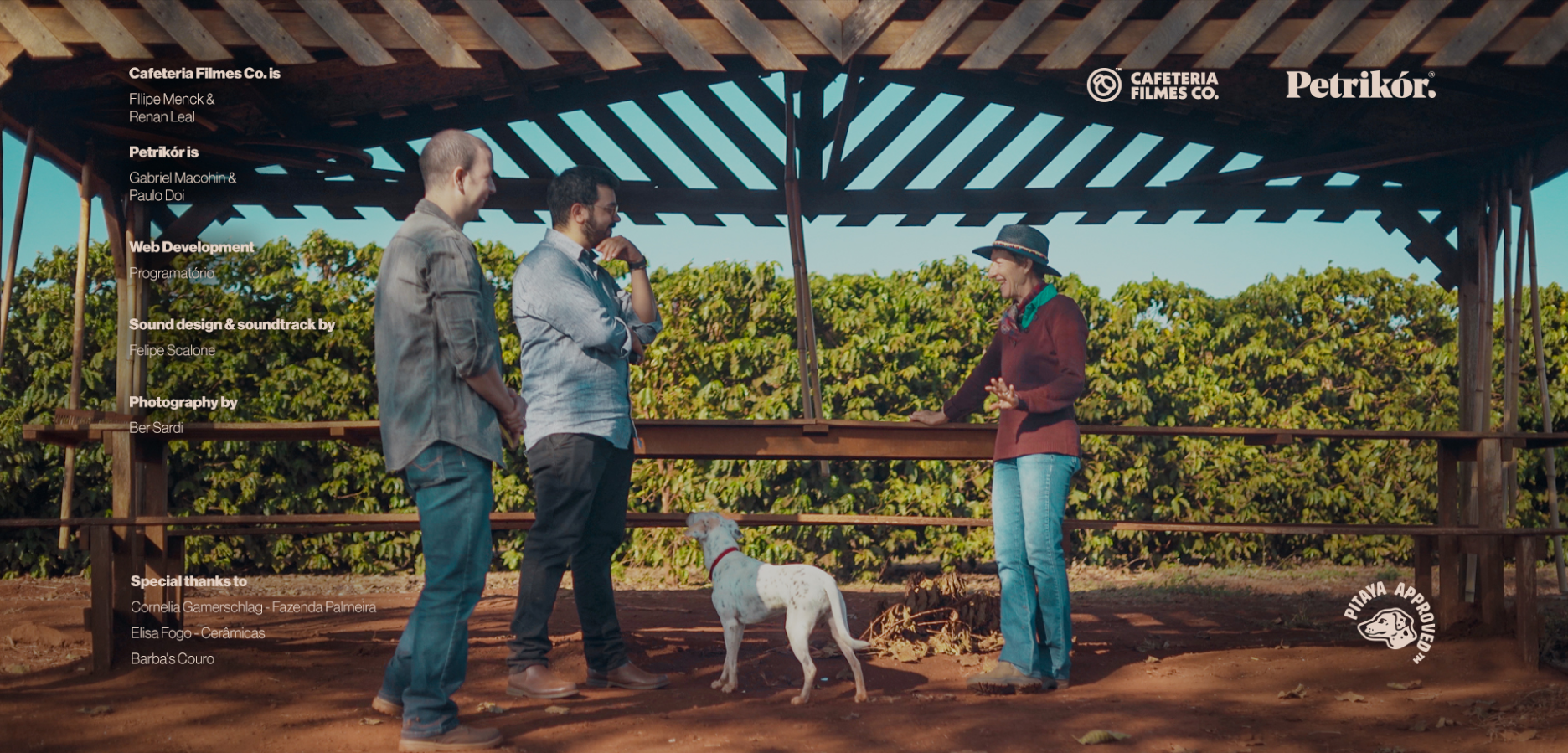


Cafeteria Filmes
Someone once said that creativity is connecting two things that are not obviously related.
The guys over at Cafeteria Filmes already had that on lock when they came to us. A video production company that uses coffee culture not as a theme, but as an essence that permeates throughout everything they do is an interesting concept to say the least. With every project we take on, we try to challenge our preconceptions of what doing "branding" actually means.
Well, here's the project that proved that personality is everything for a company, and just how strong, interesting, and unique a company becomes when it leans into its weirdness.
Grab a cup of coffee and get comfortable, cause this is gonna be a long one.
- GABRIEL MACOHIN Creative Director, Design & Voice
- PAULO DOI Design, Illustration, Motion Design & Copywriting
- BER SARDI Photography
- CAFETERIA FILMES CO. Video Production
- PROGRAMATÓRIO Web Programming
- SIMONE SEMPREBON Copywriting
- FELIPE SCALONE Sound Design & Music
"LET ME TELL YOU A STORY"
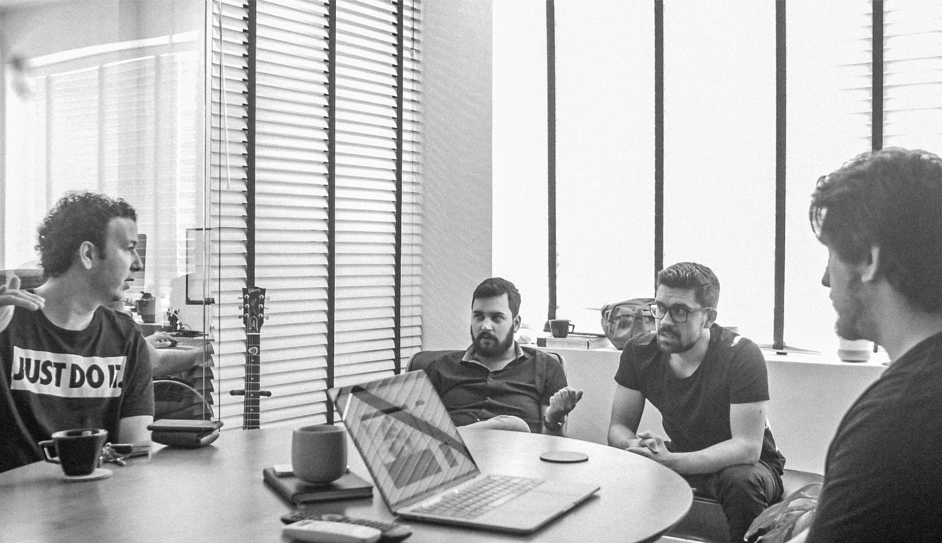
Doing a project for other people in the same field as you is interesting. You immediately feel like you understand them. Their pain points are particularly relatable.
A while ago we just kinda threw the concept of the written briefing out the window, and now we just basically talk to the client and ask a bunch of questions.
During this talk is where we start to build the foundation to what our strategic approach is going to be like.
Our job is not to just make them look good, but to help their business succeed and help them achieve their personal goals with the brand too.
Their main problem was one that any working artist knows all too well:
THE WORK WE ARE PASSIONATE ABOUT x THE WORK WE ARE GETTING RIGHT NOW x THE WORK THAT PAYS THE BILLS
What they really love doing is telling other people's stories.
On the inside, they had everything they needed to keep getting closer and closer to that goal. All they needed was a little push.
And we came in to help them focus on one thing that seems obvious but it's actually very hard to do:
Express themselves unapologetically.
THE ID
There's a thing that seem to happen when a sufficiently long enough time passes: aesthetics become part of the cultural vernacular and they lose some of their baggage. This is what happened to the aesthetics of the 60's corporate America. What before could be seen as soulless, now has a certain charisma attached to it. We can look at these old geometric logos stamped on the bottom of ancient cardboard boxes and appreciate them in a different light.
Today, they can actually carry a certain timeless quality and personality, which is what we were looking for this project.
We had countless internal discussions about the logo. "But it's just too simple and obvious", "it's barely a logo, it's more like an icon", "it's just a simple coffee cup...". Seemed too easy almost, to take a company called "Cafeteria" and make the logo be a coffee cup. But because they are a video production company using the idea of the coffee shop as an essence, we felt it was important to go towards that. To use the icons of that universe as our own.
It's what the project needed. To say that the logo was obvious and simple is not to say that to get to it was an easy process. We made many versions of this damn simple obvious coffee cup.
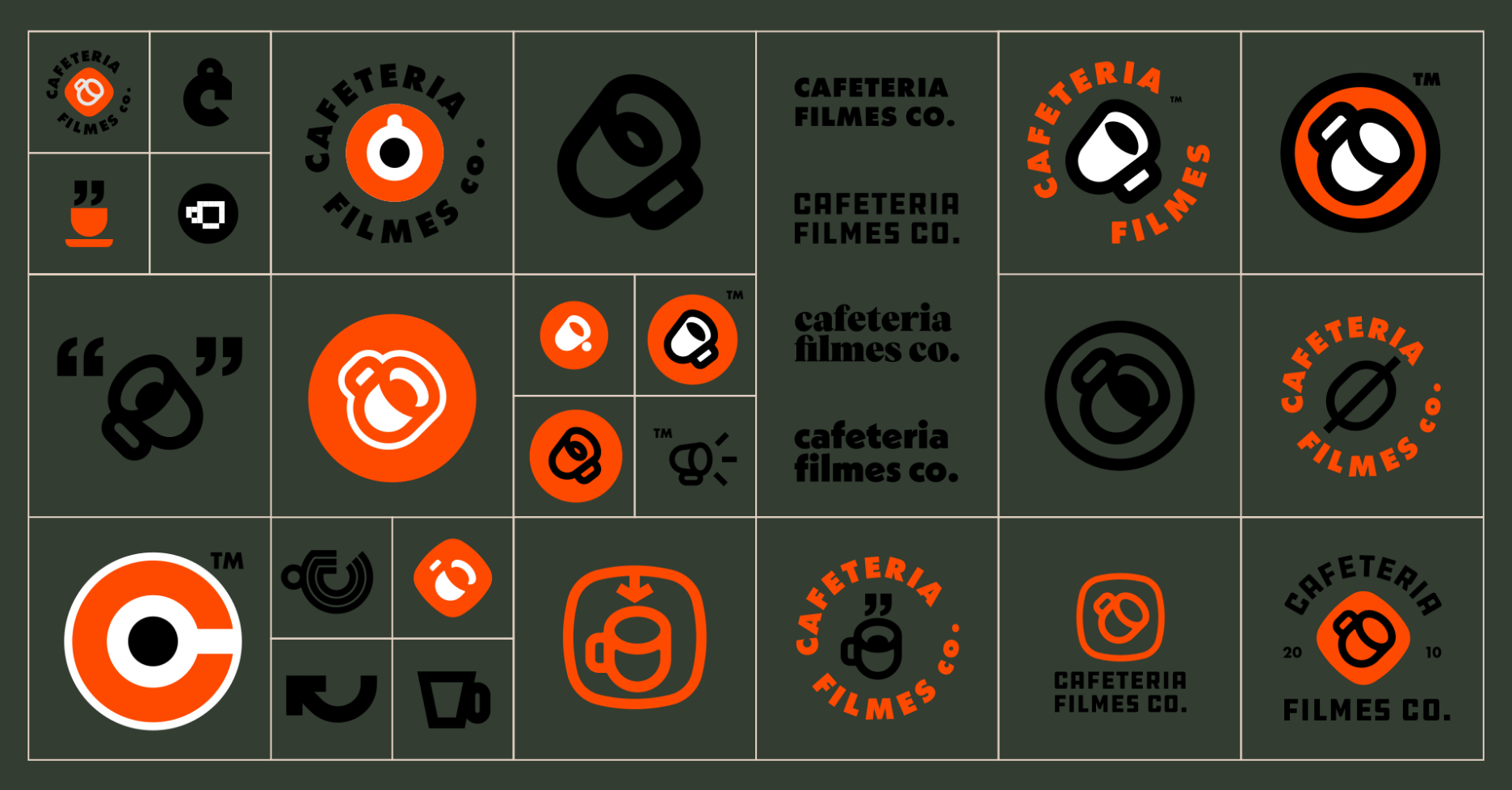
Throughout the whole thing we kept asking ourselves things like "but does it look like it's TRYING to look retro?", "if we found this logo on some old corporate identify book from the 60's, would it fit in?" and "does it look dated?" to keep us in check. The goal was that if stamped on an old piece of paper, it should feel like it fits, but when shown in a screen, maybe at the end of a video, it should also be current, not trying to look vintage.
Turns out that's a very small target to hit. Very few companies have logos that fit that criteria. Some notable examples are Kodak, Leica, PBS and Starbucks.
Just looking at those, it's hard to tell when they were made. We hope we were able to tap into that same feeling with our little coffee cup.
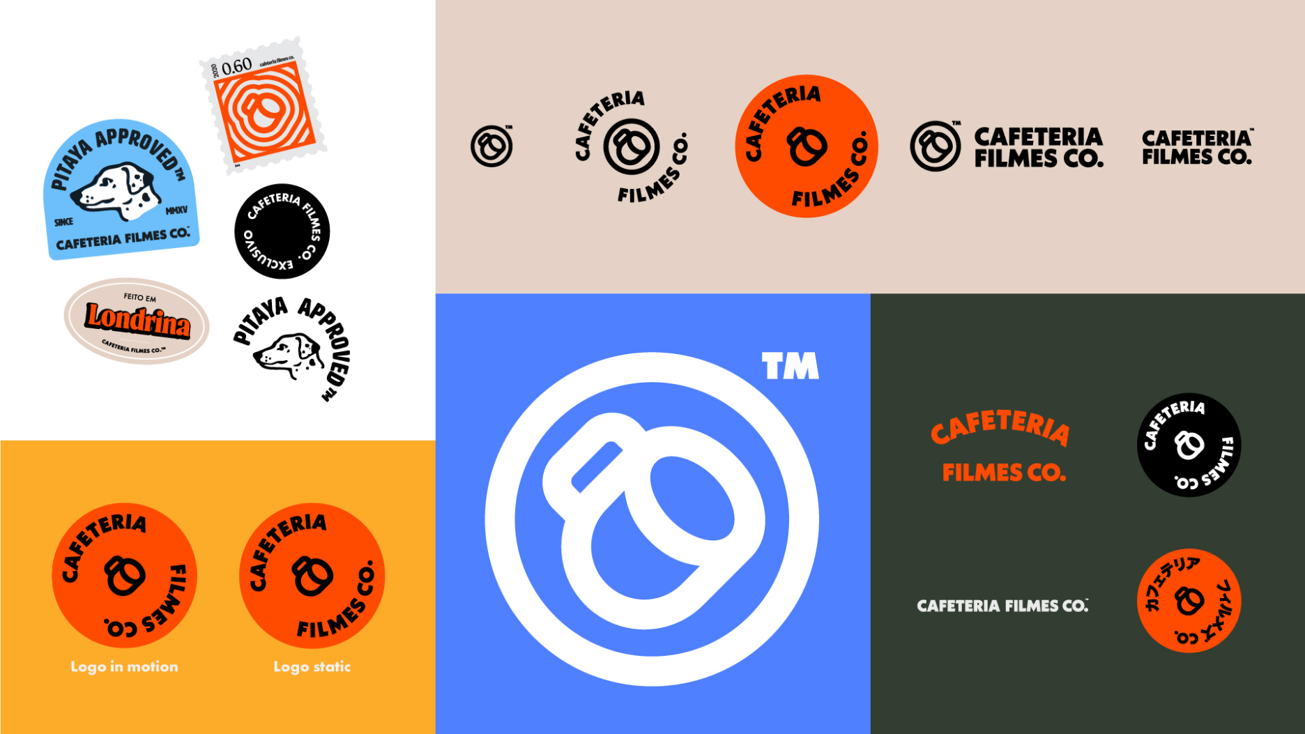
We see it as part of our job to try to anticipate. To look into the future and try to see where the brand could go.
That is how we try and future-proof our work. Making sure that the identity allows them to grow.
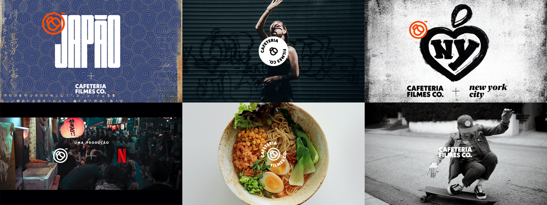
"What if they start focusing more on original content rather then client projects?"
"How cool would it be if they got to produce a documentary series with Netflix? What would that look like?"
These are how those tests manifest themselves visually:
WEB DESIGN
A decent website works, but a great one goes a little further. A website is a great opportunity to add little interesting touches to a brand. Our main focus was on their portfolio, and how we could show their work in the best possible way. But equally important to us, was to show who they are as people and as artists. On every page we added elements that showed a bit of their personality, and brought some charm to the website. From adding Filipe's dog, Pitaya, to the about page, to the little animation that plays when someone sends them a message.
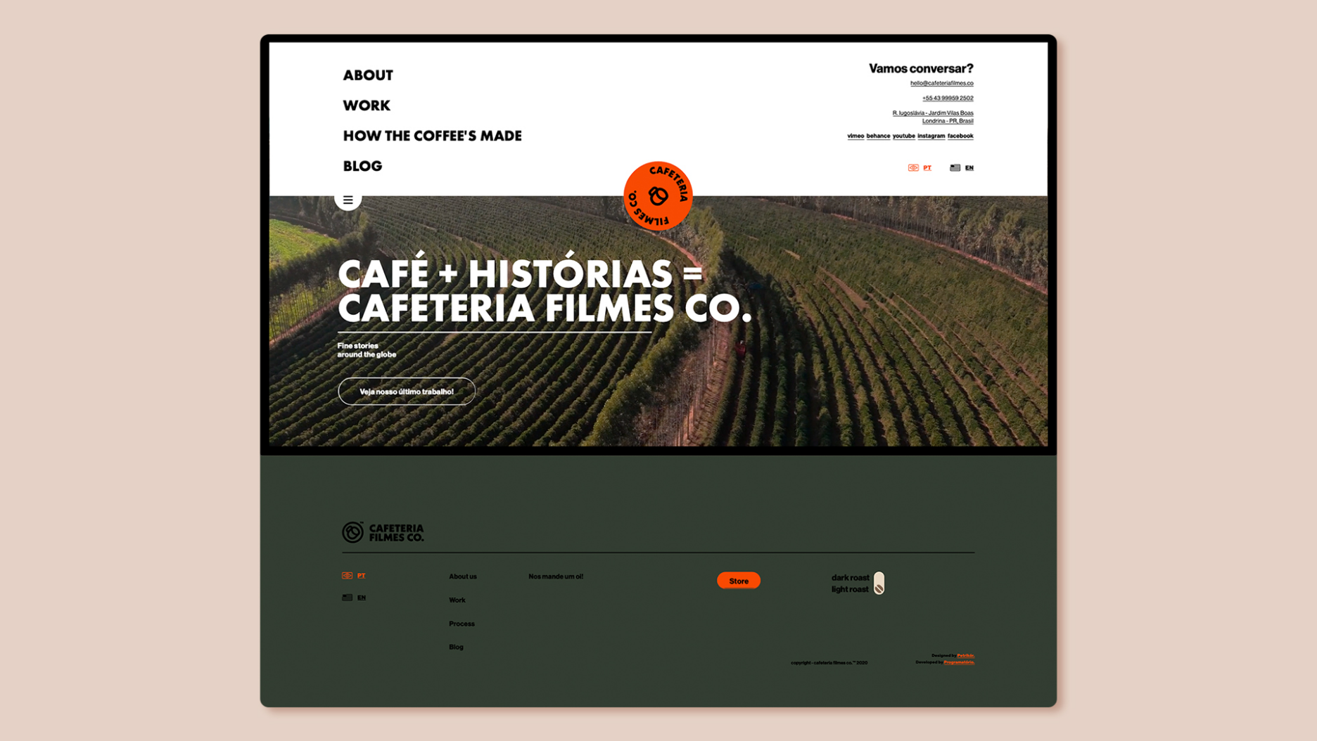
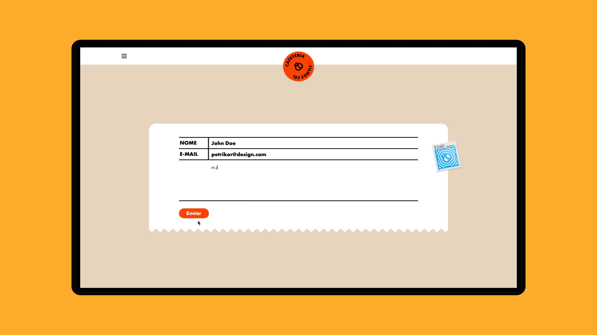
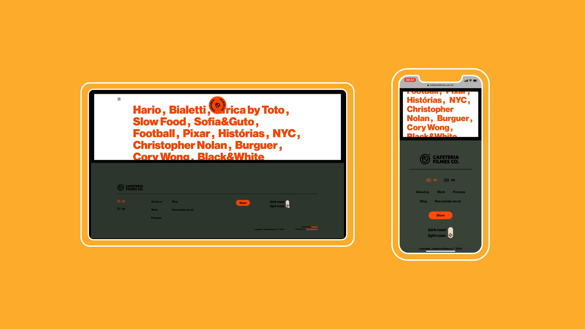
Thinking about the best way to showcase their work, we came up with the idea of adding a "dark mode". Essentially it works like a "cinema mode" where the color palette of the whole website is shifted to darker tones, allowing the user to focus on the content a little easier. But of course, we called it "light roast mode" and "dark roast mode".
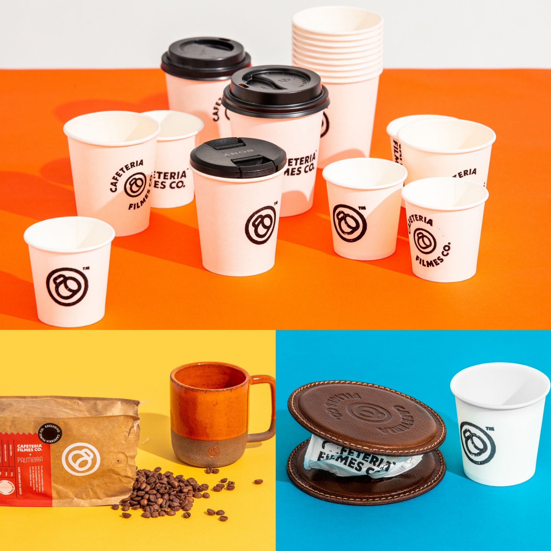
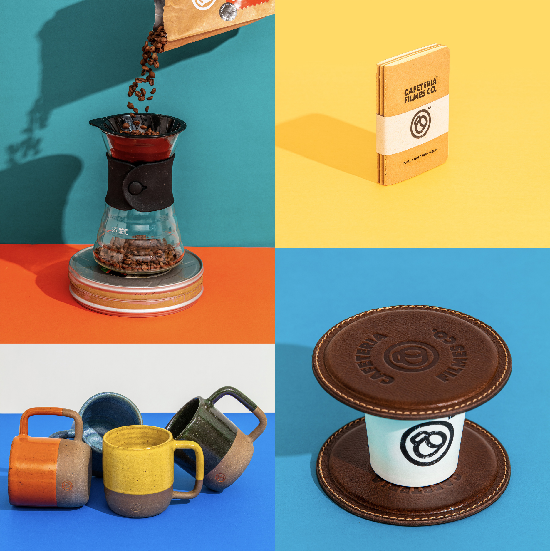
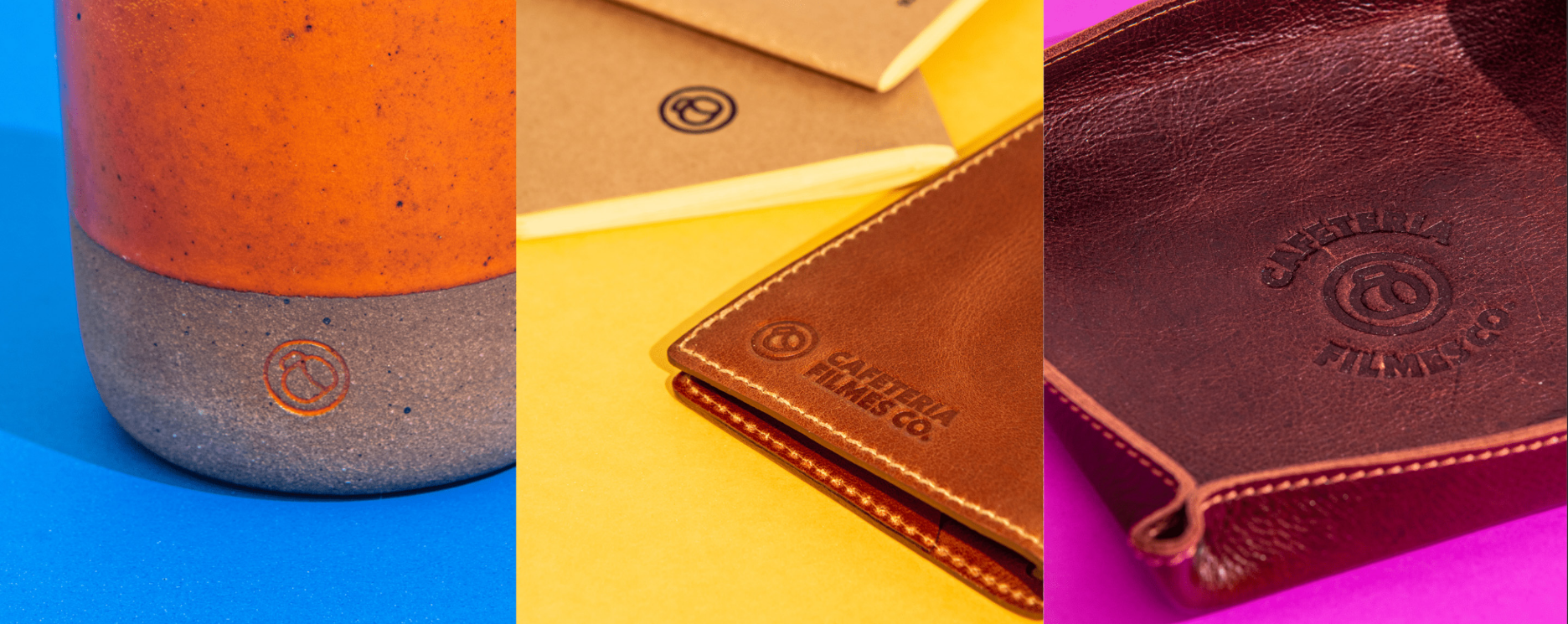
PRODUCTS & PACKAGING
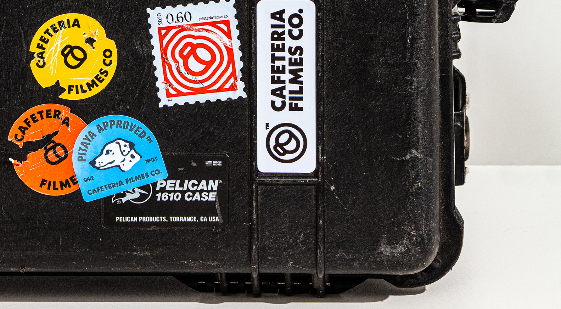
One really amazing thing this project brought with it was the opportunity to create a lot of Things surrounding the brand.
Like, actual things.
Let's be real, 90% of the times we see tote bags and enamel pins and neon signs and even t-shirts on branding projects, they never really get made. For us, creating a version of these things to present to the client is as easy as throwing the design up on a mockup in Photoshop, but it costs a hell of a lot more for our clients to actually turn those things into real physical products. So we get it when those ideas stay in our digital screen world. That said though, it's always incredibly exciting when those objects become real things.
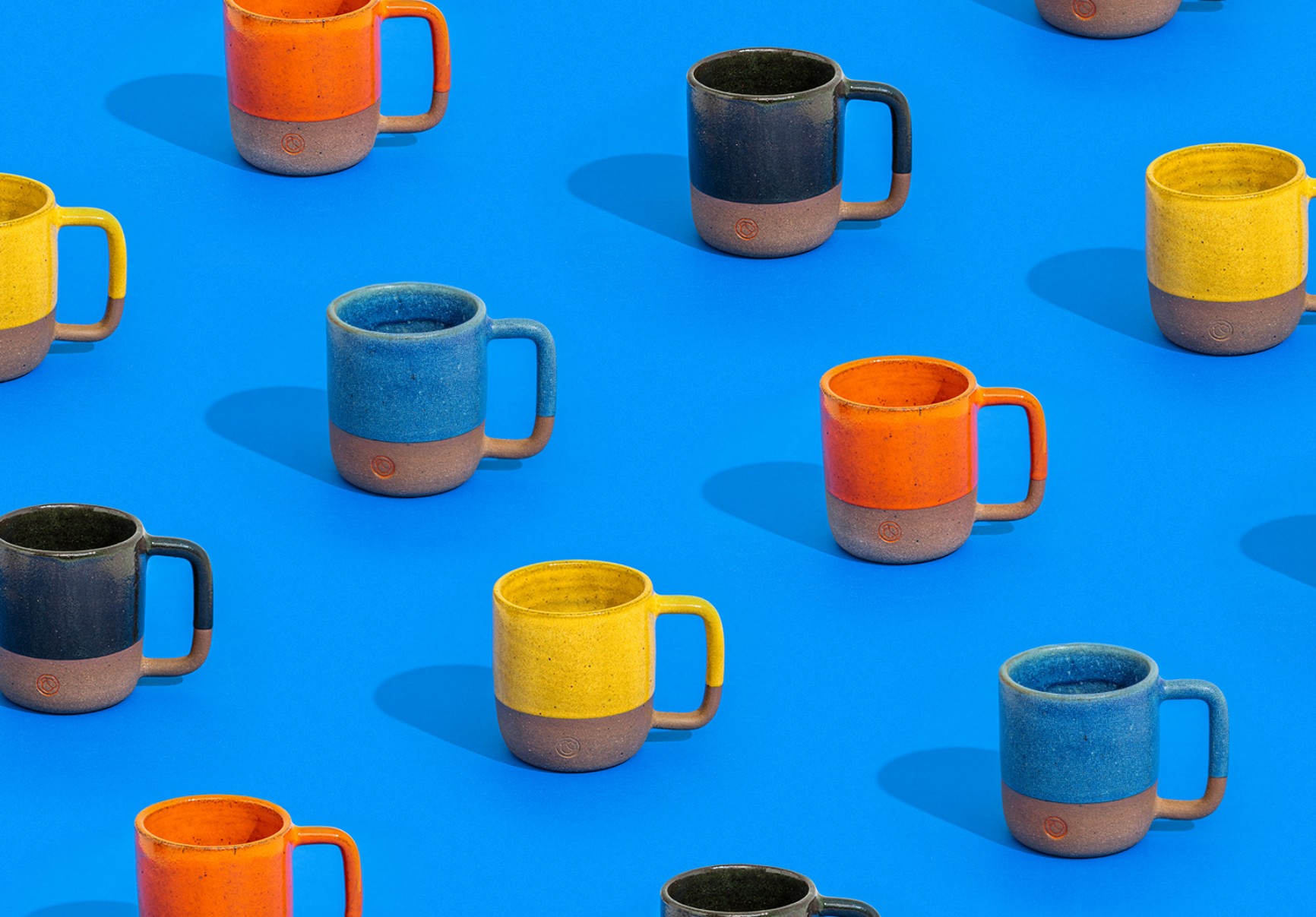
The guys went all out on this one. Memo notebooks (totally not trying to be Field Notes™ [sorry Draplin, hope you dont mind]), leather coasters, custom artisans-made coffee cups (these are not your regular white-cup-with-a-logo-printed-on-it, folks), T-shirts, keychains and probably even more things I'm forgetting now.
Here's the coolest thing though:
They got to source their own coffee beans from a local farmer, Fazenda Palmeiras. Really good ones too.
We never thought our first coffee packaging project would be for a video production company, but here we are, and we are not complaining.
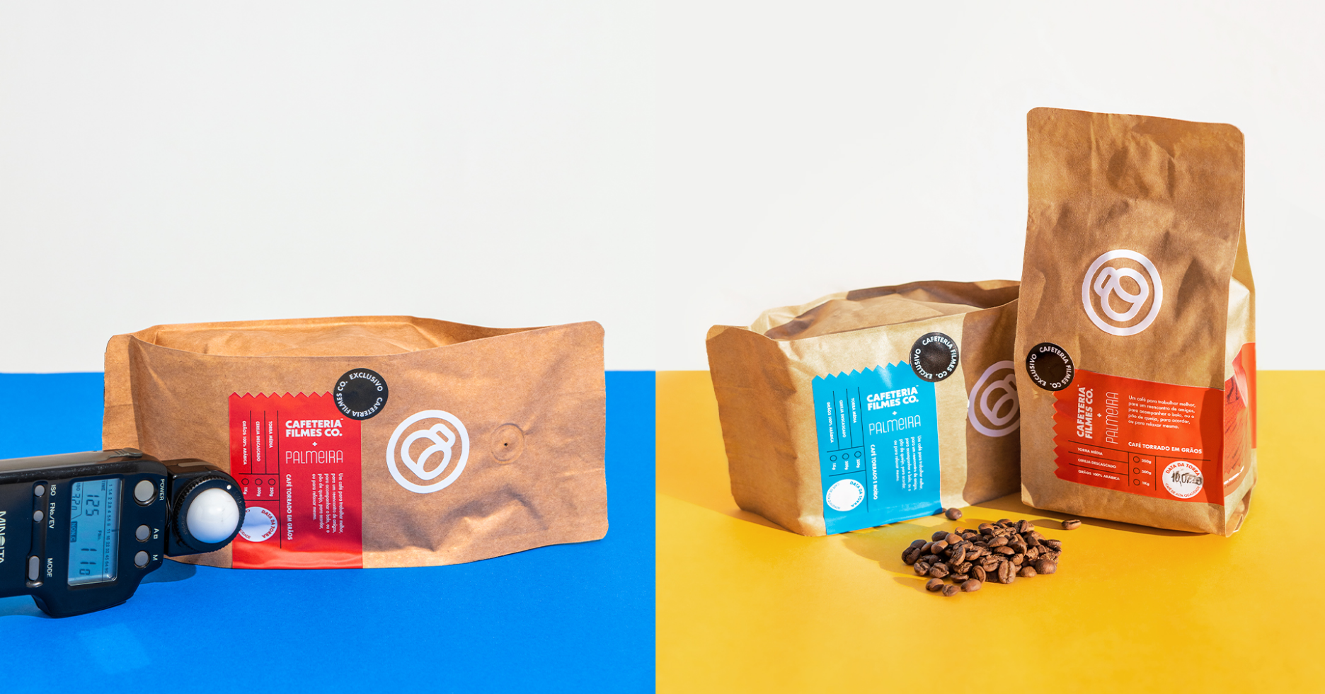
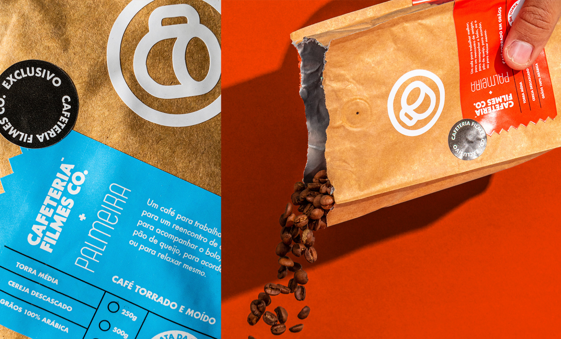
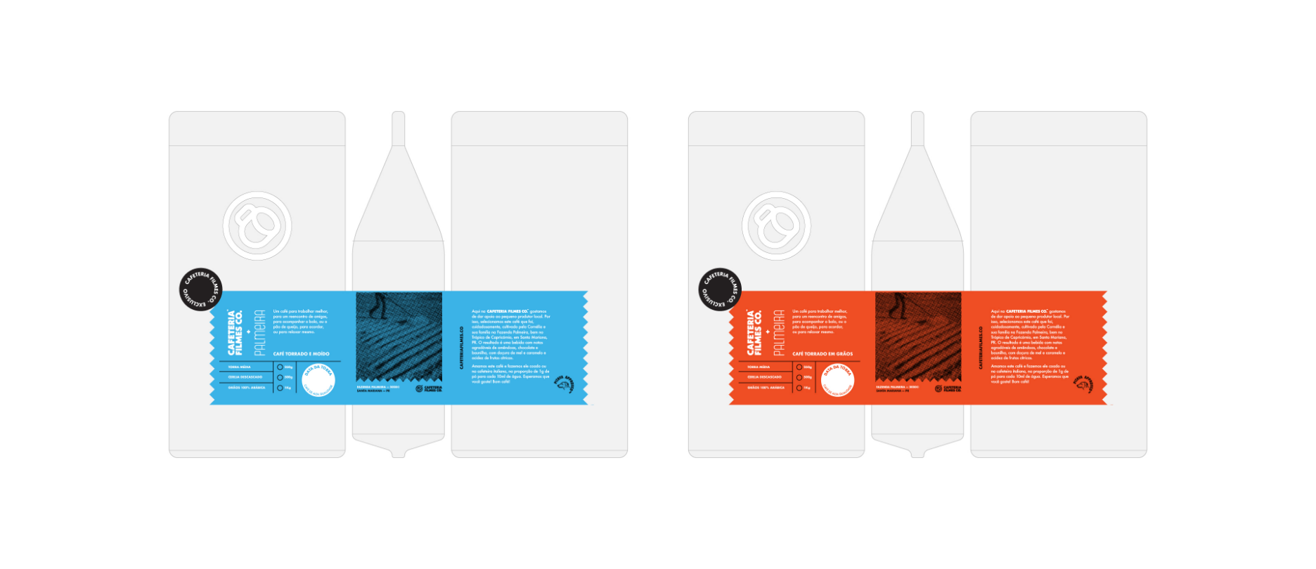
For the packaging, we knew they were not going to be producing a large volume of products. They are a video production company after all.
So we made sure to accommodate that by working around our limitations. Essentially taking a blank generic coffee package and thinking of ways to make it look great, and also be feasible for them to produce.
While all of that was going on, they took the opportunity to talk to Cornelia Gamerschlag, the person behind the farm, and made a mini documentary about it all:
THE POWER OF PERSONALITY IN BRANDING
One thing we've always believed in is that interesting companies are multifaceted. Much like people, an interesting brand is not a one trick pony. It doesn't hit the same note over and over again. Interesting companies have sharp edges that might hurt some people. They might turn people away. They are weird. Not for everybody. But those things are exactly what makes them different and interesting and unique.
We always look for that weirdness. Sometimes it's not very clear. Sometimes it's not there at all. This was the project where we felt things flip. It's the project where we got the chance to be a little weird.
A lot of people might say that the job of a brand designer is to create consistency. To create standards of usage. That's what a good brand does, right?
But to say that the job of a designer is to create standards is like saying that the purpose of a car is to take you from A to B. Yes, that's what a car is supposed to do, but that's the LEAST it should do. And we don't choose the car we buy or the car we want based on that at all. We chose our car based on who we are as people. Based on how it matches our lifestyle, what's gonna make me feel like. And if you are a car manufacturer and all you have in mind when designing a car is its functionality, you are probably going to make really really boring cars.